Last week for our usual Monday inspirational post we presented you with a showcase of web designs featuring the color yellow. Many of you enjoyed the focus on one color and even asked that we showcase another color. Since yellow is bright and bold, we thought we would go neutral this week and focus on brown. Brown is an earthy color that represents simplicity, friendliness, and dependability. Maybe it was these characteristics that caused UPS to build their entire brand around brown.
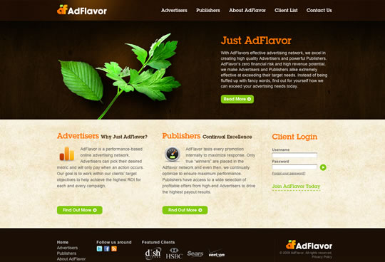
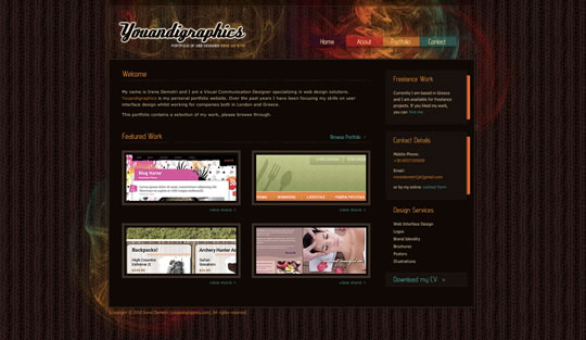
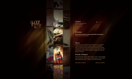
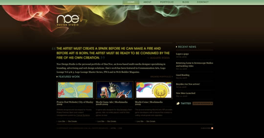
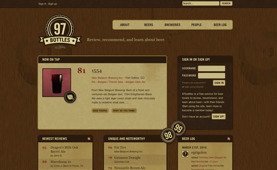
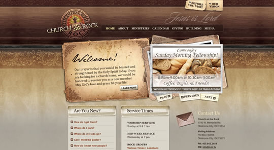
Here are 50 beautiful brown web designs that will inspire you. You will see that brown makes a great base color for a design and works well with many other colors.














Thank for awesome collection.
rzmota & SpoonGraphics are so sweets
Wow, thank you for this great collection!
Didn’t know that brown matches so good in webdesign!
fantastic collection. I must say that the use of brown in web design, when properly contextualized, is very elegant. Nine Lion, definitely cool!
That is good to hear as I am setting up a business and using Brown – glad you as a Web Designer see this as elegant Iama !!
I love TeaRound and Cellar, beauty and clean style. Our last project is also based on brown: check it out and give us a comment if you like http://www.albergogiardinetto.it
awesome inspiration and timely too!
I just did a site with brown and red too, still tweaking it but its turned out well so far.
Http:/www.johntibbsmusic.com
This one too: https://www.ousevalleyfoods.com/
My favorites from the list above of brown website designs, are sing the textured wood backgrounds, they look so effective. The other designs that work well are using a strong accent colour like green to contrast with the brown.
How could you forget https://thingsthatarebrown.com/
Nice collection. Coffee-related websites in particular are usually very well-designed sites with (obviously) use of brown.
https://www.cariboucoffee.com/
and the lovely…
https://www.artica04.nl
🙂
thanks keep up the great work
remco
Nice eye for brown websites!
Awesome, i love brown, made my own folio with this color.
Sweet – we got featured! And alongside so many great designs. Much appreciated.
Great post!
I’ll mention my site, https://www.slideaway.ca/
Love to design using brown!
Awesome share… I love the design concept of barista.
Some really nice sites here. Brown used in web design is probably one of my favorite choices. I know the wood effect is fairly popular but it can work so well with the right typography and the right kind of target audience.
Brown in various shades in my opinion can pretty much work with most styles of site, whether it be corporate business style or fun graphic design/portfolio looking.
My favorite two from your list have to be nine lion and James Lai Creative. Both work really well colour wise and alignment.
Great collection!
I just posted a similar post over at Circlebox Blog, but with blue design instead of brown!
Feel free to check it out!: https://circleboxblog.com/2010/inspiration/a-splash-of-stunning-and-sleek-blue-web-design-inspiration/
Awesome collection!
Mine is brown too!
Check it out: http://www.wezen.com.br. 😀
Great list. Nice use of textures and colors on many of them.
Too dark for my taste.
Light deshin is becomming more pupolar
I really enjoy these color collections and always bookmark them for future reference, thank you 🙂
A great inspiration list for creative websites, not sure how suitable brown is for more businessy websites though
Thanks for featuring us.
You can see some old logos and designs on our Flickr profile:
https://www.flickr.com/photos/casino-lemonade/
We are working on a making of video which will be released soon but I can show you a beta version without comment:
https://vgm.vegads-media.com/pres-design-lemonade.swf
You’ll see that we have been inspired by games such as Bioshock and Fallout 3.
You can also check our Facebook profile:
https://www.facebook.com/casinolemonade
Wow this is really post, love the brown 🙂 thanks for these inspirations
Thanks for posting. I think brown is an under-rated colour for a website. Generally warm and welcoming, just what you’d want a website to be. Some great examples here.
very nice list!
I’ve always loved brown in web design and my own site just relaunched with its second brown theme 🙂
Wow Man, you are really trendsetter 🙂
I also suggest an Italian website, verticalismi.it
great collction!…i love brown site…mine is brown too: http://www.takingweb.com... 🙂
Awesome. Brown is such an amazing color and can be use to portray different styles – majestic, bold, elegant, nostalgia, etc. Thanks for sharing.
My favorite one here is TEA ONE.
Amazing use of brown color. I’ll show them to my designers to be inspired of.
I’ll show them to my designers to be inspired of! thanks a lot