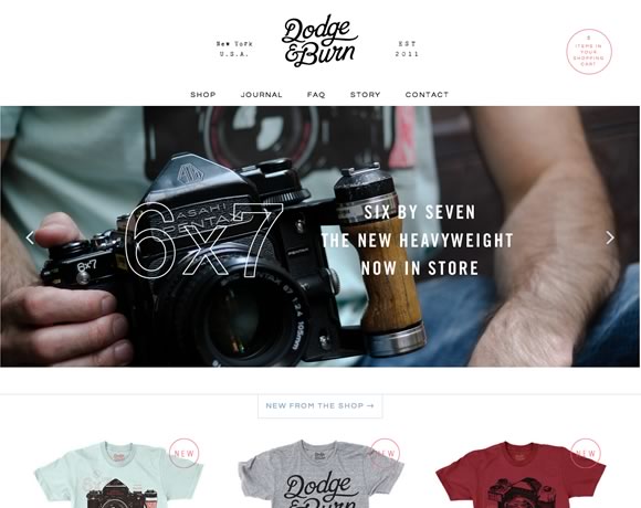
Minimal websites, when properly designed, are always inspiring. It is always interesting to see how designers approach the minimalistic point of view to create websites that are simple yet effective. Today we gathered some examples of minimalistic web designs to inspire you and to reinforce that you don’t need a lot of elements to deliver a concise website. Check out the examples we have here and share with us in the comments area minimal sites you’ve created.
InspirationWeb Design  Gisele MullerJuly 15, 201312 Comments07.1k
19 Examples of Minimalistic Web Designs
Share
Gisele Muller
Gisele Muller loves communication, technology, web, design, movies, gastronomy and creativity. Web writer, portuguese/english translator and co founder of @refilmagem & @mentaway Twitter: @gismullr


Love the tagline for Whole. “Holistic Design Agency”. Lovely nod to Douglas Adams’ series. Nicely designed site, too.
What about this one?
Minimalist designs are growing ever so popular, which I image is good as it would be less work for the web designer 🙂 .. as long as you have a clear mind on the colour combinations.
Actually, what appears to be simple in design often takes more time and critical thinking. The artist has done their job well if it looks like it was easy to make, though that wasn’t necessarily the case. Of course this makes things more of a challenge when trying to convey value if the client does not have a grasp of what is involved!
Mixd Look extremely beautiful, I like blue color.
Creatively done! love the typewriter effect on Manuel Moreale’s site
Great examples of simple elegance. Like a good host, they set the tone and invite you in.
Great! But what about SEO tho?
I think meta tags, back-links, and good on Page optimization have this covered.
I don’t like these kinds of websites. They may look nice, but they usually aren’t user friendly. If I have to search for more than half a second to find the menu I’m looking fore I’ll simply leave.
Like the one @viki53 commented about. Great a picture of a city with a tagline. What does the website do? As far as I can tell it’s just a full screen ad. I can’t find any way to interact with the website, to find out who it’s from, what it’s fore, what info I can get on this website.
A nice design is great, but it should go hand in hand with function. The only reason to have a website is because it has a function. If a website isn’t interactive, doesn’t give you info, it has no reason to exist. It’s just an ad.
Great examples, some really nice ones here. Thanks for sharing.
Web browsing attention spans are notoriously short, keep the message simple and you’ll get your point across much more effectively. Simplicity sells!