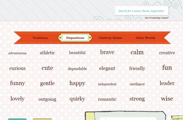
Not many designers place enough focus on the benefits of creative search fields. For content-heavy websites most users will be prepared to search for what they’re looking for. If the search interface sucks then people will be forced to leave and hit Google, or worse… Ask Jeeves.
Instead of driving people away like a repugnant foul pot roast, why not spice up the design and give it some flavor? Then everyone will simply adore the pot roast! In this analogy the pot roast is a stinky search input field that just needs a little TLC.
I’ve put together a selection of beautiful search interfaces from across the web. Some are big, some are small, others are more suitable for persnickety little babies like Goldilocks. But overall this gallery is quite diverse featuring a wide range of design trends for search interfaces. If I’ve missed any gems feel free to share your own ideas in the comments section.
