A well-established logo makes it easy for people to find what they’re looking for, and this level of recognition also typically makes consumers feel more comfortable with the product or brand in question. Despite this, some popular businesses made the decision to redesign their logo in 2016. As always, there were some new designs that really knocked it out of the park. Unfortunately, there were just as many that left us shaking our heads and questioning who greenlit such an atrocious final result.
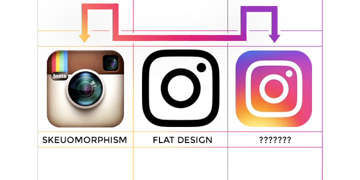
1. Instagram – WORST

The new Instagram logo hits you over the head with bright, garish colors. It also fails to stand out as an instantly recognizable camera in the same way that the first logo did. This isn’t the most awful redesign of all time or anything quite that drastic. Overall, though, this redesign is ugly and fails to advance Instagram’s brand in a positive way.
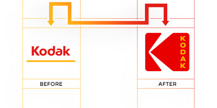
2. Kodak – BEST

Kodak’s redesign recalls the beloved and instantly recognizable logos that the company utilized from 1971 to 2005. Additionally, it shows a bold confidence that is missing from most corporate logos. The final result is nostalgic, yet modern at the same time. It is extremely rare for a company to sign off on a logo with vertically-stacked type, but it works really well for Kodak. This is a great example of honoring the past while still moving ahead into the future.
3. Mastercard – BEST

This new logo isn’t exactly groundbreaking, but that’s part of its charm. The redesign keeps the company’s roots while still modernizing everything. It actually feels like the company’s attempt to remain recognizable but also look hipper and less corporate. They didn’t exactly stick the landing on the hipness concept, but the overall look and feel is a big improvement from the past.
4. Pandora – WORST

A frequently quoted line from “Jurassic Park,” slightly modified, helps describe this change: Your graphic designers were so preoccupied with whether or not they could, they didn’t stop to think if they should. Sadly, this new logo isn’t even exciting, dangerous or dynamic like the dinosaurs in “Jurassic Park.” Instead, it’s flat, boring and feels pointless. It would have been better to stick with the old bland logo because at least that came with some brand recognition.
5. Subway – WORST

What does a company do when trying to rebrand after public outrage about a major spokesperson controversy? Apparently, they very weakly redesign their logo so that it looks like a slightly different version of the same basic idea. Changing the font and removing the black outline doesn’t make the Subway name stand out more or seem more appealing. All it does is call attention to the fact that the company is trying to remove itself from the stink of Jared Fogle’s illegal activities.
6. Taco Bell – WORST

Yet again, a major, well-known company took a boring approach with their new design. Taco Bell’s redesign is clearly meant to appeal to millennials while retaining the easy brand recognition of their old look. However, the font choice is horrible, and the varying tones of purple are an eyesore.
7. U.S. Soccer Federation – BEST

The previous logo for the U.S. Soccer Federation had numerous issues, not the least of which was using blue stripes instead of red. The new logo fixes this issue and goes much more simplistic for a clean, easy to look at result that is fiercely patriotic. The only issue with this new effort is that if you’re not a soccer fan, you probably wouldn’t know that this logo is meant to represent a sports federation because there’s no longer any reference to soccer.
8. Bud Light – BEST

This redesign is one of the best logo changes of the year. Long gone are the overly cluttered cans with the large and boring font. Instead, these cans now have a more sophisticated aesthetic, which is almost certainly meant to attract a more diverse consumer base. It’s hard to know if Bud Light’s efforts will work without alienating their core base, but the logo is definitely nicer to look at. Now they just need to redesign the drink itself to match this new level of sophistication.
9. Peace Corps – BEST

The old Peace Corps logo attracted attention with its patriotic color scheme, but it didn’t flow very well. The new design has a much better visual flow that creates the sensation of movement. Making the dove the central focal point of a non-profit organization that seeks to peacefully help people around the world is also a nice and appropriate touch.
10. The Metropolitan Museum of Art – WORST

The old logo had its flaws and probably needed to be revamped. However, the weird and visually unappealing option that was chosen is highly unlikely to inspire people to visit the internationally renowned museum. Also, deciding to officially rebrand with the nickname New Yorkers use, The Met, seems just as odd of a decision as the new logo.
11. Meetup – WORST

Meetup’s previous logo was simple, to the point and easily illustrated the website’s entire concept. Changing that look to one that’s nothing more than a quirky take on the name isn’t an improvement. In fact, the font choice isn’t very appealing, and this design appears to be aimed at only one very specific audience. Everyone else is likely to be alienated by the new logo.
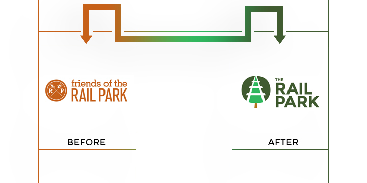
12. The Rail Park – BEST

This Pennsylvania-based nonprofit’s redesign showcases how to incorporate all aspects of a company’s identity into one logo without making it feel cluttered. They have a tree to help quickly establish the park aspect of their work, but the same tree can also be seen as railroad tracks, which ties in the rest of this group’s proposed underground park and recreation path.
13. Houston Ballet – BEST

This is a great example of how to transition from a boring logo to a design that truly pops. The implied movement in the redesign is perfect for a group that makes a living by moving on stage. The new font choice also beats the previous effort by leaps, bounds and allegros.
14. Milwaukee Bucks – BEST and WORST

Want to see what a dynamic and powerful logo redesign looks like? The Milwaukee Bucks new logo definitely fits this description. Unfortunately, it also fits the description of looking so similar to another logo that the Bucks are now facing legal action. That’s right, everyone; Jagermeister is very unhappy with the Bucks new logo, and it looks like they just might have a legitimate claim.
15. Uber – WORST x 2

Uber unveiled a new logo and app icon this year, and both of them fell flat. First off, the so-called new logo is just a very minimal update to what already existed, and it doesn’t do much to improve upon the branding consumers have gotten used to. The more egregious change was with the app icon, though, which now looks like a credit card security chip.
16. MetLife – WORST

MetLife has drastically switched identities with this new logo. The problem isn’t that they fired Snoopy and the Peanuts crew. Instead, the major issue is that the redesign feels harsh and unapproachable. Of course, maybe they simply decided to go for a more truthful representation of what it’s typically like to work with an insurance company.
17. Vevo – WORST

Music is emotive, and the old Vevo logo helped capture this. Unfortunately, the new redesign strips away the fun and emotive vibe in favor of a more corporate-friendly image. This is far from an improvement and may not go over well with music fans, especially the younger ones.
18. Florida Panthers – BEST

Replacing a logo after 23 years is no small task, but the design put together by Reebok does an admirable job. Gone is the in your face aggressiveness of the past. In its place, there’s a regal panther that looks fantastic and much more modern on merchandise.
19. Tronc – WORST

This is by far one of the worst redesigns of the year. Not only did the respected Tribune Publishing Company change their name to the insipid Tronc but they went from a solid, dependable news logo to something that looks like an advertisement for a kid’s movie about robots. This is absolutely terrible, and everyone behind this design should feel ashamed.
As you can see, 2016 had a lot of hits and misses. Whether you agree or disagree with these choices, we can all be thankful there are so many designs worth talking about.


I disagree with some of these. I like Instagram’s new logo, actually stands out now. In a world of flat, they are trying to mix it up. Only a matter of time until gradients emerge as a trend over flat designs.
I disagree in many cases. I don’t think that Kodak logo looks Modern/loving retro, it’s very boring to me. MasterCard redesign as well. There others that it’s true that they’re not outstanding but not at level to be offended by their presence.
Can’t tell if this is a troll article or the author rlly lacks design sensibilities.
I personally find kodak new logo very interesting. Thanks for sharing this.
I can’t believe it but I agree with absolutely all of your calls! One might think you had design experience.