2018 seemed to go by so quickly! But, that doesn’t mean that there’s any shortage of great website designs out there. With more and more websites joining the web every day, it’s actually really hard to find one that stands out. So, for your viewing pleasure, we put together a quick list of the best website designs that stood out to us in 2018. Some of these you may already know, but a few of them might be a surprise.
Epicurence
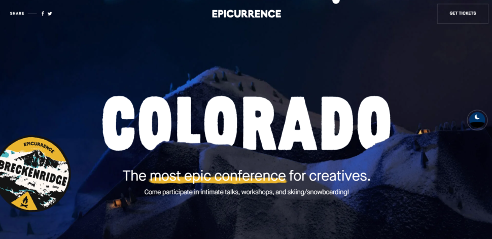
Anywhere you go on Epicurence is simply a visual delight. The site is packed with fun animations and unique transitions. Not to mention the beautiful colors and eye catching images. It’s hard to pick one single part of Epiccurence that’s better than the other. Well done!
Eleven Plants For Dum-Dums
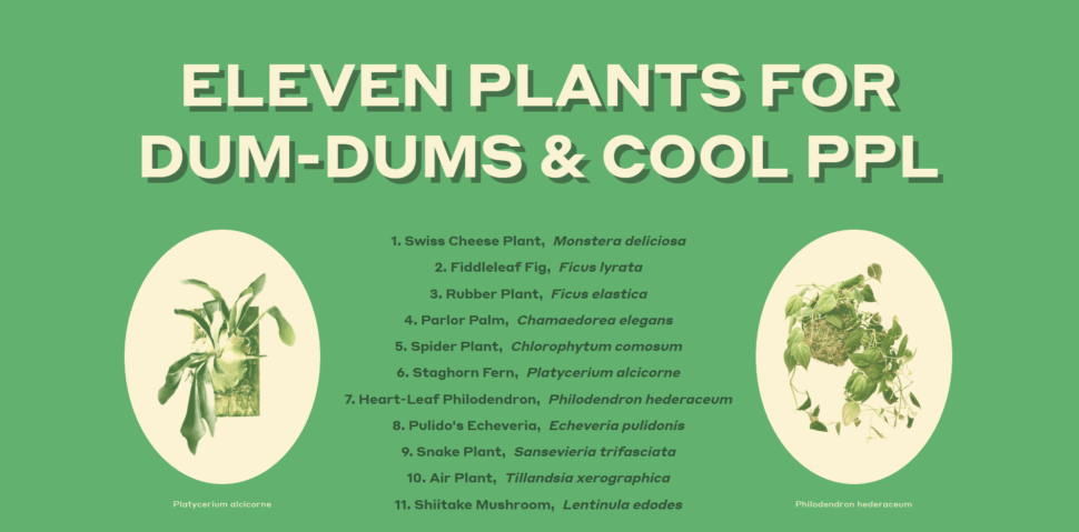
Now, I know what you’re thinking, and no, this isn’t some super hipster design studio. Eleven plants For Dum-Dums is literally just a website that lists 11 different kinds of plants. What makes it stand out is the use of animation and the color green. It’s a really fun website to visit, and they make each section about each plant so unique, that it’s impossible to look away.
Hello Monday
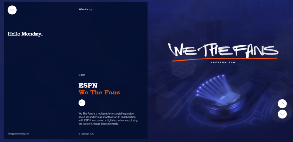
As much as we all probably dislike Monday, Hello Monday the website is a welcome site. On the main page, the way they transition from story to story is super clean. The transitions are also timed really well. They give you enough time to glimpse the story and click if you want, but they don’t stay up too long and make you feel like you’re staring at a wall.
Feed Music
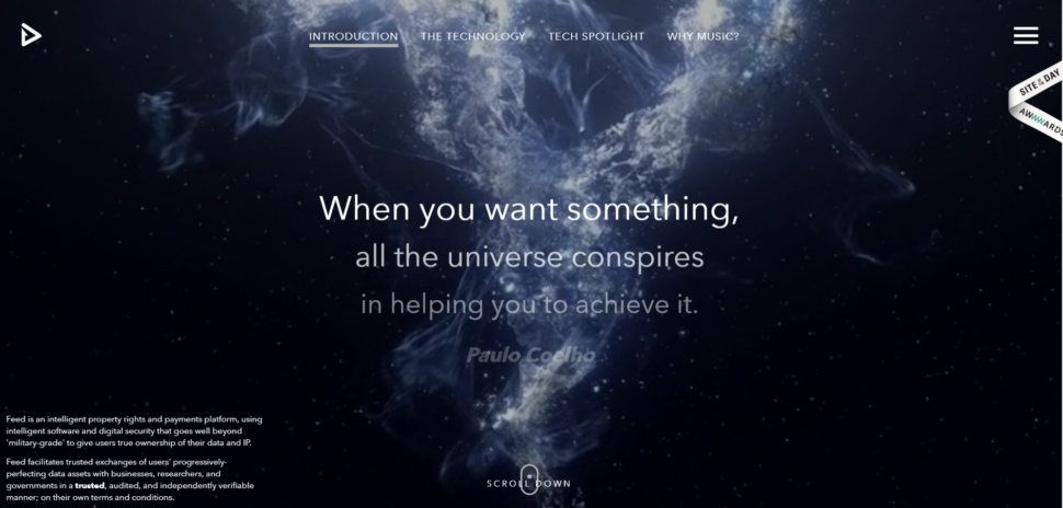
Feed Music’s main page captures your attention instantly. So much so, that you almost don’t want to click on anything else. The animation is smooth and the colors are beautifully balanced. To top it all off, if you scroll down through the content in the middle of the main page, you feel like you’re watching to intro to a Star Wars movie.
The Sum
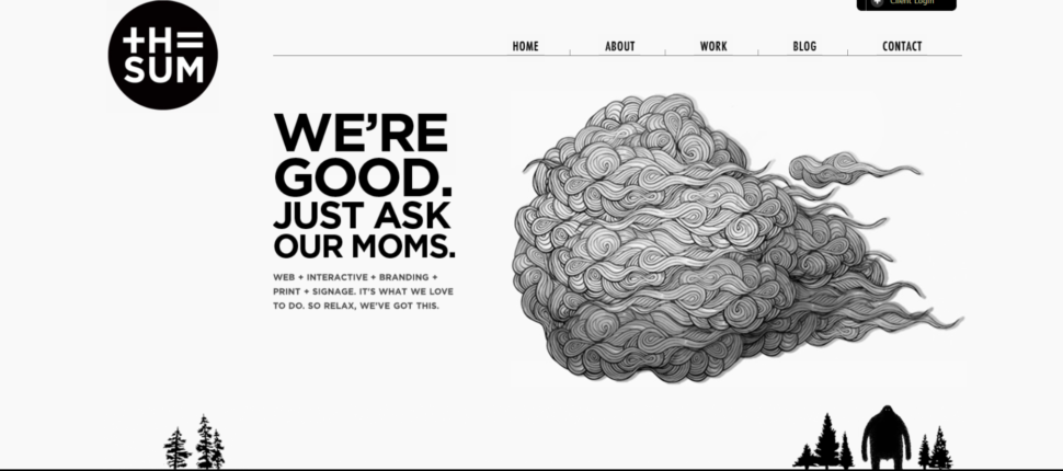
Just in case you haven’t read anything else on our blog, we love custom graphics. The Sum takes a very minimalistic approach, but wow are the visuals amazing. Combine that with a sense of humor, and a fast functioning website, and you have yourself a winner.
Zillow
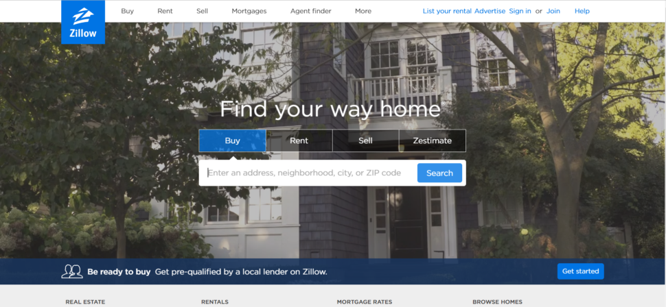
Let’s take a dip into more familiar territory, shall we? Zillow is a pretty common name to hear nowadays, especially if you’re in the real estate business. It’s safe to say that they’re really good at what they do. Another thing that they really nailed is the design of their website. The best website designs are the ones that serve their purpose and look good doing it. Zillow is not only visually appealing, it functions like a champ, and it’s easy to use. What more could you want?
Toggl
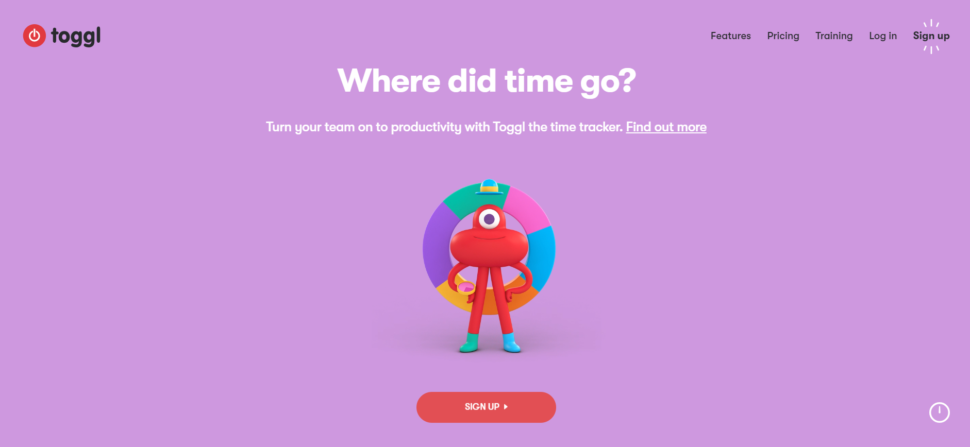
Here’s another big name you hear about a lot. What makes Toggl so mind blowing is their weirdly entertaining animations on almost all their pages. Each page provides soft and relaxing colors, and the oever website has such a friendly and helpful tone to it that it’s impossible not to feel at home.
Distance to Mars
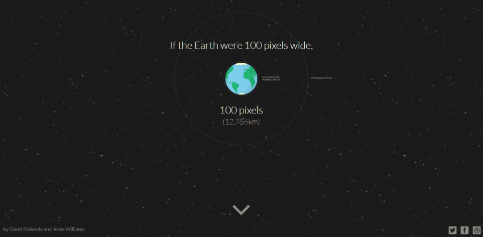
Distance to Mars was designed to educate people in a clever way. The website is dedicated to one purpose, showing viewers the distance to mars. Along the way, they’ll provide some scientific facts that are quite entertaining. If you have a few extra seconds, it’s definitely worth checking out.
World of SWISS
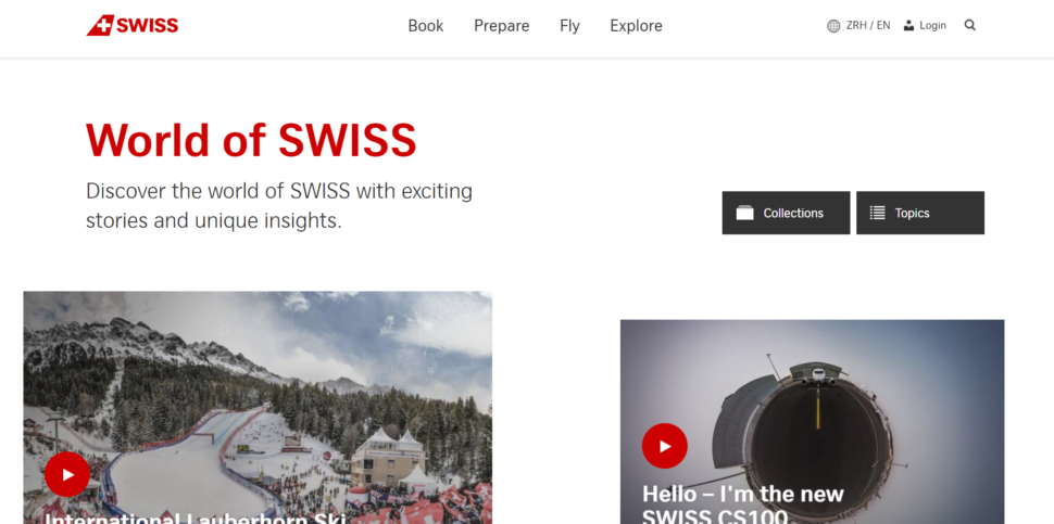
World of SWISS is a website dedicated to SWISS airlines. The website i beautiful and clean, but most of all, it perfectly tells a their story. On the main page, you’ll find no shortage of articles and videos describing what it’s like to fly with them. The website’s function is smooth and the visuals are crisp and perfect for the brand. This is a great example of how simplicity and functionality can go a long way.
Juliana Bicycles
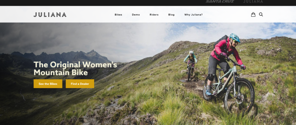
As a bicycle site just for women, Juliana Bicycles delivers clean and vibrant images, and outstanding functionality. They take advantage of responsive interactions, and it really works well for the site. It’s colorful, clean, and really really cool.
Guillaume Tomasi
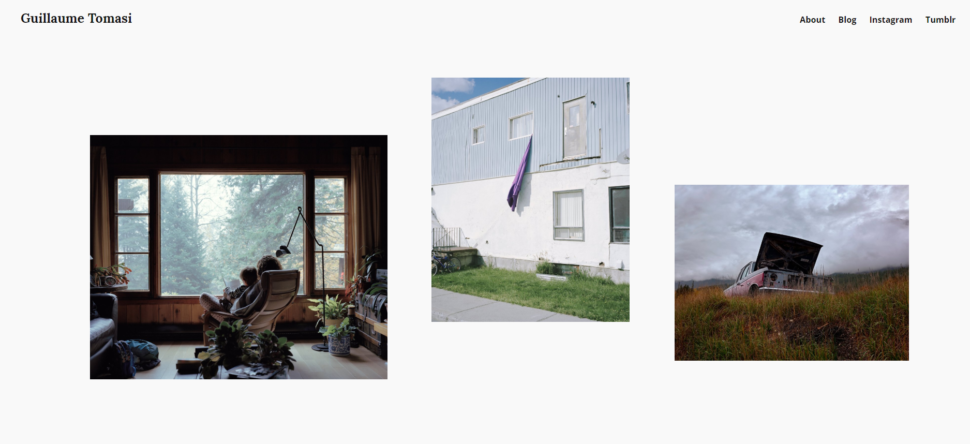
Guillaume Tomasi is a photographer in Montreal that has built a portfolio that’s quite impressive. Both according to its contents and the beautiful manner at which he pulled it off. The website is simply beautiful and is a great example of both how to design a website and portfolio. The interactions are simple but fun, and definitely get the job done. Never once will you feel inconvenienced by the way the website works. It’s simple, but it’s different for sure.
Crypton
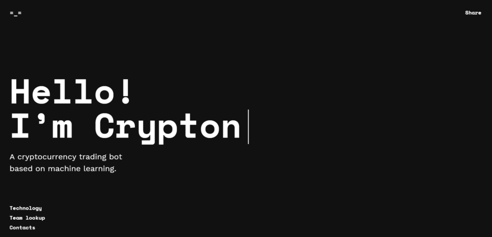
Crypton is a robot accountant that helps you buy and sell cryptocurrency. The site uses the best of the best AI to help you predict changes in values for all kinds of cryptocurrencies. Since its creation, it’s been given quite a few awards for its design and development, and you can see why from the moment you click on it.
JOHOs
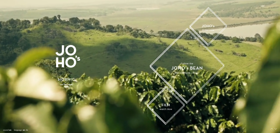
If you want a website with superb images, nice interactions, quick functionality, and delicate story telling, then look no further than JOHOs. The website tells the story of the brand’s coffee beans. You get to travel along with them from the growing process all the way to the brew. It’s like a mini movie and it’s so mesmerizing to watch.
Apple
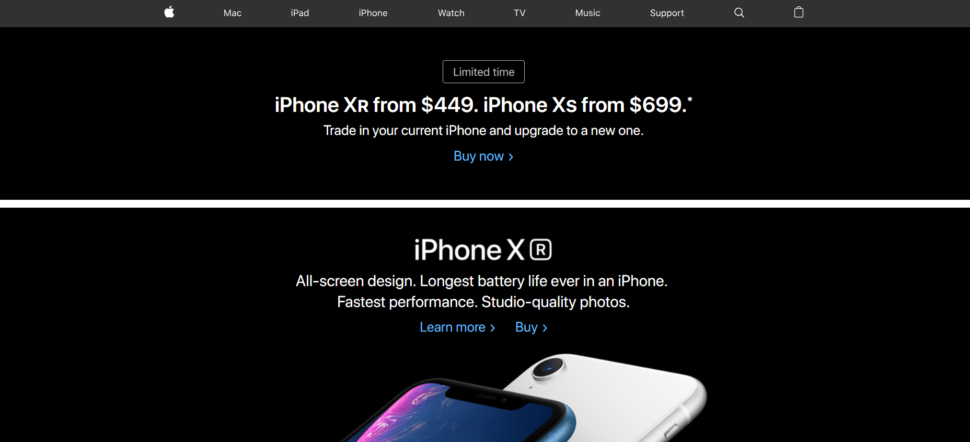
We’ll end this list with Apple, a company that has been notorious throughout its existence for creating sleek and functional products, and their website is no different. It’s packed to the brim with high quality imagery and super modern style. The iPhones displayed on the main page all but jump out at you.
Conclusion
The best website designs are not good at any one particular thing. But rather, they’re great at many different things. Each website on this list of best website designs of 2018 showcase many strong advantages that they have over other websites.
Some of the names in this list you may have already been familiar with, and some are probably new to you. Regardless of whether is new news or old news, these websites are simply stunning, and the design teams behind each one have something to be extremely proud of. Go ahead and click on the links are check them out for yourself!


Leave a Reply