As a marketer, hearing the word “redesign” is something that I’ve learned to fear. There is so much more to the redesigning process than slapping a new logo on your website or changing the font on your blog.
The risks that come with such a task are enormous and there are so many things that could go wrong.
Just look at the most famous redesign of 2016; Instagram’s new logo – everybody and their brother was talking about it. Adweek called it “one of the biggest design fails of the year” and people were legitimately angry at Instagram’s audacity of changing the logo they were so used to. It all comes down to our human nature.
Rosabeth Moss Kanter from Harvard says:
Change is meant to bring something different, but how different? We are creatures of habit. Routines become automatic, but change jolts us into consciousness, sometimes in uncomfortable ways. Too many differences can be distracting or confusing. Leaders should try to minimize the number of unrelated differences introduced by a central change. Wherever possible keep things familiar. Remain focused on the important things; avoid change for the sake of change.
Which brings me to The Verge’s new logo.

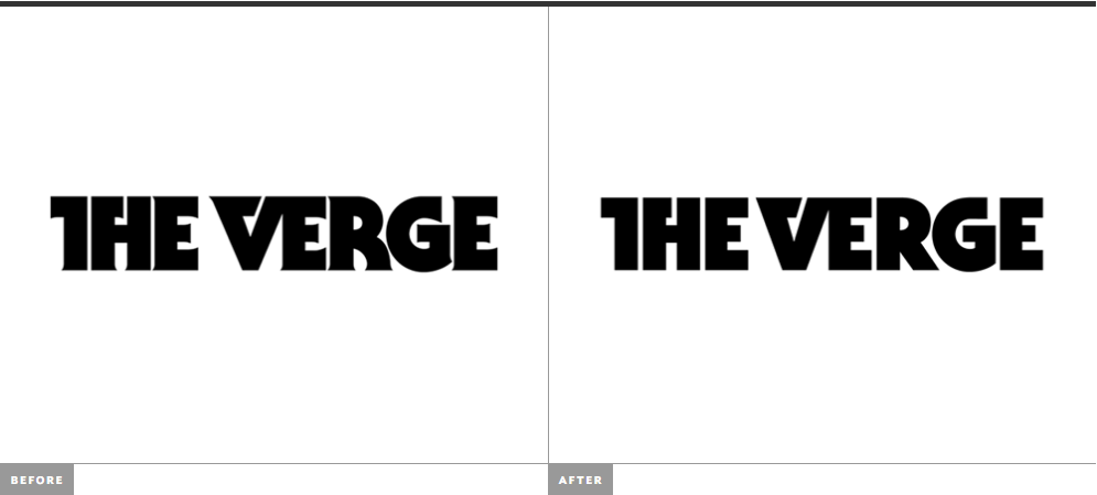
The differences are almost unobservable to the untrained eye. The logo is not the only thing they’ve changed. They also have a new design system called Pathways.
Here is The Verge’s rundown of what they’ve changed.
First, our new wordmark is a slight refinement — we’ve cleaned up the serifs, made it sharper, and generally brought it forward so it renders better at small sizes across mobile platforms. We’ve also tweaked the various colorways of our triangle logo, and created a new system of treatments for our various sections on all the social platforms they live on. […] Our new design system is called Pathways, and it’s built to scale from elements on a web page to motion graphics in videos to physical structures at events. It’s made to pop with bright colors and illumination; I think it looks like a neon sci-fi dream. We’ve also updated our main typefaces, from DIN Condensed to Heroic, and from Adelle to Adelle Sans — refinements that work better on small screens and improve our overall legibility while preserving the character of our brand.

The Verge’s new logo and the whole design system makes sense. Brands are gradually moving towards minimalist design, removing the decorative fonts for good. Hp, Subway, Gumtree and of course, Instagram are just a few major brands that boarded the minimalist train and created a storm of negative feedback.


However, this move towards simplicity is acutely dangerous for the graphic design world and it shouldn’t be encouraged.
simplicity sometimes leads to a lack of personality and it makes a brand harder to be distinguished. Less isn’t always more. And when you do a major redesign, you should be aware of people’s hate for change. The Verge logo wasn’t spared of the negative feedback.
Ugh. Not a fan. And I agree, the overall aesthetic feels cheap and knocked-off, as if the late-Millennial who created it was running down a cobbled checklist of the most obvious ’80s sci-fi motifs. Righteous pink-to-orange gradient? Check. Totally rad laser lines? Check. Tubular neon haze? Check, dude.
Also, the hero in the wordmark should be — and should have always been — the serifed stylization of the V; the little serif on the H looks forced and extraneous, and cheapens the effect of the V.
And unrelated to the rebrand, but the site is bloated and buggy — at least on Firefox
And my personal favorite comment is from Ian Phillip.
“The definition of meh.”
Conclusion
Overall, The Verge redesign isn’t necessarily bad. The logo and their visual identity as a whole are carefully and specifically crafted for their audience and it resembles the type of content they publish. However, in their attempt of delivering a minimalist visual experience they killed a little bit of their logo’s personality.
What do you think about The Verge’s redesign?


I actually like the new Verge logo over the old one. The old one was such a miss-mash of different, opposing styles; and that old R, don’t get me started on it…