

The initial design phase of a website caters more toward composition and page structure. But once you move into the nitty-gritty stuff you’ll be paying much more attention to content structure. This minutiae becomes critical when mapping out pixel-perfect mockups and page designs.
I’d like to cover a series of tips outlining best practices for typography structure on the web. The act of typography design is quite different from the act of structured text on a webpage. Hierarchy is generated through whitespace, placement, and font styles. It is my hope that these tips will prove useful to web designers who want to learn more about hierarchal content structure on the Internet.
How is Text Consumed?
Page structure is at least indirectly related to content consumption. The average person who lands on a page may not jump into reading text immediately. They’ll first notice general design choices like header location, line height, and paragraph spacing.
Some people might be familiar with the site and jump into reading without catching a breath. However a new design will be unfamiliar and needs to create a sense of familiarity. Visitors need to feel comfortable skimming content and recognizing how paragraphs, headers, blockquotes, and other contextual elements relate to each other.
One handy guideline for text consumption is building natural relationships. Place headers closer to their related paragraphs and leave plenty of space between lines of text. Ensure that bold/italic words stand out against other words on the page.
Also take into account the intimidation factor of large text blocks. When you have paragraphs spanning a full 1920px monitor the lengthy lines can create discord and imbue a lack of interest in the reader.
Instead try to limit paragraph widths to smaller bite-size chunks like on SimpleBits.

Although Dan’s portfolio is both responsive and spacious, page content is condensed toward the middle of the screen. Smaller paragraphs feel easier to digest and there’s a greater sense of accomplishment when reading feels quicker.
Of course this style may not be perfect for every site. The other alternative would be to increase the font size so that text is more vibrant. Try alternating between different sizes to distinguish levels of importance between blocks of text.

DIY.org has an interesting layout with a variety of text effects. You’ll find many different typefaces along with contrasting colors and varying font sizes. The DIY page flows naturally and seems to drive you further into each section.
Reading is always going to require time and focus. Text consumption isn’t like video consumption and text-heavy pages need to be designed with this in mind.
Font Sizes & Placement
Composition has influence at all levels of design. Even when you’re crafting smaller typographic elements it’s important to zoom out every-so-often to catch a glimpse of the bigger picture.
Text size and placement are two key components to influencing content hierarchy. Larger text will stand out more than smaller text. But the placement of text alongside other elements creates a certain atmosphere on the macro and micro scale.

Google Ventures has an outstanding layout design which feels corporate but not stuffy. Their typography is also flawless both in spacing and form. What I most admire about their page is how content falls naturally into a pattern.
Smaller paragraphs lead into topics with a natural flow. Thumbnail images are used to offset typography and create an alternating pattern. I also like that each header uses all caps to distinguish from paragraph text. This formatting choice allows visitors to skim and recognize headings quickly without relying solely on font size.

For a more detailed example you might check out the homepage for Desk. Their composition feels inviting and ushers you down further into the page. Large and small headers blend together into different sections, disconnected by groupings of white space.
Desk has one pristine landing page and there’s very few changes worthy of consideration. All the links, headers, and smaller elements fit together like a puzzle. Contrast also plays a role which is where the colors and icon styles tie into content structure.
Relationships via Whitespace
As I mentioned earlier, whitespace should be used at all levels of composition to build visual hierarchies. Live examples of whitespace may help you see how the content hierarchy becomes dependent on space. Too much space will look gaudy, but too little space will feel cramped.
With time and practice you’ll learn how to see proper white space values. The first step is to analyze how other websites incorporate white space to blend typography into a hierarchal structure.
For example, headers should be located close to their related paragraph text. But paragraphs need a lot more space between each other to give the sense of distance. Readers want to difinitively recognize when a paragraph is over and when a new one is beginning. No amount of font size or contrast will solve this problem; whitespace is the best solution.

Stuff & Nonsense is a design agency with a serene grasp on typography. Their company about page uses a series of different headers and columns which all seem to blend together nicely. Content relationships are noticeable even when standing away from the monitor.
Along with headers and paragraphs you’ll also want to consider smaller typographic elements. Think about tidbits of metadata or microcopy scattered throughout the page. Whitespace values get smaller when dealing with small bits of text, and in these scenarios a few pixels can make all the difference.

I recently found a helpful Medium post written by Andrew Coyle covering better typographic hierarchy. In one of the examples he demonstrates how a little space between blog post metadata can seriously improve readability.
The lesson to take away is that whitespace should be your friend. In many cases you’re better off using too much whitespace rather than not enough. With practice you’ll be able to discern when something doesn’t look right and subconsciously know how fix the problem infallibly.
Noticeable Link Styles
Hyperlinks are distinguishable from regular text because they’re interactive. Paragraph text is primarily made of static letters on the page. Hyperlinks are clickable and should be designed to feel clickable.
The design style of link text will change based on a website’s color scheme and page structure. Font size also plays a role but ultimately link text should stand out through contrasting effects. Underlines, colors, and/or backgrounds can be used along with other features.
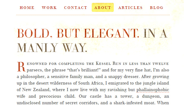
Take a peek at the layout for Information Highwayman which uses a very loud and harmonious tone for hyperlink design. The text color changes to a brighter red and the background includes a yellow parchment texture.
I feel like this works great because links are so blatantly conspicuous. Someone could be standing 10 feet away from the monitor and still recognize the design.
Not every design can work with bright links that jump off the page but you should try to design links that can stand out when skimming through paragraphs.
Final Thoughts
When crafting a new web project keep in mind that text is going to be a huge part of the finished piece. Content hierarchy does include more than just text – but text can set the stage for other elements. Use the tips from this post along with your own intuition to design beautiful layouts with order and typographic rhythm.


One of the most powerful tools and concepts for harmonious typography is the Modular Scale.
After learning how it works, which is amazingly easy, I never went back to eye-balling or letting reset CSS files or browser defaults dictate the font sizes.
This has to be one of my top 3 design tools for front-end design in my toolbox.
https://www.modularscale.com/