
The prepaid wireless market has been rejuvenated by Virgin for years. Their goal was to offer a solution for young adults or non-technical people who don’t want(or need) a monthly cell phone bill.
Virgin Mobile uses a minimalist design style which follows suit along with other tech companies. Lots of photos and product shots illustrate the items Virgin has to offer their customers. I’ll be delving into a brief overview of their website including layout, typography, patterns, and content organization.
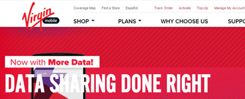
Recognizable Header
Virgin Mobile and many other companies utilize their website header as a point of reference for all visitors. Once the page loads everyone gets a chance to see the header – this is a good reason to include as much pertinent information as possible in this small area of the screen.
Composition is slightly misaligned to draw attention through asymmetry. The Virgin Mobile logo hangs ever-so-slightly over the header bar with a crooked orientation. Since everything else aligns horizontally this rotation brings more attention to the logo & the company identity.
Also notice how the navigation text is slightly above normal size. It may not come off as “unnatural” but it certainly feels big & bold.
Nav links with a small triangle icon represent dropdown menus. When hovering over these links an internal dropdown box slides down from the top. This adds more content for user interaction without taking up major parts of the header.

But perhaps the most magnetic area of the header is the sliding photo carousel.
Each slide includes a photo with some extra details for customer info. You can switch between slides using the “1-4” numbered links in the lower-left corner. When you hover these buttons a little tooltip appears to explain each feature. Pretty darn nifty!
Fullscreen Backgrounds
Major pages in the side use full-width backgrounds that span the entirety of the screen. These are meant to draw attention and keep people focused on what’s new(deals, products, etc).
Although photos are a huge part of the operation, you’ll also find rendered photos and distinct extras with text & digital composites. The footer also includes a repeating pattern tile which blends nicely into the whole layout design.

Overall this fullscreen effect is meant to draw attention. It makes the Virgin Mobile site appear a lot bigger and wider, especially on large-screen monitors.
Since the website is fully responsive these fullscreen headers will automatically resize to fit into the appropriate browser window. Take this consideration with any fullscreen sections like on the cell plans page using the wide grey background.
Grid Layout for Products
On the Virgin Mobile homepage you’ll notice a distinct grid-style layout promoting individual products and/or services. These include special rates, new phones, and upcoming releases.
Many other pages on the Virgin website use this same design style to attract attention. In fact, many websites follow a similar grid system to organize their products according to rank.

The cell phone shop lists phones in a similar grid structure like you might expect in an e-commerce store.
Also the phone contract page organizes wider squares like rectangles. This creates an asymmetrical grid that remains balanced while giving prominence to certain features.
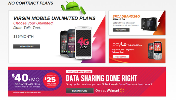
This grid design trend is perfect for almost any corporate layout because it appears organized and easy to read.
Sliding Interface Blocks
Everyone knows about parallax scrolling and how it affects modern web design. Single page layouts often incorporate parallax effects to create an easier browsing experience.
Virgin mobile uses a similar feature on their “why choose us” page. It has a fixed side navigation that animates down to individual sections. While browsing the layout each section will auto-hide the label until you hover.

It’s a rather ingenious design with the added benefit of a crisp user experience. The page serves as a representation of what Virgin Mobile can offer its customers.
Keeping all this information contained on one page makes browsing the site a heck of a lot easier. Consider this design for your own sites and study how Virgin makes this page easy to use yet futuristic and modern with parallax effects.
Tech Company UI
Every website is created differently with different goals in mind. It’s up to the designer to recognize the purpose of a website and how to pursue it accordingly. I hope this breakdown of Virgin Mobile gives a bit of insight into tech company design trends and how content for mobile communication companies are structured on the web.


It is a great website for sure. It’s not overcrowded with parallax layers. Simple, easy to read and a good general design.