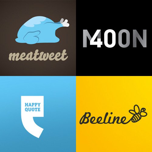
A few weeks ago, we showed you some very good logo design tutorials and techniques. Now it’s time for some logo design inspiration. Here are 30 very good examples of logo design that should help you come up with your own excellent logo ideas.


If you appreciated these 30 examples of brilliant logo design, I’m sure you will love this piece by DesignHill where you can see the logo evolution of some of the most amazing brands.


Making a logo that suits blog or website is not easy, all logo designs are beautiful.
really good post and nice logos amazing work
Some very nice looking logos in this selection. I like ‘Tony’s Organic Food’ is my fave.
Nice post, all of them are inspiring!!
Clever and apt logos. brilliant examples!
Most of these logos are quite clever and beautiful, but I’m not sure about the use of the word “brilliant” here to describe them.
Are the logos working for their respective clients?
Brilliant collection! Love the pet photo one.
Great collection! The getwired logo looks great! Anyone know which font is used in it? I really liked the tony’s organic food logo too.
I guess not – http://www.smorss.com no longer exists…
Much harder information to get hold of, but would be much more valuable than just the ones the editor of WDL likes..
wow,….these logos are really inspiring.
I already gave this link to my Graphic designer so he can get inspired too 🙂
Amazing post as always.
cheers!
Alex.
While these logo’s are good for their time (right now), they are–for the most part–too stylized to support any kind of longevity. If any of these companies intend on being around for more than 5 years, a lot of will find themselves with a dated logo (people will be able to guess the year it was created based on stylistic trends).
Have to agree with the ‘Brilliant?’ and ‘Scaled Down’ comments here. A lot of these logos are very stylized and clever enough for web sites that require little or no print branding, but very few really carry the necessary aspects of a truly great logo. Scalability, Symbolism, Simplicity, and Style. Just realized I kind of invented some sort of 4 S rule there… Anyway, these logos just fit a kind of style and act as an illustration for a website, where really the quality of the service provided creates the brand, allowing the logos to be in a more painterly fashion. Used as a style element rather than a mark to easily identify the company in many different sizes and mediums. These are all ‘pretty’, and well done in that regard.
very nice logos. thanks for inspiration.
A nice selection from LogoPond guys, all good but I have to wonder how some might look when scaled down.
Amazing. I love the ecofood logo.
I really like a lot of these….particularly firestarter, lemon stand, and happy quote. 🙂
really creative logos and i really like there all list.
The list’s including some nice logos but I think creating a stunning logo is more, or better, different from some of the above shown. A really good logo must be simple and timeless…
The Get Wired logo is very clever! Great collection here, very inspiring.
Amazing set of logos for inspiration, thanks for sharing them.
Good picks. I like this set of logos. A lot of them have a good blend of graphic and typography.
Clean designs, great inspiration!!!
Lots of emphasis on simplicity. I like it!
Adam @Advent Creative Web Design
Im not convinced… make all these grayscale and scale them down to 1″x1″ and you will start to get a feel for which logos are effectively designed. I agree, as is they are all pretty… but “brilliant” design is far from just looking pretty
Great collection! I always enjoy seeing good design:)
Some really nice designs, Moon Balloon & RazorRSS are probably my favorites, beautiful and clever – always a good combo!
Cheers.
Oh, how clever, how interesting!! just about every one of these, a pleasure just to look at.
As someone who is involved internationally, not only in North America but in Europe and on the African continent, I am personally interested in logos that cross over languages and socio-cultural barriers. This is another design universe altogether, applying an additional filter or criterion to considerations that go into coming up with powerful logos.
Comments on this aspect and perhaps in future, a series on logos that address this problem would be interesting.
I came upon this website by hapstance. It was a lucky moment.
These are fantastic. Simple, but yet very creative. As someone who is always looking for creative logos, it’s always nice to see a well put together collection.
Awesome roundup of logos! Simple, effective, and memorable. My personal logo was recently featured on Jacob Cass’ Logo of the Day website, check it out and let me know what you think!
https://bit.ly/Ttd2U
@Chris Morata: Very nice Chris! It’s hard to design a personal logo, but you did a great job on yours. Very clever too.
Good collection of logos. I always stress…simplicity is king, and will stay in the mind of the public longer.
awesome logos
The above logos are awesome and excellent thanks for sharing
All of these are great! Thanks for sharing. A nice collection to possibly draw inspiration from.
I’ve said it before and I’ll say it again. Just because you see a stylized logo does not mean there isn’t a simpler version available for limited mediums, such as print. It’s ignorant to assume that is the case based on seeing a gallery for inspirational purposes.
I don’t believe we should limit visual presentation on screen to match limited mediums, like b/w print. With that mentality, websites would use “web safe” colors always, and we would still be using tables.
I can’t speak for all, but at LemonStand we have a 2-color version that works quite well. It scales down very small as well.
nice collection of logo designs
nice collection, thanks
Nice roundup
Very web 2.0 in my own opinion. 🙂
Very good starting point for getting good logo idea. Each one is different and could be developed further.
So you`re able to develop these logos further? Really? Why don`t you start with your own logo and we can talk after that about your amazing ideas, hm?
What a great site. Really clever stuff
Nice collection Henry!
Amazing collection, such innovative designs. I really like the moon balloon logo.
Thanks for sharing.
Great stuff
Thanks for the post!
Good collection of creative logos! Keep the good posts coming.
Hey, such fantastic collection of logos, impressive!
Great ideas of logos in here, thanks for sharing the links 🙂
The Moon Balloon logo works really well. Lots of great examples. Thank you for sharing with us.
These are great. I think I like the Infinity Crime Studio one the best.
Hrmm that was weird, my comment got eaten. Anywho I wanted to say that it’s nice to know that someone else also touched on this as I had trouble finding the same information elsewhere. This was the first place that helped me understand this. Thanks.
very nice logos
really appreciate ur effort in finding logos
Wow cool logos.Thank you for posting them 🙂
I think the blue chicken with the cloud hint is kind of weak but I liked the rest of them.
wider scope than most..nice logos!!!
Some really nice designs, however I’m not really sure how a logo like the “Lemon Stand” would transfer to single color or lower resolution print. A logo should be simple. While I love the design, it looks more like an icon than a logo per say.
Some really nice designs, however I’m not really sure how a logo like the “Lemon Stand” would transfer to single color or lower resolution print. A logo should be simple. While I love the design, it looks more like an icon than a logo per say.
The tree fork is cool 😉 x
these logos are absolutely amazing !
queso
I think the resolution is quite outstanding and the pixel is enormous. I think a reverberation would be applicable for a viable tensile strength.
Great examples some much needed inspiration.
These are some great designs for the web. Thanks for giving a kick start to thinking “new”. I have to agree that the logos should also look good on print; even black and white. Keep up the good articles.