
In 2015, two major American craft beer companies were at odds over a font design. Lagunitas, known for their signature IPA, and heavily recognized for the graphics on their labels, including font style, sued Sierra Nevada. Sierra Nevada, already a regional competitor, had just come out with the Hop Hunter, also an IPA, and their branding included a font that was just a tad too similar for Lagunitas’ liking. Although the case was eventually dropped, the turbulence demonstrated not only how heated craft beer enthusiasts can be, but also the huge role fonts play in brand recognition.

Even though we’ve been basking in the convenience of the digital age for a generation or two, designers still spend hundreds of hours designing custom fonts that are then carefully protected under licenses — and rightfully so.
In the last few years, the use of these custom-designed fonts has grown in popularity. Free from the bygone limitations of “web safe” fonts, website designers and developers have found effective ways of implementing custom fonts in projects, an essential design tool that allows us to present typography that matches a customer’s branding while increasing the legibility of the site. What many people don’t realize though, is that crafting customized font files, aside from looking pretty, also greatly enhance the site’s usability. We’ve found that by creating files that contain custom vector art and iconography using font files, we can avoid performance degradation, improving not only the appearance, but the functionality of the site as well.
Acquiring Your Fonts
Even with the invention of the printing press, typography was a surprisingly physical task. Typesetters would spend hours carefully placing each letter and space, a new set for every font size and style, a fresh coat of ink for each color and resetting for each page needed — imagine how much of a backache distributing even this short of an article would have been. Because it warranted a large amount of time and skill, professionals were hired to design and produce font families for specific purposes depending on their clients’ needs.
Although less physically demanding, perhaps, harnessing the fonts needed for a website can be a challenging task. In order to properly employ custom fonts for web development, although there are no tile sets or ink types to keep track of, there are still a number of format, file, license and hosting specifications we have to take into consideration.
Format and File Types — A file format is a standard way that font information is stored for the computer to read. The two types of file formats we work with are TTF (TrueType Font) and OTF (OpenType Font). OTF is our preferred format because OTF files don’t require anti-alias hinting, leading to smaller file sizes. The way a font is distributed is determined by the font file types. There are six different types, but we’ve found the most success working with a WOFF, (Web Open Font Format) paired with a TTF or OTF file.
Licensing — One thing that has probably changed the least since printing press days is the amount of effort it takes to create a custom font, which is why it is important for the designer to protect their work under a license. Much like a copyright, these licenses are legally binding and may result in legal action or fees if a font is used in violation of their terms. Although there are many variations of licenses for web use, these are the common categories to be aware of when acquiring fonts you do not already own:
1. Open Source. Otherwise known as “free,” many open source fonts have been released for any use, including modifications, with no limitations on page views.
2. One-time purchase. By paying a license fee to the creator of the font or a reseller, we can use it on a website for an unlimited or estimated number of monthly views.
3. Subscription. Pay a fee to the creator or reseller per period of time or number of uses, (such as page loads) then pay-as-you-go for further use. TypeKit, Typography.com, and FontSpring are examples of this model — but using a third-party source like this has its flaws. If they go out of business or change their business model, your company is left with the consequences.
Hosting — Many websites use fonts hosted by a third party, such as Google Fonts or TypeKit, which is less work for developers because the licensing and hinting are already dealt with by that third party service. However, using a third party means there is less or no optimization of the font files available. By allowing another company to host our fonts, we would sacrifice the ability to remove unnecessary glyphs leading to substantially larger files. Additionally, when a font is hosted on a third party server, every time the site is loaded, that server must be running and perform well for the site to load properly, making the site more vulnerable to problems.
We opt to host our clients’ font files ourselves, which then allows our developers more freedom to fine-tune performance and provides less exposure to potential problems for our clients.
Applying Your Fonts
Much like the IPA label on our bottle of Lagunitas beer earlier, the fonts used in your website projects can enhance, or completely encompass, a company’s brand, establishing uniqueness against a client’s competitors — in some cases something worth defending with a trademark. After acquiring the license for the font files you want, there are some application techniques that will improve their appearance and performance to fit your project.
Editing the glyph set. The glyph, a single shape of a particular font, can be anything from the letters A-Z, a-z, symbols (= + & %), the Greek alphabet and even a variety of icons used throughout a website. For example, the icons in our footer are glyphs in our custom font set:
![]()
Preparing a typeset for a printing press involved thousands of tiny lead characters, organized in trays by font size and style. Even in the digital age, it is common for a single font file to contain upwards of 1,300 glyphs, most of which will go unused on a single website. Unlike those tiny lead characters tucked away in their drawers, however, the virtual space today’s extra characters use compromises the loading performance of the site. Loading all these unnecessary glyphs wastes memory and bandwidth and slows the rendering and experience; at the high end of the spectrum, a single font can demand more than 1MB, which balloons the time required to load the page. Some fonts, especially ornate “display” fonts used for titles, have high levels of complexity in each glyph and it becomes necessary for us to edit those files to save bandwidth. As an example, we recently stripped a pizza glyph, among others, from a font being used for a header.

Custom fonts and glyphs in the interface inventory for Outpost Restaurant. Not only can we choose a preferred font style, but embed Bison and Moose iconography into font files as well.
Various optimization techniques are possible, including editing individual glyphs to reduce their complexity, but we focus our efforts on reducing the number of glyphs in a font to remove sets of glyphs that are not used by the languages we’re supporting or ones that won’t be used by the site (e.g. pizza glyph). We’re often able to reduce our custom font sets to collectively weigh in under 80 KB, with 150 KB as an upper target for projects that require more fonts or have fewer images to slow down the page load.
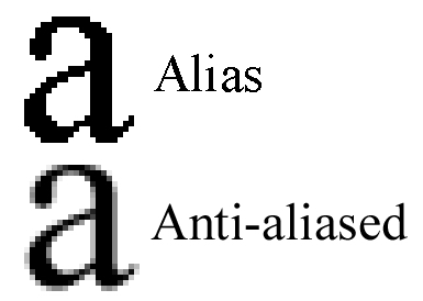
Anti-aliasing. Another part of properly applying custom fonts to your website is anti-aliasing. Anti-aliasing can improve the appearance of your fonts, especially for larger point sizes and when zooming in a window. Techniques vary depending on your screen, browser and operating system, but the main idea is to display glyphs so that they’re smooth and crisp by blending the colors on a square grid. In the case of a black letter “a” for example, the black edge pixels would be smoothed by the interpolation of grey pixels so that it appears smooth and sharp on-screen even if you zoom in close.
Different browsers and operating systems anti-alias fonts differently and at the CSS level browsers provide some control over how this can be handled.
For one example of CSS anti-aliasing in action (and the hiccups you may encounter), consider Apple’s web-browser, Safari. By default, Safari renders text with the CSS syntax -webkit-font-smoothing: subpixel-antialiased. This looks great in most scenarios — it produces sharp, legible text. But whenever the text is set to be transparent, animated, or transformed by certain transitions, Safari defaults to -webkit-font-smoothing: antialiased instead as it uses the computer’s GPU to accelerate performance. The result is undeniably jarring: a flicker effect as the text’s rendering type changes. The workaround is easy: if you specify -webkit-font-smoothing: antialiased from the start on any text that is affected, there is no flicker when a transition or animation begins. By being aware of this and other browser font-rendering quirks, we can ensure consistency and performance in our designs.
Customized Iconography
In addition to editing font files to contain only the glyphs necessary for our projects, we also extend the glyph set of our font files to contain custom vector art and iconography. We use the program Glyphs (another popular program is Font Lab) to create custom icons for our sites. Creating icons and saving them in an OTF allows us to use that vector art at any resolution or color without wasting the bandwidth by including a new image (as we’d need to with a .jpg or .png).
While you can render a font in any color using a CSS color attribute, the most appealing alternative for custom iconography is SVG, which allows for multi-colored icons. SVG files are scaleable and require separate files for each color variation. For that reason SVGs are required for vector-based images such as logos that are not monochromatic.

The logo we designed for Goin Mobyle is an SVG file, allowing us more freedom for variations in color and size.
Although surpassed in raw performance by font-icons, which typically have smaller file-sizes, SVG files are just another way we improve the branding, aesthetics, and functionally, of our clients’ websites.
Conclusion
Although the process has certainly changed since the days of the printing press, the efforts necessary to properly design and implement fonts have not lost importance. There are companies that we recognize solely by their brand’s font and, as proved by the Lagunitas-Sierra Nevada legal spat, sometimes shoulder some serious monetary worth. Developing custom font files in web development is an effective way to include ideal typography and produce unique vector art to more accurately meet the needs of the client. It also decreases the number of requests required when loading a page, improving the overall performance of their site. Web typography that is well thought-out and crafted is one of those subtle but unmistakable clues that improves user experience and shows customers that they are dealing with a professional organization.


Excellent Article! I am curious how this could be implemented within a third-party web site creator like Squarespace or Wix, maybe one day they’ll unveil the CSS-code curtain and let us get our hands into the backend.