
Headings play a major role in the way users digest content. Through size and style, they help establish a hierarchy and make text easy to scan. The design of your heading also help establish the mood created by a design. So it’s important to choose the right font to compliment the website’s style.
For this article, we’ve rounded up 20 fonts that are ideal for creating big and powerful headings for your web designs.
Franchise

Bebas

Insolent

Nevis

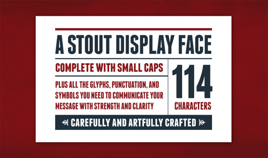
Molot

Gnuolane

Fertigo Pro

Alte Haas Grotesk

Vollkorn

PLAYFAIR DISPLAY

Telegrafico

SORIA

League Gothic

Forque

Romeral

Tertre

Bitstream

Communist

Old Sans Black

Sling


Pingback: The Principle of Contrast in Web Design | Tips
Pingback: Designing Typography for the Modern Web | Tips