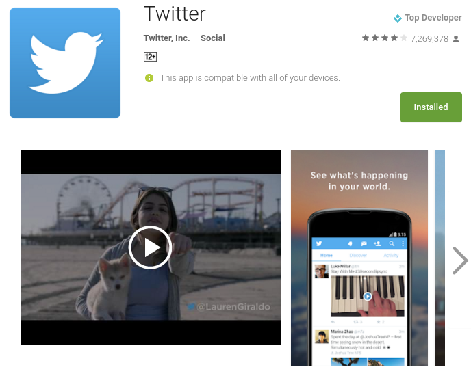
Twitter is working on a new design and layout for its Android application, and if the opinion provided by beta testers is anything to go by, the new look of the official Twitter app shall be based on the principles of Material Design.
The new version of the app shall retain the basic structure of the current layout and design — Feed, Moments, Notifications and Direct Messages shall still be at the top. However, you can now navigate between them by scrolling left to right, or by clicking on their respective icons.

Furthermore, the app for Android might also now come with a slide-out menu that will replace the current ellipsis menu. Plus, much like GMail and Google+ apps, Twitter too might add a floating “new tweet” button, if reports by Android Police are to be trusted.
There is no word yet as to when this new version of the app for Android devices will be released, but it surely will be sticking to Material Design henceforth. In terms of interface, Twitter might probably not do a lot of innovative experiments, but the design and appearance will surely be revamped.
What do you think of this step by Twitter, of opting for Material Design for its Android application? Long overdue? Share your views in the comments below!


Leave a Reply