
Design is constantly changing and moving forward. However, typography is one aspect of design that seems to resist progression. When it comes to typography, there are standards and traditions that have been around for many years. These rules are there for a reason – to make sure that letters and words are legible. But to move forward, sometimes rules have to be broken. So for this post we’ve rounded up 26 free progressive and experimental fonts. These fonts might be pushing the limits of traditional type design, but the results are stunning.
Rounded

Cube 02

Paranoid

Dark Moon

Ultras

Gagalin

Nano

Slukoni

VAL

Guerrilla

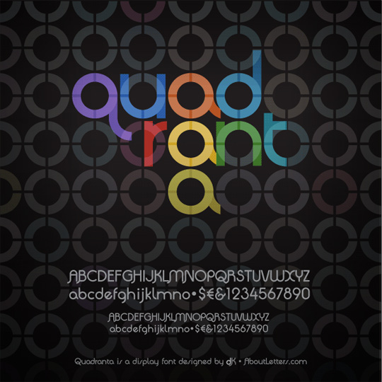
Quadranta

Guest Circus Paradiso

Playtime

Sylar Stencil

Sans Serious

Kain Block

LOT

Clutchee

Tribbon

KnucklePuck

Etcetera

Amputa Bangiz

Betlog Square

Slimbo

Days

FILE


I like the Slimbo font. Most of the other ones are a little too retro for my taste. It’s not easy making a font, kudos to those who do it.
Ooo these are lovely! I love the retro appeal in these fonts, downloaded a handful of them. Thanks for sharing =)
Although retro is good, but not in every text
Love these fonts. Look really cool. Thanks!
Thanks, some of them are very interesting !
Super Awesome I really like this unusual list of fonts. Will try a few of these in my next designs.
Latest Blog post: 12 Ways To Market Your Brand Better
Thx for sharing!
I like Quadranta very much! Thx god these fonts are free!!!
Digital Pizza latest post: https://www.digital-pza.com/blog/inspiration/showcase-of-iron-man-artworks/
I just wanted to tell you how much I enjoyed your article. I really enjoy your site I’m currently 22, a college student, and quickly looking to develop myself on the web. I currently work at my university as the web designer and developer. I’m impressed with these resources and hope to discover more here in the future.
I just want to add another point of reference for typography is http://www.pilo.me – it is a quite remarkable typography forum where you can find free and exclusive typefaces. It is usually invite only, so if memberships are open, join while you can and be sure to contribute as the rules are a bit strict.
Nice! I am loving it ::)
It’s amazing how many of these typefaces are so obviously inspired by (if not partly contructed in) FontStruct. Modularity is an approach that is quite dominant in typeface design it seems.
I’m lovin’ a whole bunch of these – thanks for the headsup!
Most of them are variation of the others. Seen so many of this style, nothing is original anymore. The last 4 ones are my favourites.
nice list, I especially like quadranta, probably just the way it has been used in that design anyway. The one that I would probably use quite often is days and val. I think they could work really well in a few of the websites I have designed, especially val with starburst, it is kind of bit like cooperblack.
Using a web embed font tool, web designs are becoming so much nicer too look at now so many fonts can used and still be “SEO” friendly. Just can’t wait for CSS3 and HTML5 to become more usable (basically meaning getting everyone to stop using old browsers, mainly IE)!
solid! 😀
Thanks for the share. some of the fonts are exceptionally looking good will be going to check it out
Very nice and progressive, thanks for the round up.
Nice list of fonts..exceptionally good..i like the Tribbon font very much..thanks for sharing
Great post. Love Quadranta, Clutchee, Tribbon, Etcetera, and Days.
Thank you.
Nice list of fonts!
nice fonts…. thanks for sharing…
Great article
Something new:
http://www.behance.net/Gallery/QUB-font/487834
Very nice fonts…
I love it.
Thank’s a lot.
great collection. Thanks a lot for sharing!
I literally just downloaded this font, you should add it to the list:
https://useallfive.com/blog/sly-fox/
Nice 😀
Quite a few of these are a more retro look, am I right? Reminds me of Milton Glaser….
love it… I look forward to playing around with them
Thanks so much for these fonts, I really like paranoid and Ultras and downloaded the latter!
Great round up. Bookmarked!
Thanks.
Great selection of fonts. I just downloaded the Quadranta. Great work you’re doing on this site altogether. Keep it up.
Pincoya Black would have been a great addition to this article https://www.flickr.com/photos/the_hernandez/4502775191/
I’m using it on my site.
Nice fonts – silly article. There have never been limits on font design if you want to create fonts for headings or artistic purposes like posters, etc.
The so-called “rules” apply to typography for body text people read for sustained periods. And they’re not “rules”, rather constraints that are driven by the mechanics of human vision. Typefaces have been evolving since Gutenberg. Body text has changed little in the past couple of hundred years because what worked for human vision survived, and what didn’t work failed. Human vision hasn’t changed in the past few million years…
these fonts are all great! I love the “LOT” font. thanks for sharing
Quadranta is lovely
The link for days.otf is broken. This one works though. Enjoy. Thanks for all this, brillliant stuff altogether.
https://www.dafont.com/days.font
Great round up it is. Will test LOT Font nest project for a Dj Academy. Pretty neat font if you ask me.
Love it. Thanks for sharing!