
In this tutorial, we’re going to learn how to design an on/off switch UI, in Adobe Experience Design CC (Adobe XD).
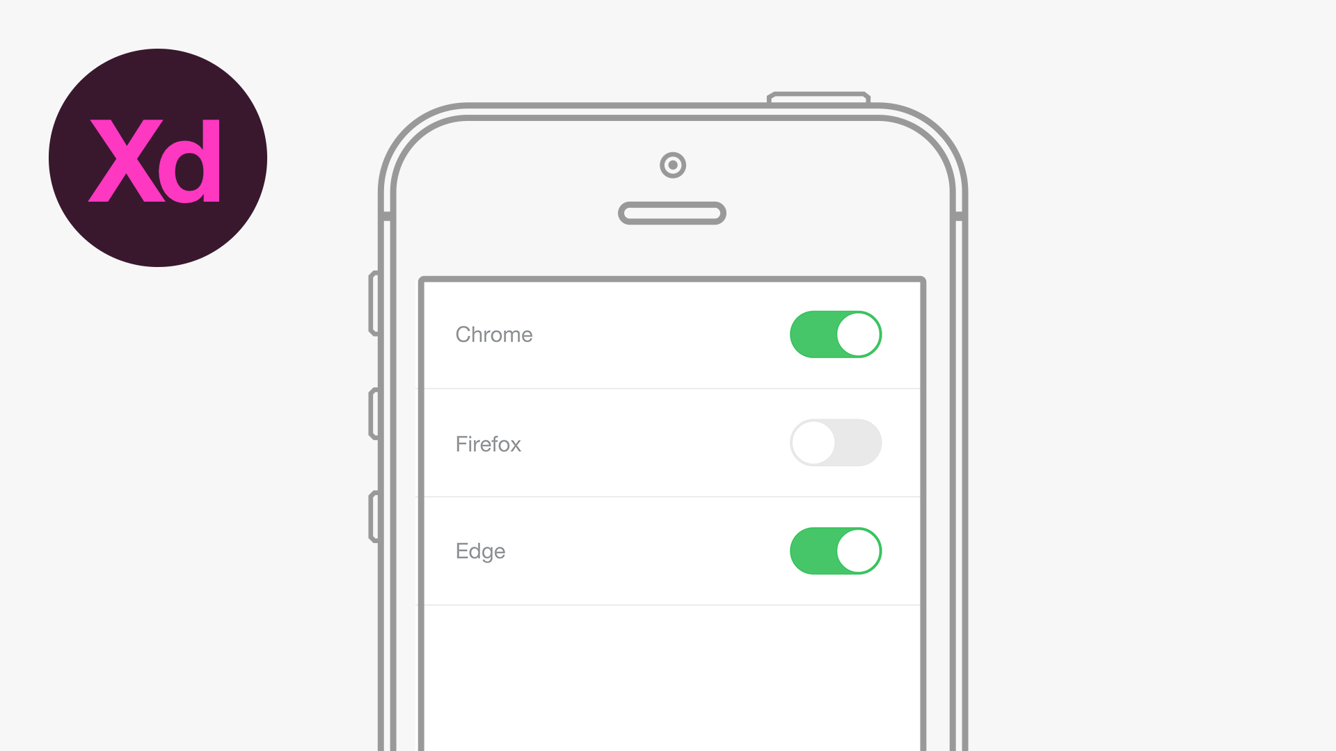
The Steps (1-18)
1. Create a new document by selecting iPhone 6 from the Start Screen.
2. Select the Line Tool and hold Shift to draw a horizontal line that spans the width of your document (375 pixels), and position this at the top of your artboard.
3. Duplicate this line by going to Edit > Duplicate, and move this new line downwards approximately 80 pixels.

4.Repeat Step 3 two more times. The pink guides in Adobe XD will help ensure that the spacing between the lines is consistent.
5.Remove the top line (that is touching the top of the artboard), and give the remaining three lines a colour of your choice. For this tutorial, we’re going to be using a light grey colour.
6.Select the Text Tool and type the text for your first option, and adjust the font and size of this text as desired.

7. Duplicate this text two times, by going to Edit > Duplicate, and position these two copies so that they are vertically centrally aligned between the lines below. Change the additional text objects to display the desired wording.
8. Select the Rectangle Tool, and create a landscape-orientated rectangle that fits within the space between the lines.
9. In the Appearance section of the Property Inspector, select the icon that displays a square with rounded corners, and enter a value in the box alongside this, so that either end of your rectangle become completely rounded at either end. Alternatively, the shape corners can be adjusted by selected the shape, and then clicking and dragging the circle anchor points that appear just inside of the outside anchor points for the selected shape.

10. Give this shape a white fill, and select a border colour of your choice.
11. Adjust the width of the border to be between 1-4 pixels.
12. Select the Ellipse Tool and hold Shift to create a circle that is the same height as the rounded rectangle created in Step 8. Align this circle to the right-hand side of the rounded rectangle.

13. Select the rounded rectangle, and give this a fill colour of your choice. For this tutorial, we’ve used a green colour to signify that the option is selected. You can also remove the border from the rounded rectangle by un-ticking the box in the Property Inspector (optional).
14. Select the circle, and alongside the border options, select the Eyedropper Tool, and sample the same colour used for the rounded rectangle in Step 13.
15. Select both the rounded rectangle and circle elements that make up the slider, and go to Edit > Duplicate to create a copy. Repeat this two more times, and position the additional sliders alongside the corresponding text in the spaces below.

16. Select a slider that you wish to display the opposite position, and adjust the fill colour of the rounded rectangle so that the button appears inactive (grey can be an effective choice of colour to clearly communicate this functionality to a user).
17. Select the circle for this inactive slider. Next, similar to Step 14, select the Eyedropper Tool, and select the same colour as the inactive rounded rectangle.
18. Align the circle on the inactive slider to the left-hand side of the rounded rectangle.

Download Adobe Experience Design CC (Adobe XD).


Leave a Reply