
Colors are very important to print, graphic and web design. Colors are actually important to everything, from spring to summer, clothes to balloons and so on. To show the power of colors we already showcased colorful websites here a few times, including a showcase published in March/2011 and October/2010. Today we gathered a new fresh round of websites using colorful elements to show you. From complete colorful layouts to discrete elements, you will see that colors can give your website a really neat look.
Typemedia 2011

More Hazards More Heroes

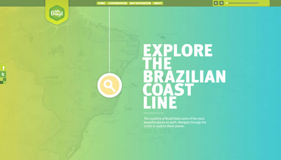
Into Brazil
Radial

CAU

Girl Effect

Goodfoot App

egopop

Bjarke Clauson-Kaas

Zaarly

Worry Free Labs

ala

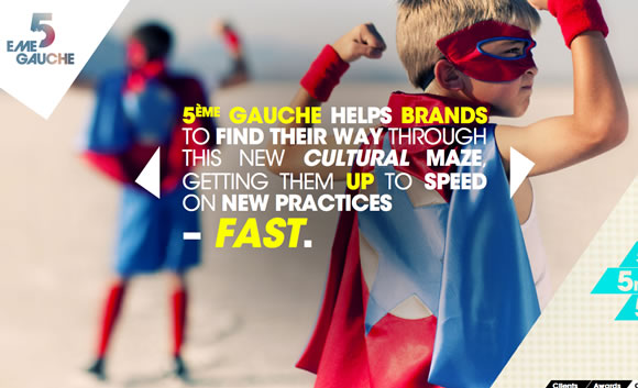
5emegauche
Pandr

1minus1

yurbuds

Zeitgeistbot

Shout Digital

Theo Thermometer

Red Pop


woah that Pandr website is really nice! Love it 🙂
Actually, most of those websites are simply mind blowing! Truly talented designers at work! Great round up Gisele 🙂
Great list.
I personally love sites that mix almost bland minimalism with a splash of colour to draw attention (much like Girl Effect and Egopop above).
I tried my hand at this once, with what I consider moderate success (https://www.crazyshrinklady.com if you want to have a look).
Designing sites like that never fails to impress clients who like pretty things.
some really cool examples. they’re very eye catching.
What a great article for a Monday morning. It’s great to see colour in web design, obviously, never too much. I loved ‘Red Pop’ and ‘More Hazards’ is a lovely design and a great example of responsive web design. Ala is a bit crazy but it works well in reflection to the company. I have seen none of these before now.
What a great article and fantastic use of colour!
Yeah, colors are very important for catching attention. Personally i use a dark background and a light green/blue color for the content. Its stylish and useful.
Worry Free Labs has really nice design, Especially the slider.
So nice and refreshing to see so much in this list! Big fan boy of bright and colouful sites, you’ve only got a few seconds to grab and keep your viewers attention and what better way to do this than warm and fuzzy color! Absolutely love Ala & wearepandr.com!!!
Great collection
Great collections – as always!
Nice collection. Thanks for sharing 🙂
It’s really nice when you see your design work among such incredible list.
Into Brazil portrays probably the best color usage I have seen in a long time. Great list of sites btw.
http://www.treelifedesigns.com
small business web design
Did you guys not see this? It went viral in reddit a day or two ago. Best designed portfolio and great use of colors too. Worth a mention at some point.
https://sahaskatta.com
Very eye catching!
Great examples.
Superb design, beautiful choice of colors: great inspiration, thanks!!! We are so far from 1996… thank god for that!! Or maybe I should I say thank good designers for that!
Does anyone know who designed the Zaarly website?
The whole site is in flux, but from the beginning its been a collaboration between myself, @thismatt, and @marcosuarez
Love the yurbuds design. So dynamic! I’m going to buy a pair!!
That brazilian design is so beautiful!