
Navigation is certainly a very important part of web design and an important aspect to think about while designing a page. Today we gathered a few examples of navigation menus to show you. From clean and simple typography based menus to colorful and fixed positioned ones, there are a lot of examples to inspire you.
In Motion
In Motion is using nice and colorful icons to navigate the page.

zoo.
Fixed header with clean and elegant typography based menu.

New Gotham
Another good example of effective typography based menu.

Timberland
Drop down menu that ‘come and go’ as you need it.


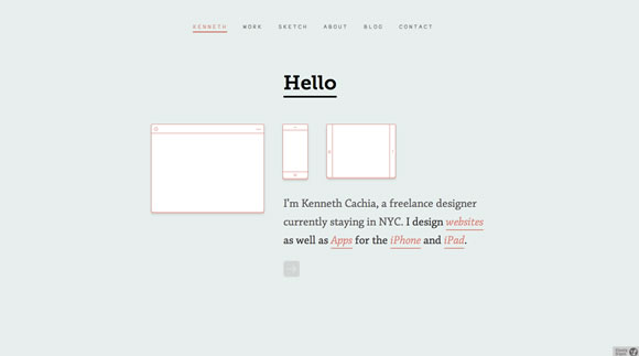
Kenneth Cachia
Clean website with a minimalist and beautiful menu.
sparks
A nice HTML5 website with a menu that allow you to drag the marker to navigate or simply click the options.

New Citroen DS5
Another good example of hidden menu that you use it just when you need it.


Moment Skis
Nice and clean typography based menu. Hover it for some color effect.

solo
Also a nice example of clean typographical menu with hover effects.

Cameron Reynolds-Flatt
Beautiful HTML5 website with a typography based menu with hover effect. The website also have some pretty neat background transitions.

Hermetik
Another example of a clean menu that you can hide and use it only when needed.


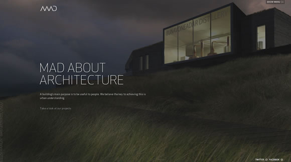
MAD
MAD is also using a menu that you can hide to have a better view of the page.

Carter Digital
A cool single page design with nice typographic based menu. Scroll down a little bit and the menu stays in a fixed position.


3Degrees Design Agency
Clean and elegant typographical menu with hover effects.

divups
divups offers different options to please different users. You can scroll down to check the parallax scrolling effect, you can also choose the fixed header menu or the side menu.

Chimp Chomp
Another beautiful example of typography based menu.

Analog
Simple and colorful header menu.

Pongathon
Nice colors and typography. Menu also has hover effects.

inkling
Clean design with a minimalistic menu and a nice background animation.

hering berlin
Beautiful minimalist design with super clean typography based menus.


Wow Gr8 collections 🙂
I like the New Citroen one with the “Parellelogram”. Its amazing.
The MAD one too
I have one site for recommentation which display good navigational menus
https://uicart.com/gallery/ui/horizontal-navigation.htm
Great collection, I really like the Analog navigation. Simple, intuitive and colorful.
I’ve also collected some of my navigation inspiration here: https://creatiface.com/web-design/e-commerce-website . You might also want to see it
I think I’ve given the wrong URL. this is the right one https://creatiface.com/web-design/web-navigation . I’m sorry
They’re all so great, am finding trouble trying to pick out the best one!
Wonderful collection! Really inspiration after see this! Thanks for sharing. I like design by MAD, and choice of colours by Carter Digital.
Great stuff!, I really enjoy it with your recommendations. Thanks.
Nice examples, not so sure I understand Mad though? Why would you want to hide the menu, none of the pages benefit from hiding it :-S
nice collection, always loved Citroen’s sites!
The map on here (although flash) is very unique & fun https://www.citroen.com/
In Motion = goatse?
I was thinking the exact same thing, Darryl. Unfortunate choice of imagery.
Hey thats awesome collection of navigation i like the MAD and Citroen.
Please keep posting.
The MAD navigation is silly fresh. Analog is really nice as well. The trick is to be unique without re-inventing the wheel, per say. You never want a navigation to be completely off the wall just for the sake of standing out. A nav’s primary purpose is functional. Unique aesthetics is a bonus (if you can pull it off tastefully).
Sparks website concept of the turing heads is fantastic!
The sparksonline.com menu has inspired me. To Photoshop I go!
Great lot of examples here. I love all your collections. Thanks!
Nice example of website navigations, it shows the expertise of website designer. Nice post thanks for share
How many of these work if you have scripting turned off?
I stopped after the first 5. Sure, they look nice if you have scripting on, but I wish they degraded more gracefully than they do.
Ans I didn’t ever *start* down the road of screen readers…
@Mark Zip : Try Citroën DS5, it’s a full JS non-obstrusive 😉 Non-optimised, but works !
Like the MAD architecture menu – but not sure how functional that is …. then I suppose my Mum for example probably wouldn’t be looking at such a site 😉
Thanks,
David
A very nice collection – Great inspiration, thank you 🙂