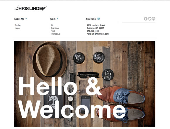
As a web designer, sometimes it can be tempting to try to incorporate the latest and greatest, trendy eye candy into a design. Or use a complex color palette. Doing this will often result in a web site that looks over designed and distracts from what’s most important – the content. More often than not, you’ll discover that it’s much better to take a minimalistic approach. So for today, we gathered 21 Stunning Examples of Clean and Minimal Web Designs to inspire your for your next project.
Inspiration  Gisele MullerJuly 2, 201216 Comments05.6k
21 Amazing Examples of Clean and Minimal Web Designs
Share
Gisele Muller
Gisele Muller loves communication, technology, web, design, movies, gastronomy and creativity. Web writer, portuguese/english translator and co founder of @refilmagem & @mentaway Twitter: @gismullr


Thank You Gisele, very good choice as usual !
Another great list Gisele. Keep ’em coming!
Yes, simple is better in every where. And one of another example is Facebook. Gisele, why not count Facebook in your list?
I think minimal is figured based on content as well as design. If this is the case, Facebook does not qualify., it’s design may be simplistic but with the mess of content that shows from every angle, i feel as though it is anything but minimalistic.
Really nice Giesele! Clean and minimal seems so soothing to human eyes. I find websites full of unnecessary content, images and even ads, which is really disturbing. Locating a home button is much difficult than searching for content on a website. Your post and the websites showcased above are really inspirational. Keep up the good work 🙂
Nice designs, but I don’t understand why you always pick vertical scroll websites and never responsive sites. I’m shure if you have tested some of this works on a phone you didn’t show them here
Hmm, I think my website would fit in the collection: https://molbal.co.cc/
It’s not as high quality as them, but it is at least as creative as them.
I totally agree. I love your site!
I am a massive fan of bold minimal web design and would have to say that the Hochburg site won me other in this article!
*like*
Thought this was a very interesting and inspiring collection you have put together and there are some amazing sites. I have seen a few articles you have published and this has to be one of the best yet. I love every site you have included and they all have aspects that I fond inspiring from both a design and development point of view. The site that really stood out for me was the open121 site with its clean professional look and feel through the design and user interaction. I really liked how the the different sections get pulled in. I also liked the Olivier Staub site with the clean navigation and use of background images, it had that minimal feel but done in a different way. Great article and I look forward to more like this from yourself
Great list. As a web designer, I am impress with all of that. I like the Minimalist design.
Thanks a lot guys! Really great list at all! (:
In all of these examples, great photography is key.
Great list. I like the Minimalist design.
nice collection. .i hope my site will present here soon. .