A fixed position menu is that one that is fixed relative to the browser window, not only to the page, which means that if you scroll up and down the fixed menu will remain in the same position – so the user can quickly access the navigation no matter where they are in the site. For today’s post, we gathered some very good examples of websites using fixed menus. In these sites, you’ll see a variety of ways you can use fixed positioned menus – in the header, the sidebar, and even in the footer.
b14
Beautiful and clean fixed top right header menu.
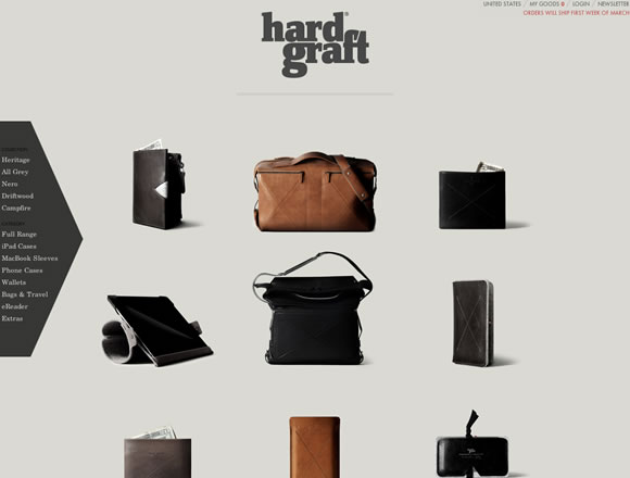
hard graft
Hard Graft is using two fixed position menus, one at the top right corner and the other on the left. The only thing moving are the items you can buy.
Happy Cog
After you scroll down Happy Cog’s page the menu gets fixed and will stay there for good.
Oncarbure
Here they are using a clean fixed header menu.
Character
An elegant and beautiful design using a fixed header menu.
Face. Works.
Nice and simple header fixed menu.
Resoluut
Another example of a menu that gets fixed after you scroll down the main illustrated header.
Gnosh
Here big typography and hand draw elements contrast with a small bright fixed header menu.
MmDesign
Another example of a clean layout, this time using a fixed menu on the right side bar.
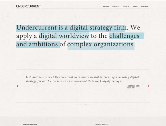
Undercurrent
Undercurrent is also using a fixed header menu.
Y.Co
Here the background image moves while header and footer are fixed and offer you the options you need to navigate.
James Anderson
Another good example of header fixed menu.
OK Studios
While the elements move around the page using parallax scrolling, the fixed header menu stays still all the time.
Psych & Psych
Here they are using a fixed menu with a bit of transparency.
Reserved
Another example of a simple and clean header menu.
Latorre
And once again we have an example of fixed header menu.
Girl with a Camera
A delicate design that counts with a small fixed side bar menu.
Void
Void is using a fixed footer menu to help you navigate their page.
Mustache
Mustache keeps all their menus fixed on the left time.
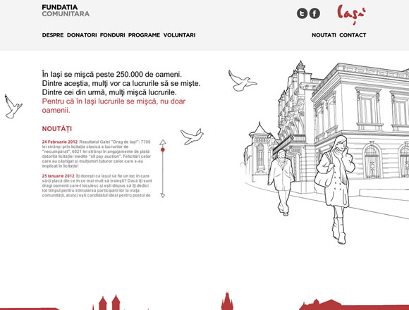
Fundatia Comunitara
Here you will find parallax scrolling and a fixed menu using transparency.


I like so much the fixed menu. Is a good way for make a good site. For the eyes have a fixed point by the menu is important. Is my preferite solution. Site “b14” and “Character” are my preferite
Hello!
Found another example: https://www.workdiary.de
Great collection. I’m loving the G’nosh website, one of the best one pagers I’ve seen for a while.
“Character” is a great example of how clean and minimal can really work wonders.
Like Sam above, I love the G’nosh website too. It’s been done before, but rarely this well.
Fixed position menus are great, as long as they don’t take up too much browser space on a small screen (i.e. a smart phone).
Wow, some beautiful work featured again. So thought-provoking, I’ll be utilizing some of these strategies!
Fixed position is very helpful to the Users…It is the only way to navigate anywhere on the site quickly!
Great inspirations are here..
The MmDesign fixed sidebar and clean minimalism layout is quite the same as my wordpress layout at mcorbitter.de. I like this kind VERY much!
Excellent list.
The variety leaves me wondering how to pick one 🙂
Thanks for sharing.
Awesome! I really like this. keep up with the good work. Thanks a lot for sharing.