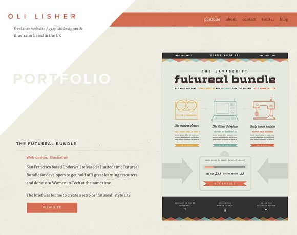
It’s always nice to browse some nice and clean websites. It is a good way to get inspiration for future projects and also to see how designers are delivering clean designs. Today we gathered some inspiring examples to show you that clean layouts don’t need to be plain and boring, you can have colors, textures, illustrated elements and much more. Remember that the concept of clean design is to have something simple, striped from allegories and unnecessary elements, not something boring. So check out the examples we have here and let us know what you think of them.
Share
Gisele Muller
Gisele Muller loves communication, technology, web, design, movies, gastronomy and creativity. Web writer, portuguese/english translator and co founder of @refilmagem & @mentaway Twitter: @gismullr


really cool list Giselle, and without seeming like blowing our own trumpet, could I show one of our cleanest web designs. It’s called day2 (https://www.day2.co.uk) and design was intended to be very minimalistic and fresh. What do you think?
Great list Gisele Muller. Out of those 21 I like wootten and mixpanel most. Here is one more clean and great looking website: https://envylabs.com.
There is so much “clean” design these days that is so lacking in depth. I call these sites “Fluff” (like a can of fluff, pretty but, oh so empty) — they look like nice big fluffy clouds, so nice and peaceful but after a couple of seconds you realize there is no depth so you leave and never come back.
This is a very nice list. I really like how flat the designs are. Some sites are also being considered as minimalist, like Peachey Photography, Lars Tornoe, Amy Woodside, Michiel de Draaf, and The Clocksmiths. Here, if you want to see more examples of clean web design (https://indecss.com/design/style/clean/)
Really some of them are really awsm.. Thanks.. mixpanel’s design is what I liked the most here..
Good Collection of websites with minimal design. I specially liked Richard Photo Labs.
Thanks for sharing.
Love these designs! Most sites now a days just filled with clutter with excess content and I just hate these kinds of designs.
The Richard photo lab design is perfect retro-clean! Love it.
Again, very inspiring! Living Edge is my favorite… their logo should have been one of the “Negative Space in Logos” examples. Brilliant!
Really nice collection, the simple and clear design accompanied by some great images really make these websites look very slick
Very good choice of websites and a good source for inspiration:)
Nice collection of inspiration
Thanks for the nice collection. Found some new ideas. I will apply them to my new project!
Thanks for the inspiration, please tell me what you think about this one: (https://subsign.co/)
I have always enjoyed your posts as they have come to my attention. But I have never mentioned it to you. So, here it is – Thank you for your intelligent and great collections!