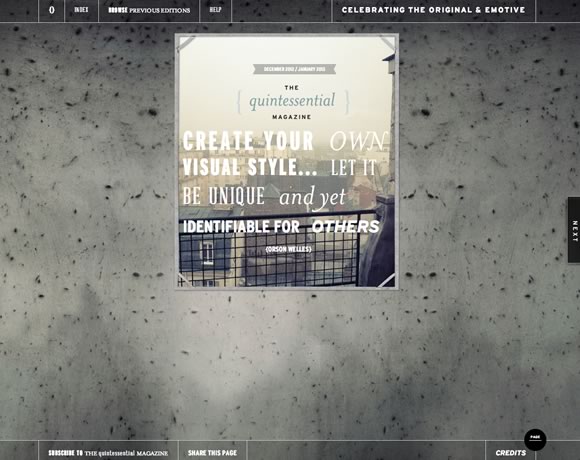
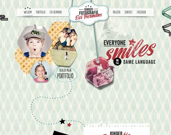
Using texture is a great way of adding personality and depth to a webdesign. It doesn’t matter if you choose to use texture only in the navigation menu, the header or if you go with a totally textured background, as long as you pick the right texture and don’t over use it, the result, most of time, will be elegant and beautiful, as the examples we’re showing you in this post.
Inspiration  Gisele MullerDecember 17, 20124 Comments05.7k
21 Inspiring Examples of Texture Use in Web Design
Share
Gisele Muller
Gisele Muller loves communication, technology, web, design, movies, gastronomy and creativity. Web writer, portuguese/english translator and co founder of @refilmagem & @mentaway Twitter: @gismullr


We love a bit of texture on a website. Somehow makes it feel more “real”.
I love using textures in my designs, in both graphic and web design projects. I feel that textures give more personality and emotion to the works.
Our New Site Template in Minimal Styles. Please Check it out https://themeforest.net/item/drive-responsive-corporate-template/3607609
Great roundup! 🙂