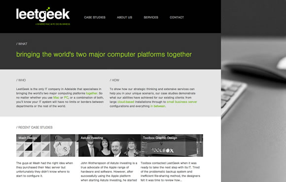
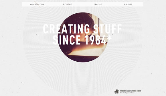
Letter case – in orthography and typography is the distinction between the larger majuscule (capital, caps, upper-case, upper case, or uppercase) and smaller minuscule (lower-case, etc.) letters. The usage of capital letters can have different meanings – in emails CAPS can sound rude, but when used properly, especially in web design they can be pretty effective to get attention and to showcase main information, menus, and titles. So here we gathered a list with 25 examples of websites that use big bold letters to showcase their info.
Inspiration  Gisele MullerJune 27, 201111 Comments05.6k
25 Examples of Capital Letters Usage in Web Design
Share
Gisele Muller
Gisele Muller loves communication, technology, web, design, movies, gastronomy and creativity. Web writer, portuguese/english translator and co founder of @refilmagem & @mentaway Twitter: @gismullr


Very interesting focus… A nice way to see how little detailes, such as capital letters, can make a difference when used on the right place at the right time!
Thanks 😉
Nice collection! There’s a fine line between caps looking nice and caps making text a lot less readable. These web designers seem to know what they’re doing!
Nice collection. I love the font/artwork of Brand New Conference.
Nice collection. Love to see more and more usage of fonts in the web.
They are looking really great but,
I think in some examples it is hard to find the navigation or a hierarchy because of the capital letters so the usability suffer from that.
Nice Collection. It is good to see that such new trends are being tracked so well. I think nowadays, web design is a lot more bold and with this new found ‘boldness’ things like ‘Capital Letter’ in design are showing up.
I’ve never really paid attention in capital letters on web sites. It really makes a difference. I’ll pay more attention to these kind of details from now on thanks to this article 😛
It’s not very often that a company gets it “right” when designing with all caps.. You have found some supreme examples to show us how it’s done the “right” way! Well done!
Awesome Inspirations!
Very nice. Saved a few for later 🙂 I especially like “Unfinished Business School” – Thanks for sharing!
Amazing typography !
Great round up, very inspiring. Thanks.