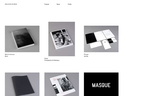
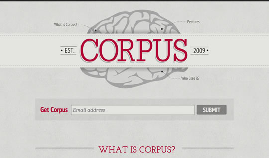
I believe that we can agree that minimal and clean websites are the new black. Every day people seem to be embracing more and more the idea of less is more. So we decided to gather a new list of minimal and clean websites to show you how designers are showcasing minimalism on websites. And here you will also see some use of color, showing that minimal does not mean colorless.
Gisele Muller
Gisele Muller loves communication, technology, web, design, movies, gastronomy and creativity. Web writer, portuguese/english translator and co founder of @refilmagem & @mentaway Twitter: @gismullr


I really like the Logartis website, it’s so calm looking and the animation around the tree works wonderfully. I would love to be able to create something as complex as that. I love that the birds are comments. It would be great if you showcased more websites like this. Simplicity wise, I also like Tinkering Monkey.
true but flash
nice designs
I love minimalistic design, thanks for sharing these great examples. The Jon Montenegro site is very unusual – it’s definitely memorable!
Stephen Vernon Clarke and Plastical are my favourites. They are simple and their work shown inside are the highlight among the rest of their site.
John Montenegro good too but the loading time for the navigation is kind of long and makes me want to look at something else. I don’t have the patience to wait for something to load like that.
Nice article though! The rest of the sites are nice and clean. Thanks! 🙂
Cool round up! minimalist is gaining more these days.
So many that I like! Thanks for the great list 🙂
I have a little preference for the Ahrens website.
Very nice selection.
great collection.. tkz for sharing…. 🙂
Greats compilation!!!!
Very good work, congratulations!! 😉
^^ i loved the logartis interactive website. very inspiring! lol i made 2 wishes on that site. hehe
I am a long time fan of minimalistic design, yet never see such a ultimate showcase. Thanks for sharing these!
Some people think of minimal design as a shortcut. A kind of style where creativity is hampered. Were the designers lazy or did they simply not have enough time to complete it? But it’s easy to see the difference. When you have come full circle both with the concept and the design and gone through iteration after iteration removing everything that is not functional; then is when you reach a true minimal design. And it’s beautiful.
Great examples! How do you find them?
webcreme, cssmania, css awards, moluv, creattica, the best design, css remix, css leak, awwards, css beauty, and many many more galleries
thanks gisele 😉
Good design, Simple and elegant…..
thanks for share…..
Great collection of minimalist websites… my favourite is Logartis but there are plenty of others that look fantastic, thanks for sharing!
Thanks, there are some great minimalist layours here.
Lately i have been looking specially for this type of design for websites since faster sites have gain a nice boost in their rankings in Google.
I could say that minimalist layouts are trending now
Beautiful examples, Ahrens is probably my favorite one, very professional and sharp looking site, minimal, clean and simple is the way to go.
Marios
great examples! Thanks for sharing.
Many of this are really interesting, but what exactly falls under minimalistic? I always though minimalist as something that relies purely on basic shapes, color, type and white space, though I see many sites here that use shadows, gradients, etc.
Thanks for sharing! All these examples would be great for my new website!