Resumes are one of the most important documents needed when applying for any kind of a job. If you’re wondering how to get a job of your dreams, first of all consider creating an impressive and outstanding resume with a custom design. It’s your opportunity to create personality, show off your skills and creativity. In this post you will find 25 intelligent resume ideas for your inspiration revealing smart ways of presenting technical information by using some creativity.
Share
Tomas Laurinavicius
Tomas Laurinavicius is an adventurous designer and entrepreneur. Editor-in-chief at Despreneur and Product Manager at Refe. Connect with me on @tomaslau.


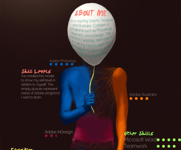


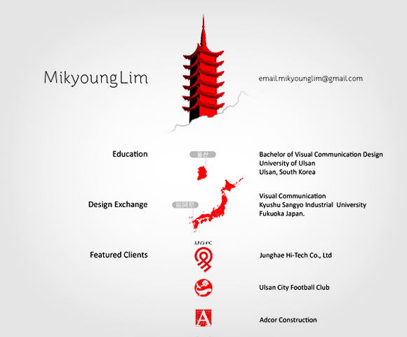



A great resume can sometimes mean the difference between gaining a job interview or not gaining a job interview. I love the old style newspaper one and Leonardo Zackour and Loyez Geoffrey, both are fantastic! There is a lot of inspiration to be found on here.
I can’t help but feel that this habit that graphic designers have of trying to crams all their skills onto an A4 sheet of paper, rather than simply presenting the important information in an elegant and sophisticated way, is a more of a portfolio boosting exercise to gain exposure on blogs like this than anything else. On half of these CVs it’s actually quite a task to get to the vital information. I as an employer want to know about who they are, what their experience and education is, and an in-depth, yet brief understanding of what they have covered/achieved in their careers to to date. If I want to see their photoshop skills, I’ll look in the attached portfolio. Just show me you can present vital information in an easily readable and economic way, and that adheres to the usual structure, so that after a quick 20 second scan I an have an idea of you as a potential candidate. I would have to spend a good 5mins on some of these CVs to get to that kind of information. Show skills, but not at the cost of vital information and coherent structure. Think about who will be reading it and how much time they have, rather than your portfolio.
I was taught by my profs in College not to ‘Over Design” your resume. Concentrate on the typography (make sure your Kerning and Leading are dead on), don’t put images, and stick to a very traditional look that has been well laid out and is Typographically perfect, leave to art to your portfolio and sample work.
Thank you, Matt. I am an “out of the box” individual, but I write very traditional resumes for my clients. The emphasis is on skills and results, not on images.
Simply put – and true.
I wouldn’t employ any of them even though some are excellently done.
Can we please stop with these articles? This is never a good idea.
Agreed.
Way to set up inexperienced designers for failure.
The person reading your resume belongs to HR and is not amused by visual gimmicks. They will assume you are unprofessional and toss your resume into the trash, or worse- the unpaid internship pile.
Hey Guys,
I totally agree with you. My Resume has alil bit of creativity to help it stand out but theses above are way over the top and tough to read. If someone came into my office looking for a job with one I’d wouldn’t even consider them just because the information on the page is need more then design they should let there portfolio speak.
Side not this article is really not needed to be listed considering newbies and rookies to the industry are going to read and take this to heart while in the real world thats not the case.
I love this idea – just remember that a great resume (just like a great website) begins with a great content-driven strategy. Otherwise, it’s just a pretty picture – which is never a good idea if you want to be taken seriously as a design thinker.
As the head of a Web & Graphic design agency, I receive CVs & resumes almost on a daily basis. The majority of which are set in a standard black on white MS Word layout, with a mundane font face and size (usually Times New Roman 12pt).
I find it really refreshing when I see a really creative, and unique design such as those in this showcase. There are a few in this list that I would consider hiring based purely on their resume designs. I can see that they have put a lot of thought into how they wish to portray themselves and they have accepted that some will like it, and some won’t… but they still stand out.
My concern with posts/lists like this is that people will see these designs and then copy them directly for their own resume. PLEASE DO NOT DO THIS! – The key is to be original!
About 3 years ago, I received a CV from a young graduate who had taken the initiative and done his research. He sent me an A2 sized poster which matched the same style and layout as an advertising campaign that we had worked on for a popular brand of soft drink. Except, he put himself in place of the product… I found this to be really creative and also flattering that he had chosen to use one of our designs. It told me right there and then that 1. This guy knows how to get noticed, 2. He is very talented and creative and 3. he understands exactly what my company is about. – Exactly the sort of person I want on my team.
I called him that morning, we met for coffee that same afternoon, and he started working for me the next day. He is now my Creative Director and second in command.
I say “keep the creative resumes coming!” – But don’t sacrifice legibility for creativity. I don’t want to put your resume on my wall. I want to see your skills as a designer as well as your personality.
Finally, posts/lists such as this one are great for inspiration and showcasing talent. But please do not copy directly! Develop your own style.
Don’t get me wrong, I loved a lot of designs showcased here, but my take is that an overly designed resumé might actually hurt a person’s chance at getting a foot in the door. A resumé is your one chance to tell a hiring manager your real work experience, what if your design isn’t that manager’s cup of tea? They might also wonder if you’re trying to mask a lack of real world experience with a bunch of eye-candy. I’m not saying you should design your resumé in Word, but I would recommend keeping it simple and to the point.
Some lovely designs here. I’ve always thought though, don’t most companies want just a normal black and white resume given to them? Most of these are graphic designers, hence the great designs, but a normal job? You would never send in something like this.
Anyway, great inspiration and good article.
Regards,
Simon Duck
Some of these are good but most of them are very tacky and wouldn’t be recommended.
Love the visual inspiration. These might be good for an Art Director to see, but the hiring folks in the office will give about 17 seconds to actually read your resume. If anyone goes this “designy” route, make sure you have a nice clean hierarchical Word doc version too.
Don’t forget the Word Doc too! It still astonishes me that so few businesses (especially recruitment agencies) still can’t / won’t accept PDFs or anything other than a Word file.
Lot of nice stuff to put in a portfolio but if I receive a CV LIKE THAT, THEY WILL PROBABLY NOT GET THE JOB, WHY BECAUSE IT’S NOT CLEAR AND IT’S NOT PRINTABLE
sry caps
Yeah, just make sure an art director is getting a resume like this and not a human resources manager. This kind of resume can land you a job with one person and cost you the job with another. At least be sure everything is legible and easy to find. Great post.
This is awesome inspiration for creative types. Thanks for pulling these together!
Resumes have an established format for a reason- rapid reading.
Your portfolio is where you should show off your creativity.
If you feel compelled to pimp out your resume, maybe your portfolio needs work.
Not so sure about this idea. I hire designers for our ad agency in nyc and a simple resume will do along with a gorgeous portfolio.
These resumes are really cool. However, as a recent AAS graduate now in the job market, I have been told by employers and instructors that employers want emailed resumes in word docs with no special formatting or fancy (or Mac) fonts. HR doesn’t use Adobe; they use MS Office (generally). Now I am very confused.
These are ALL over-designed to be suitable for a resume (some nice designing though)
Are you totally nuts? The only one of these samples that would make it to th “B” pile is that of mikyoungLim. The rest would be in the trash on the first glance. And that is the absolute most I would give them – a glance.
I agree. That is the only acceptable one. The rest would be passable for an online presence, but would be thrown in the trash bin by an HR person. A resume should rely on it’s typography to show design skills, it’s not a magazine advert. How many of these articles have been published showing horrible resume designs praising them for creativity? Can we stop this please?
your 25 suggestion are good for to make designer website, but it’s not enough you need to promote your site on google search engine, to increase your site traffic and business. so when you are designing your site you must care about SEO and SEM.
Haha thanks for featuring my resume here.
Just wanna point out that this is the ONLINE VERSION of my resume (which is a page of my online portfolio)
The real resume has just nothing to do with this one.
Really cool collection! Some of them look nice but uninformative, like a page for DJ or a pop star…
I think these cv ideas are great, where can I get mine done.
Remember that you are selling yourself in under 20 seconds with a resume. If a HR person-who may not be graphically oriented-has to skim over details because the resume is too busy or visually all-over-the-place you could be sunk. A good designer will design appropriately for the job. A resume has a SPECIFIC function-to get you in the door! Then you can wow the creative director with your portfolio. You can make any design pretty and striking as long as the reader, consumer, etc,… knows EXACTLY what they’re looking at in the first 3 seconds.
Thank you for sharing these. I’ve attracted to 1st resume which applied simplicity, only two basic colors make me feel free to read besides organized. I know which word deserved my eyes / which one should be read first. Simple would be better. And yes, I like the idea of “brochure”.
It’s nice to see creative resumes but some are just a jumble of unnecessary information. The idea was to catch the eye of the hiring managers but if that’s where it ends then all your work would seem pointless.
Design it so you catch their attention and retain it by KISS (keeping it simple/stupid) is what I had been told.
To be honest… save the creativity for your portfolio. If you want to be creative on your resume, then stick with minor typography. like the Leonardo Zakour. If you’re going to a larger company with an HR department… stick to just a word document or plaintext. HR doesn’t care about what your resume looks like. Only the information.
I don’t know. I think it’s easy to dismiss these as too flashy to really achieve the purpose, but quite a few (such as Leonardo Zakour and Joshua Moorhead) succeed in cleanly presenting the necessary information.
Isn’t that the purpose of graphic design? To find the best way to convey a message?
Terrible post. If you can’t make a decent resume, your in the wrong job! Majority of these are totally overdone, I’ve gained myself an excellent career without having to paint on my CV.
Hey, really nice portfolios. I guess for me a good portfolio is a lot of creativity and a big ego working together.
What I tried to do with my approach was to, quoting Jill, “cleanly presenting the necessary information” taking into consideration design and functionality aspects to offer an easy, pleaseant and beautiful navigation / experience.
Thank you for the comments and feedback.
Cheers,
Leo.
I agree that the designs are fascinating, but a resume must be targeted toward its audience. An applicant must always consider the employer. For instance, a bank will generally be seeking a much more conservative look than will a bumper sticker publisher. I’d suggest targeting a segment of the market or developing several resumes and online portfolios showing different styles.
I was clicking through these resumes and the one titled “Design Resume”, – it’s the one on white paper with red graphics – by Mikyoung Lim – has a very cool feature and a different take on ‘usability’ for lack of a better word, than others I’ve seen. The trick is to download the pdf version of it which can be found at the bottom of the page that the resume links to. Once you have pdf viewer open set the view so that it displays one page at a time only. Then as you scroll through the pages using the mouse wheel you’ll notice that it’s almost like a slide show how the page are set up. It’s clean, simple and I loved the way that it was a top down story, almost like a journey of her profile, education and skills. Great job!
Got my first professional job with an ‘out of the box’ resume. Rather than be forced to represent my skills with a black and white 8.5 x 11 sheet of paper, I sent my interactive resume/portfolio on mini-cd. Got the call the day it arrived.
i had one of those resumes in my mailbox today. thought it was witty and fun and i had to look it up.
Well derived and better prospective way of approach in today’s world
Check out something more added in my info graphic resume as this is first 3d paper crafted info graphic resume, to see this type of resume come to this link, your comment and appreciation are welcomed
https://www.behance.net/gallery/Info-graphic-3d-Paper-Resume/4691783
Some of these are really interesting, but many employers want to see something that stands out.. but not TOO much. If any words or information is hard to read, they probably won’t bother reading it.
Just something to keep in mind.