November 21, 2024

50 Yellow Web Designs to Inspire You

Color is an important aspect of web design. Good web designers choose color carefully to serve a purpose. Sometimes that purpose is to be bold and get people’s attention, and yellow happens to be an excellent “attention getting” color. Yellow is a high energy color that can evoke mental activity and bring on cheerful thoughts.

For your inspiration, we’ve selected 50 web designs that use yellow effectively. You will notice that some use it to highlight the most important parts of the design, while others use it more abundantly for a bold effect.

paralotna

yellowsites01

sebdesign.eu

yellowsites02

Trout Creative Thinking

yellowsites03

strangenative.com

yellowsites04

garethdickey.com

yellowsites05

Roome

yellowsites06

creative spark

yellowsites07

we make

yellowsites08

FontShop

yellowsites09

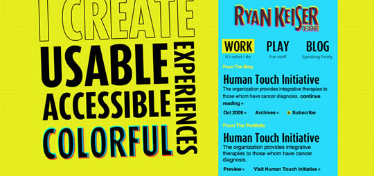
ryankeiser.net

yellowsites10

Sketchen

yellowsites11

teammanager.se

yellowsites12

hellobard.com

yellowsites13

agatha group

yellowsites14

designcharts.com

yellowsites15

fcsiauliai.lt

yellowsites16

Champion Sound

yellowsites17

chemopren.cz

yellowsites18

Imaginary Design

yellowsites19

IAAH

yellowsites20

helveticons.ch

yellowsites21

booreiland

yellowsites22

espira tecnologias web

yellowsites23

chunk.

yellowsites24

journey-to-zero.com

yellowsites25

itswhite.co.uk

yellowsites26

44k.cz

yellowsites27

Agent 89

yellowsites28

kettle

yellowsites29

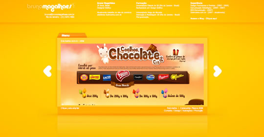
Bruno Magalhaes

yellowsites30

Atelier ZXU

yellowsites31

typeish.com

yellowsites32

biocate

yellowsites33

foodtease.com

yellowsites34

riotindustries.com

yellowsites35

yearsf.com

yellowsites36

CoolCreation

yellowsites37

Nancy Felix

yellowsites38

mein-eigener-baum.de

yellowsites39

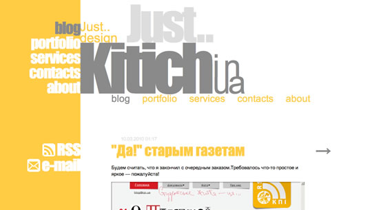
kitich.in.ua

yellowsites40

wakesomebodyup.com

yellowsites41

wipetheworldsass.com

yellowsites42

Wilkintie

yellowsites43

dfp.com.ph

yellowsites44

areyoufrank.com

yellowsites45

littlelines

yellowsites46

GlasGoWeb.Designers

yellowsites47

wsdia.com

yellowsites48

creativeunited.dk

yellowsites49

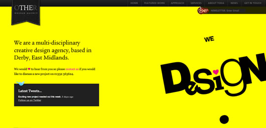
theotherdesignagency.co.uk

yellowsites50

Share

Gisele Muller loves communication, technology, web, design, movies, gastronomy and creativity. Web writer, portuguese/english translator and co founder of @refilmagem & @mentaway Twitter: @gismullr

4 Pings & Trackbacks

  1. Pingback: 50 Beautifully Brown Web Designs | Inspiration

  2. Pingback: 55 Minimal Black and White Web Designs to Inspire You | Inspiration

  3. Pingback: 50 Green Web Designs to Inspire You | Inspiration

  4. Pingback: 50 Red Web Designs to Inspire You | Inspiration

40 Comments

  1. Daniel Long Reply

    I think this is a really good selection of designs using the colour yellow. Yellow is a really bold colour to use, and i think the best designs have incorporated white and dark grey in well. itswhite.co.uk has used a clever piece of photography in the main design which i think is really good.
    There are some really creative solutions including sebdesign.eu which is one of my favourites.

  2. FF Reply

    Fantastic article!
    I like yellow and it’s good to see what can be done – loving the black/yellow for contrast.

    @ Jordan Walker – don’t eat yellow snow!

  3. Bobi Reply

    Ive kinda like easymsg.com. nice and clean and very yellow. Dont see many websites in yellow. Its my favorite color 🙂

  4. Leisha Reply

    Yellow happens to be one of my favorite colors… that said, not all of these are pleasing to the eye. Some of them actually cause pain to look at. Super-bright yellow is just not a good choice for the dominant color scheme of a website.

    The ones that are softer or more golden in color are much nicer. Bright yellow is also nice as an accent. Only about half of these showcased designs did not make me cringe. My favorite among these designs is WakeSomebodyUp.

  5. Yesuah Reply

    I personally for the most part I believe that yellow is a horrendous color.. however I enjoy seeing posts like this because I get to be proven wrong,.

    Thanks!

  6. Naples Web Design Reply

    Those samples of yellow web page designs are really unique if we really compare it to the familiar look of a website which is not that fancy right but the main thing which I have notice in all of those samples is their similarities of being a fancy design site. Is yellow really for intended fancy? Anyways thanks for sharing those inspirational web designs.

Leave a Reply

Your email address will not be published. Required fields are marked *