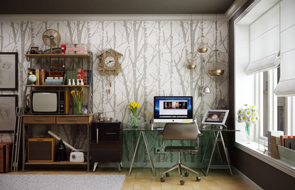
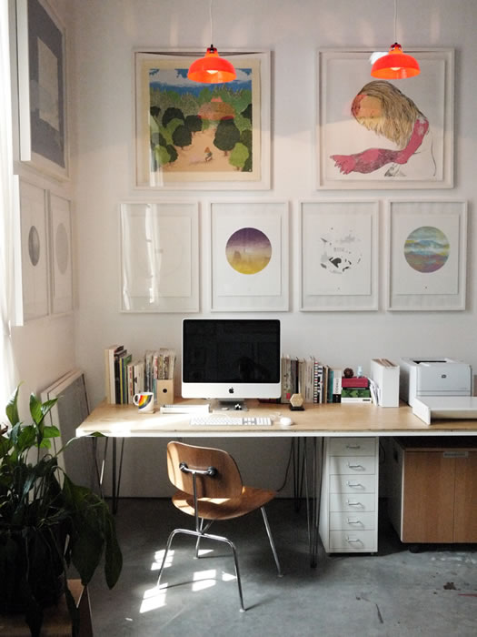
Browsing beautiful workspaces is a great way to get inspired. It’s also a great way to get some ideas for your own office and discover how other people put their workspace together. So for today, we gathered a showcase of beautiful and inspiring workspaces to show you. Remember to click at the images to check out more about each space. And feel free to leave a link to show us your own office.
Share
Gisele Muller
Gisele Muller loves communication, technology, web, design, movies, gastronomy and creativity. Web writer, portuguese/english translator and co founder of @refilmagem & @mentaway Twitter: @gismullr


No PCs?
At least two, which isn’t much. I’d guess PC users couldn’t be bothered to tidy their desks … but that’s probably just me 🙂
Haha, PCs aren’t meant for beautiful spaces, otherwise they’d be beautiful themselves. Get back to your 6×6 fluorescent lit cubicle! ;P
PC’s arent 4 designer’z 😉 dude!!
I built the desk myself making sure to leave plenty of surface space to draw. I like the natural, homemade feel of the wood and plenty of shelf space to keep my inspirational mementos and reminders of my family. The cat perch is vital to let them keep me company while staying off the desk.
it’s not real life. come on, let’s be honest, a desk is always messy with trashes, post it, pencils, coffee mug, old posters, craps etc. it’s ikea’s photos, you show us here !!
Totally agree! Even if i clean up my desk after a couple of hours it gets messy again. But hey, i’m not a mac user so maybe that’s the reason why my workspace is not so tidy. 😛 (according to the comments above..)
Very nice and neat workspaces! Thanks for making me feel bad about mine now. :p
Nice ripoff simpledesk.net, it must be hard work on this “article” 🙂
It’s simpledesks.net
I wanted to see more images like this so I went there and I thought I was trolled into going to some not-on-topic site. But, I figured it out now.
Whoa! Total ripoff! I thought this article’s author must run simpledesks but they are out of the UK! This article could have just started with a link to the most recent posts on simpledesks and saved a lot of cutting and pasting. “I am dissapoint.”
Do you think the article is a ripoff because I used only their images? Maybe I did that because they are a website specialized in curating offices images, and they have the best ones… and maybe this is why I added a link to their page so readers could know more about each space. So I don’t think it is a ripoff.
Maybe point out in the intro that all of the images are from simple desks. Credit the work of the original creator.
To those who said Gisele “ripped off” the images from another site, aren’t you being a bit dramatic? She did link the images back to the “simpledesks” site she got them from. If anything, that site will benefit from the extra click through traffic.
Well, most of them don’t look very comfortable to work…
Spending hours on a pure wooden chair? No way!
That’s exactly what I was thinking.
I noticed the no clutter, don’t feel bad Earl, they were made to look like that for the photos. Personally, I found just about every one of those work spaces to be aesthetically cold and uninviting. I wouldn’t feel comfortable working in any of them. Sorry.
Great photos!
Unfortunately, most of us never have spaces that tidy!
Love the fact that they all have Apple products!
Macs rule!
Ok, am I the only one thinking it’s a really bad idea to place your workstation right in front of a huge window? How could you see anything with sunlight bursting in your eyes? (and none of them had like black curtains)
Love the simplicity of most of these work areas. Do we work better? Or are we just neater with less paper? I woiuld love to have a view in my office!
What great inspiration to create a better and more-productive workspace. I appreciate all examples and will “get busy” putting some of this into practice in the coming weeks.
You should add my workplace too :
https://www.behance.net/gallery/Workplace/7283557
Far too many clean spaces, design is messy and active!
Nice collection Gisele, especially the work spaces with natural lighting. If anyone’s interested, here’s a related article I created a few weeks ago that includes instructionals on how to build a great workspace on a tight budget: https://designbuddy.com/low-cost-graphic-design-workspace-improvements.
A clean desk is a desk of someone who doesn’t do any work.
I tried for a long time to get one of the ‘beautiful and inspiring’ workspaces, however I’ve found its next to impossible to keep it looking ‘tidy’ unless I want to spend my entire working day tidying up.
My desk is clean, but its not tidy.
Agreed! I love to look at these pictures – but I always realize I’m way too busy to keep everthing so very perfect!!
Nice collection, but i can’t image that it’s possible to work in such workspaces. I can’t show you my desk but it’s a table of 4 meters, with 5 screens, 3 keyboards and a mountain of papers … and my job is : webdevelopment ! My co-worker has the same desk in front of me.
I’d love to see how all these ‘work places’ turn out by the end of the week 😀
Love the simplicity of most of these work areas. Do we work better? Or are we just neater with less paper? I woiuld love to have a view in my office!
Love these!
All of these “workspaces” are too small, uninviting, and cold. The rooms they’re in are bland and give off no sense of creativity to inspire them.
Maybe it’s just me, but because I use two screens, the small desk I have has room for my monitors, my mouse and pad, and keyboard. I love to sketch out wireframes and doodle when coming up with ideas along with taking notes ON PAPER because there’s something original and ‘right’ about it. None of these workspaces have places to do that.
Let’s get real, no one is comfortable on a snazzy looking hard plastic chair for hours.
It’s a nice collection of desk areas we think designers (should) use.
LOL — workspaces for people who don’t work.
These images would inspire someone with OCD but not the least bit appealing or practical for people who actually spend 10 hours a day working in that space
These are fantastic, but I have to say, one little home office is easy to make look amazing. Most real work spaces are part of a sea of dusty office cubicles -yes, even for designers. I’d love to see some inspiring solutions to design studios and office environments for 10 or more people.
You can tell no one gets any work done in these photos…because they almost all have Macs in them! Bazinga! No, actually because there’s not anything on their desks. (papers, post-its, pencils/pens, etc.)
Apparently I’m the only “control/cleaning freak” here. My office is the last one in the bunch and I have to say that I really keep it super organized all the time… and yes, I get my work done.
You don’t need to have stuff all over to show you are working. In my case is the other way around, but I guess is because of the control freak part of me 😉
A lot of those spaces are totally dead and NOT inspiring at all, but some are very sereene and would be great to start a day of constructive work at. I find however, that a desk full a creative work does get messy very quick and you always have to clean it up to make it look like the pictures. And to you MAC haters, did you ever try one? I traded my old PC in three years ago, and never went back. Never got any of those hick-ups that PC has either….I’m just sayin’
Pure coincidence. I am in the process of creating a new workspace in a glassed in section of my home 8x3M) which over looks the Med and the Taurus mountains. The article was useful in that ı could see what I did not want. ı noticed that nobody had a sofa, which is for me essential for thinking.
These looked lovely, but almost none showed where the computer was (as opposed to the screen), and where was the printer, scanner, speakers, phone, hub, mouse pad, coffee cup? My desk is reasonably tidy, but full…
Other than the work space surrounded by nature, I found most to be rather cold and too industrial. Live plants and creative containers make a huge difference!! They warm it up, add more oxegen to the area and tend to increase productivity.
My company has implemented the similar sterile design nine months ago, and it is inhuman to work in. I get headaches from eyestrain from all the white. I put a purple cloth on my desk to give my eyes a rest, which is against the “New Way of Working” standards. I hate it. Give me a woodgrain desk and color on the wall. Even cublicles are an improvement. And what is wrong with having a drawer?
It would be great if there were a similar article on “standing desks”. I’ve been trying to find the right balance between sitting/standing in my office and am looking for inspiration.
i think most of them are gorgeous for home offices that dont get used a lot, but mine certainly doesnt ever look like that, as much as I would like it to. I love the black clock desktop on the mac 8th pic down – can anyone tell me how to get that?
I really enjoyed looking at each image. Every space had their own interesting characteristic. At the end of the day, no matter how your space looks our inspiration comes from within.
The 2nd, the 6th, and the 16th are great examples.
Haha… workspaces for people who don’t do any work.
Apple, Apple everywhere.
So many big, ugly & grey Apple screens.
Hahah “And this is where I work” is great ))))
Beautiful and Inspiring Workspaces, more like beautiful desks with a computer on it.
Love the use of light in a lot of these, it really gives a feeling of freedom, changing that whole ‘being chained to a desk’ idea!
Really inspiring collection of workspaces. Simple, clean and organized is how I work best!