There are loads of great footer examples in web design. These are some of the most common interface features which you will find on practically every website. Modern designers know which types of content surface well in the footer. You can now design influential areas for page links, credits, website info, and other crucial details.
I want to use this article as a deeper look into footer designs. Specifically I will be focusing on dark footers in website layouts, using darker color tones and icons surrounding the theme. I feel these are some brilliant examples for designers who are looking for inspiration. But they also provide some new techniques you may not have considered appending into your own projects.
Pulling Dynamic Content
The idea of pulling new dynamic database content into your footer isn’t brand new. But it has been improved over the years to bring out some exciting new techniques in website layouts. I personally love the design of Tone Agency which includes a lot of helpful resources.
You can find all of their newest blog posts, along with tweets and a recommended product(ebook) column. Designers could also consider opening these up for any related featured content. Think of displaying your most recent portfolio entries along with thumbnail shots. Or even past clients and their feedback on your work.
Also notice how elegant the links appear when you mouse over them. In the far right-hand column you can see a few basic contact details. This is a great system to follow and evolve since most professionals will head to the footer looking for this information.
Blending Footer Widgets
One other exceptional trait I have noticed in footer design is blending into the layout. In some examples such as Tone you notice how the colors transition as you scroll down the page. This is true of many websites and it works flawlessly. The website for Barcamp Omaha 2012 blends the whole footer design right into the layout.
This is perfect for dark-themed layouts who already know what type of content is available. I commend the Barcamp website specifically for their scrolling widget of new tweets. You can follow any of the webmasters from their Twitter handles, or check out their most recent tweets scrolling by. The small icons and side illustrations also catch the eye while glancing around the layout. Using colorful hover effects is another way of drawing attention towards content within the footer without distracting users.
Security Info
You will notice a lot of company policy statements and security badges on ecommerce websites. Anywhere that you are purchasing items online is generally a place where security is highly valued. The website for Monitor Backlinks has a similar design essence which includes a PayPal badge and an SSL lock.
You notice these right away as you scroll down the page because they jump off the darker background. So many Internet users prefer to stick with PayPal for online purchasing because it is just easier. And honestly I cannot argue with that logic, especially having been online for so long, and having a button in place is almost like advertising for your sales team.
The designers have included an additional email registration form at the very top of the footer. This is an interesting method for capturing visitors who have scrolled down this far on your homepage and may be interested to learn more. Since these companies often have a difficult time selling services, newsletters are a direct way of keeping in touch with customers.
Profile Roundup
This technique is most prominently found on portfolios and personal websites. The webmaster will place direct information about themselves in the footer area, possibly along with some links and a photograph. This grants visitors a direct connection to the owner which is much easier than searching for a contact details page.
One of my favorite examples is Albert Lo who is a freelance artist and designer. His portfolio website is fantastic and I really love his footer area design style. You can find many various forms of contact and a select few testimonials from happy customers. This is the kind of all-around information you want to present to others looking into your professional work. And while this style cannot fit everywhere, it is possible to setup footer profiles on companies or even teams/groups as well.
Inspiration Gallery
I want to finish up the article with a brief showcase gallery containing some amazing dark footers. Modern website designs are not perfect, but we have come a long way over the past five or ten years. I feel these are some exciting layouts for anybody looking into web design trends. Footers are especially fascinating since they hold much of the metadata hidden away from the initial page screen.
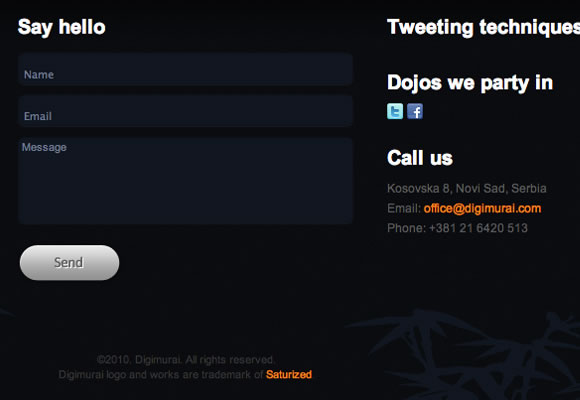
Digimurai
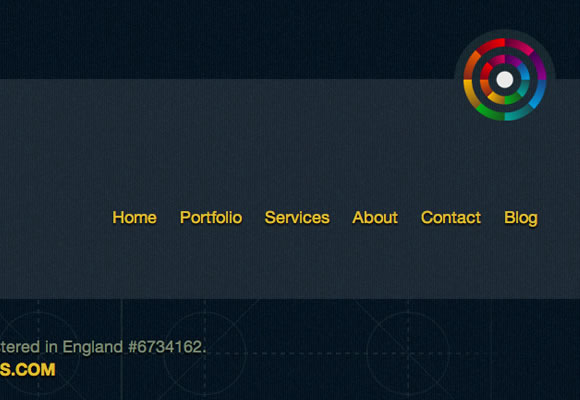
Colorcubic
GoodBytes
Culverhouse
Tapbots
Jess & Russ
Alt Design
Neutron Creations
Edit Studios
Productive Dreams
I Primi Dieci
The Ordinary


Very nice and informative article. I like especially “Colorcubic” website for its dark footer design.
Yes great footer designs, thanks for sharing such an inspirational showcase.
Very informative, and some great designs. We’ve found that it’s at least as useful to have important contact info in the footer as it is at the top of the web page.
Hey Jake. Thanks for including us in this collection of sites 🙂
Very good collection of dark website footer design example. Thanks for sharing.