
Here at WDL we believe that typography is always a great source of inspiration… and we never get tired of finding good examples to show our readers. Today we gathered a few breathtaking beverage bottles to show you that a good combination of typography and colors can deliver an amazing result. All these examples are from Lovely Package, a super inspiring site for package lovers. Click at the images to check out more about each design.
Saxton


Cornohora Balsam

Diet Coke Limited Edition

Muskoka Brewery

Add Some

Evian x House of Courrèges

Lot 96

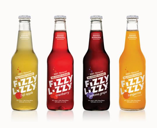
Fizzy Lizzy
12 Signs Wine

Agua de Cortes

Off.

Jonah and the Whale

Silhouette

Ponte Romana

Caravan

Garobel

One Tree Coffee Co.

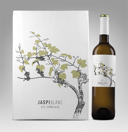
Jaspi Blanc
Les Tropeziennes

Coca-Cola x Daft Punk


Cornohora Balsam, Coka Cola and caravan are my favorites out of this collection. I love Coka Cola’s corporate identity it has hardly changed since it was created in 1886. Its a testament to good design and marketing.
This is awesome..
I love the Saxon bottles, they are really unusual compared to the usual cider packaging style. Elegant and light, It’s usually dangerous to go against the norm but in this case, it works. I know some of these are mock ups but it’s a shame we only get to see such typography in upmarket supermarkets. We need to get some of these in Tesco!
Jonah and the Whale, Evian x House of Courrèges ans Saxon so light and clean design. Essential and a good choice of colours. More inspirations in this post thanks!
As a designer and lover of type I have to say, “you have a typo.” The headline name above the Saxton Pear cider packaging is missing the “t.” Should read “Saxton” not “Saxon.”
Nice examples of good design!
Thanks for pointing the typo, just fixed it 🙂
Yeah, SAXTON, like my last name. COOL! I make an awesome Pear Cider.
I liked Jonah and the whale. Very simple yet so very elegant! Thanks for sharing this wonderful collection.
i must admite i love the Evian,it inspires neatness,simplisity,calm environs n beauty at the same time,am also admiring the ones on top of it because of the feminine features they present n the colours just blend with each other harmonioursly
Love the designs, so much can be done with Type! Especially with a limited space like a label. Great examples.
Hey Gisele. Great post. This is a good one: https://bit.ly/qNAecS
All of these are beautiful examples of packaging and typography! It’s very refreshing to read/view a blog that draws inspiration from different media to improve web design practice, especially since typography is such an important part of the success of both of these mediums. Though I guess it’s hard not to appreciate good typography on amazingly designed packaging!
cool collection, coca cola is one my fav
Though this collection took awhile to catch up with me, and as a lover of design and typography, I believe there could be another “typo” for Garobol. When looking closely at the bottle, the letters are G O R O B E L, Not G A as in the headline. Still great to see brilliant minds at work! Elizabeth
This is awesome.I would definitely buy beverage bottles who look like this instead of the normal bottles.This is good advertise!
Typography on bottles is more challenging than on paper. Great collection, very inspiring!