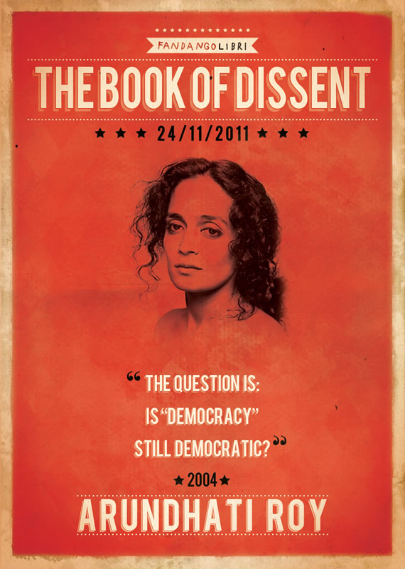
Here at WDL we love to show our readers inspiration from different media, especially inspiration involving typography. From package to web and print, we believe that typography can always be a great source of inspiration. Today we gathered a few examples of inspiring and creative typography usage in print ads.
Share
Gisele Muller
Gisele Muller loves communication, technology, web, design, movies, gastronomy and creativity. Web writer, portuguese/english translator and co founder of @refilmagem & @mentaway Twitter: @gismullr


Most of these are highly UN-inspiring.
While there is some fun ideas in terms of layout, I’d love to see some with information on the results. In terms of posters some of these just dont communicate much and wouldn’t make me buy.
But WDL is always a great source of inspiration.
Good choice of examples by typography! Thanks for inspiration.
Very nice collection of different type treatments. Would’ve have been nice to know what fonts were used. Looks like a lot of fonts were modified or hand drawn to begin with.
awesome showcase you arrange. thanks
Some really cool graphics and layouts here. Inspiring, but as other have said… would love to see how effective they were in communicating the message.
I would have thought, by and large print ads need more simple text to convert on their call to action.