Сreating emotional connection between your brand and website visitors is critically important. Modal pop up windows may help you in this challenging task as well as to share the visitors some important information.
As a rule, modal pop up windows are used for various call-to-action messages, such as encouraging users to subscribe for newsletter, download some freebies or informing about some new products, services, or features released. Here you’ll see 20 websites with gorgeous pop up windows worth your attention. So, scroll down and get to know what kind of information can be shared in popups and how to design them properly.
InspirationHut
BloggerJet
Photodoto
ShoeMoney
Vandelay Design
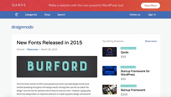
Designmodo
365psd
Webdesign&Such
Lewishowes
Elegant Themes
invision
Web Designer Depot
Dapulse
Yorkdale
Woman
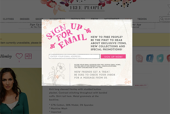
Free People
The Coveteur
I Love Lou


The tiny X to closd is just terrible design. It is frustrating as hell when u can’t click it on mobile.
How the hell are these links already broken? Is this a fake evergreen content fail?
Which link is broken and we’ll get it fixed?
BROKEN:
Garnet Hill
I Love Lou
Free People
PAGES WITHOUT MODALS:
Coveteur
Yorkdale
Web Designer Depot
Invision
365psd
Designmodo
Bloggerjet
Inspiration but
Maybe this article should have been, “Where have all the MODALS gone?”
Oh I’m so glad you posted this. I am sure they will really helpful! Thanks for sharing these tips!
Hi Nancy, Ive seen a pop up that comes down over the whole site like a curtain or veil. They have set so it only comes one time, do you know what teh technical search term might be to find this kind of pop up optin? I cannot find it, Thanks
Nancy, as a designer, content creator, and all-day web user, all I can say is that none of these is gorgeous. There has never been a gorgeous modal pop-up. They are an act of violence against the user. Every time I’m interrupted by one, I am distracted, I am annoyed, I promise myself I will never respond to it in any way, and I wish harm upon the web developer. This is a band-aid tactic to make up for bad design, and it only ever alienates your users. Please help to abolsh this horror show practice.