The NBA playoffs are here and everyone is buzzing about their favorite NBA teams. So… we’ve taken it upon ourselves to entertain you with what your favorite team’s logo could look like. Some talented designers put their special touch on these iconic logos redesigned and mastered. Let us know which one is your favorite at the bottom of the article.
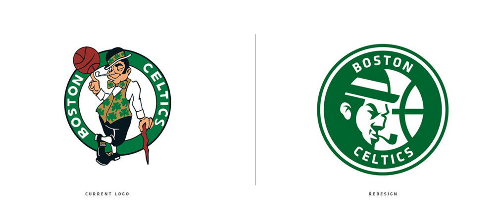
Boston Celtics
Brooklyn Nets


New York Knicks
Philadelphia 76ers
Toronto Raptors


Dallas Mavericks
Houston Rockets
Memphis Grizzlies
New Orleans Pelicans
San Antonio Spurs
Chicago Bulls
Cleveland Cavaliers


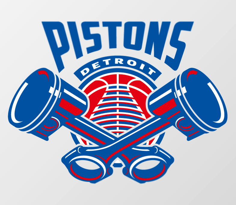
Detroit Pistons
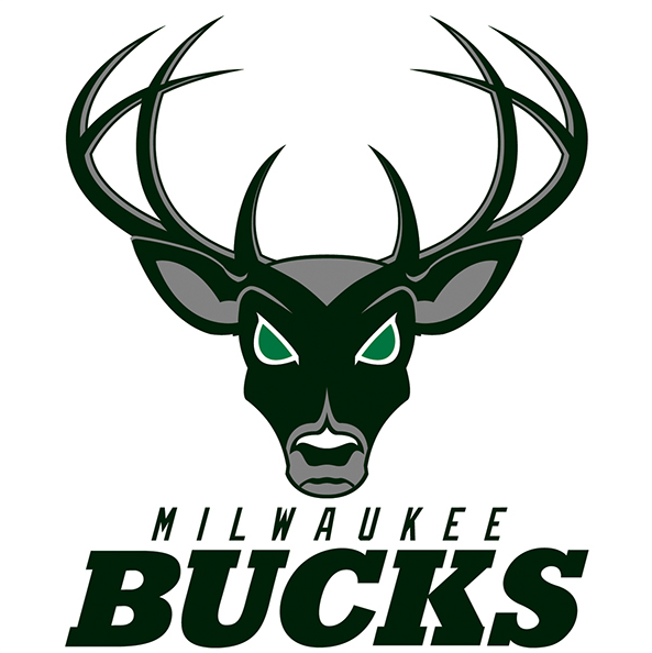
Milwaukee Bucks

Indiana Pacers
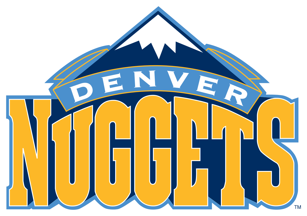
Denver Nuggets
Minnesota Timberwolves
Oklahoma City Thunder
Portland Trail Blazers
Utah Jazz
Atlanta Hawks
Charlotte Hornets
Miami Heat
Orlando Magic
Washington Wizards
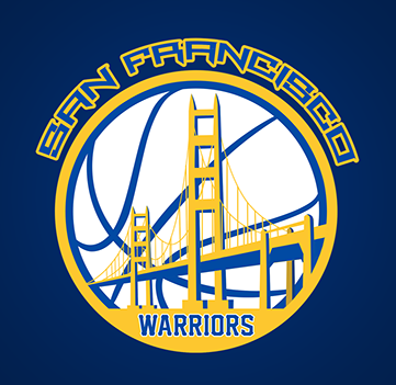
Golden State Warriors
Los Angeles Lakers
Los Angeles Clippers
Phoenix Suns
Sacramento Kings









Most of the originals were already cleaner and better than the redesigns.
A few good ones are Raptors, Rockets, Thunder, and maybe Lakers.
Others are kinda bad.
Namely, Nets, Pelicans, Jazz, Magic, Clippers, and maybe Warriors.
Worst offender is the Trail Blazers redesign, without a doubt.
These are hard to look at. It would appear the majority of these were not passed through any kind of critique process and failed to take printing and merchandising into consideration.
Good: Celtics, Knicks (much needed!), Mavs, Rockets, Nuggets, Timberwolves, Jazz, Suns, Kings.
Bad: Raptors, Spurs, Bulls, Thunder, Hornets, Clippers, Sixers (AA level baseball team written all over it)
Ugly: Pelicans, Pistons, Bucks, Trailblazers (what is that?!), Heat, Magic, Wizards, Warriors.
I like the redesign and the original of the Lakers and the Hawks.
Most of the originals are way better. I think the Portland Trailblazers might be the worst of the bunch. Clean design. All you need.