
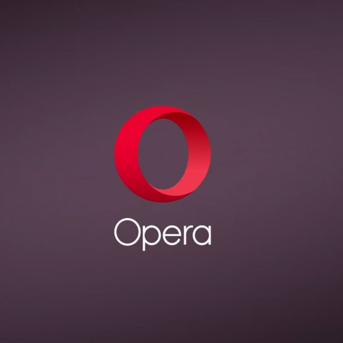
Most web developers know of Opera as a major player in the web browser market. Opera was built in Norway in 1995 under Opera Software. This year celebrates two decades of growth, innovation, and wonderful memories for Opera users.
As with many other large milestones we’ve seen a complete rebranding of Opera’s identity for this latter portion of 2015.
The logo has been completely redesigned along with an update to the company’s style as simply “Opera”(as opposed to Opera Software).

One of Opera’s related companies Opera Mediaworks is also undergoing a similar transformation. It seems Opera as a whole is really pushing for a new identity to represent their movements beyond 2015.
Opera never stands still, so it was really important for us to make our new brand something that could endure and grow with us. We have new solutions and products in the pipeline, and we want them fit into the new identity organically.
Users will first see the new identity roll out onto mobile apps within the coming days/weeks. Over time other programs will be fully updated with Opera’s 20-year celebratory rebranding.
The company also released a brief video of digital effects to market the new brand. You can check it out below & if you like it be sure to share this exciting news with other designers around the web.


Leave a Reply