
Be honest, have you ever, ever created an amazing design or came up with a great idea and coffee was not involved?
Because, I’ve got to admit… I’ve never had a good idea on a day I didn’t have coffee.
And I might have a little bit of a problem. Recently, I’ve been drinking about 4 cups of coffee a day, and that’s not helping my sleeping habits for sure.
But that’s what gave me this idea.
Today I want to talk to you about coffee branding basics and how to design for your next coffee shop clients or company.
[source]
We’re also going to go over the best examples of coffee branding and graphic design.
So grab your coffee and let’s get into it.
The Basics of Coffee Branding
Coffee is pretty much an essential part of life at this point.
[source]
Almost every single person I know starts their morning off with coffee, then has an afternoon pick-me-up coffee.
And it’s not just my friends who drink that much coffee. It turns out that 75% of all Americans intake their caffeine by drinking coffee.
Besides the fact that it’s just a wonderful beverage with a million and one benefits, from clearer thinking and better ideas, and also helping you stay awake on the days you stayed up absolutely too late, it’s also a drink that brings people together.
[source]
People love to bond and spend time together in coffee shops, people go there to relax, work, have meetings, etc.
On average, a typical American adult will spend about 2 grand a year on buying coffee, and 173 million bags of coffee are consumed worldwide each year.
So this means that now, more than ever, your coffee branding needs to stand out.
When people walk into the grocery store to pick out a bag of coffee beans, their eyes need to be drawn to your design.
But how?
Ask the Right Questions: Assess The Brand’s Values, Strategy, and Style
Before you can hop on any graphic design software and start designing away, you have to stop and think about what your brand’s values are or what your client is expecting from you.
[source]
Here are some questions to ask yourself before designing.
- What’s the style or vibe you’re going for?
- Is it a more earthy vibe? Will the colors be neutral or do they want them to be crazy eccentric?
- What are the values of this coffee company? Are they ethical? How can I express that through my design?
- Who is my target audience and what would they look for in a coffee brand?
Once you answer some of these basic questions, you can start designing accordingly.
4 Easy Steps to Creating the Perfect Coffee Brand and Logo
1. Come Up With The Right Branding Strategy
As I said, it all comes down asking the right questions, and when you get your answers, you can start coming up with a strategy.
Pinpointing your audience is key in the first steps of designing. Who are you designing for? An elegant brand that requires minimal color and a fancy typeface, or for a younger, more fun generation, where you have the freedom to do whatever you want? No matter the audience, make sure you design with them in mind and what would make the choose your brand.
The brand name is going to decide a lot for you. The creativity wheels will start spinning when you look at the name. Do a play on words, coincide your design to make sense with the name. You can also get a sense of tone-of-voice from the name of the brand and design accordingly.
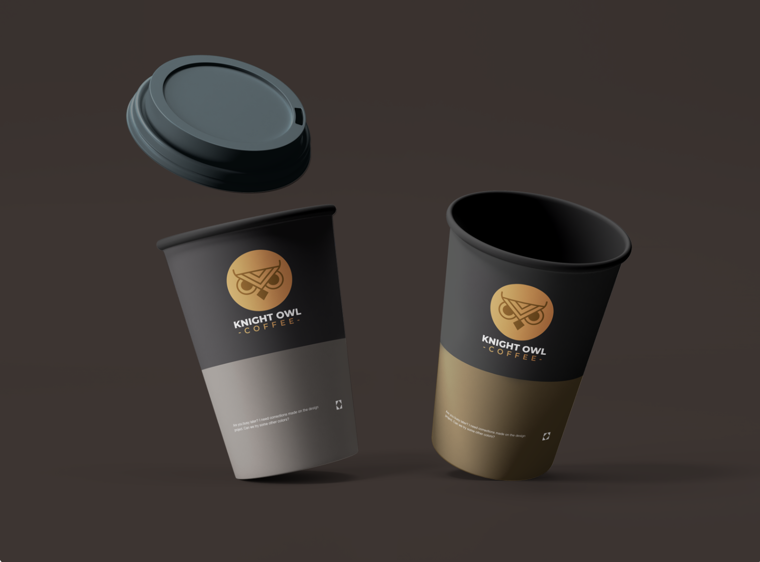
Your logo should be something that everyone can recognize and something that sparks joy for your clients and customers. But we’ll talk more about this a little later.
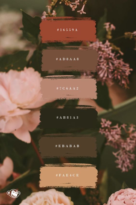
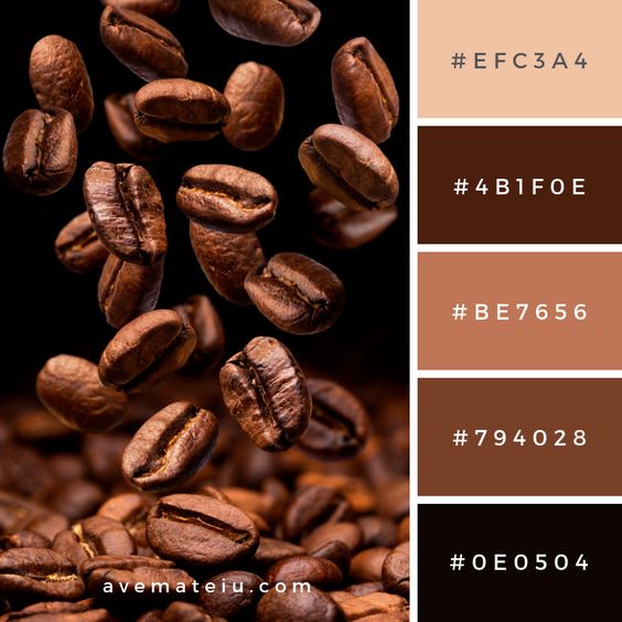
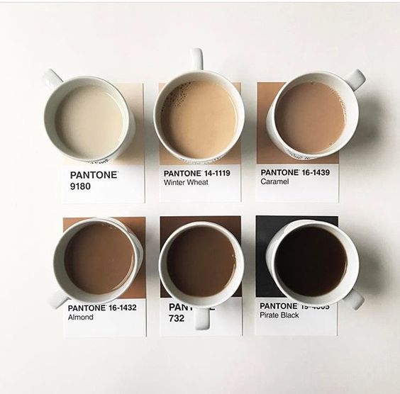
2. Use An Irresistible Color Palette
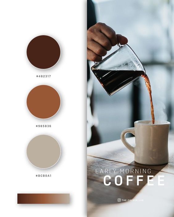
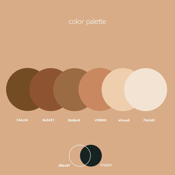
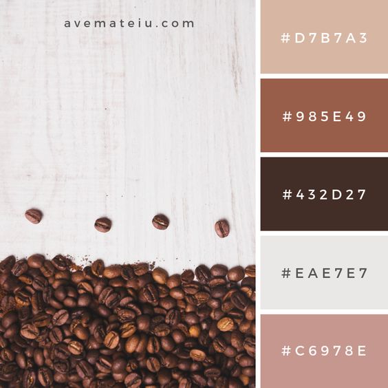
After doing some research and drawing some conclusions from my own experience in designing for coffee brands, most people love earthy tones when it comes to coffee branding.
So whether you go from a toned-down green, or an earthy brown pallette, make sure everything works together perfectly.
Just because most people choose earthy tones, that doesn’t mean that you have to! You can still go for brighter, more vibrant color palettes, but my recommendation is that you use the more muted versions of the colors you choose. So if you want to use orange and green, for example, just use a more muted version of the colors.
Here are a few of my favorite color combinations when it comes to coffee branding.

3. Check Out Your Competitors
One sure fire way to know if you’re doing well is by checking out your competitors.
Check out the ones who are doing better than you, but also the ones in the same boat.
You want to look at their work and not just be a copy-cat of what their doing, but be inspired by them and ask yourself what you have to offer that is different from them and how you can do better.
4. Keep it Simple
When it comes to your logo, the best thing to do is to keep it simple.
Especially nowadays, when the trend is flat-design and minimalist.
You want people to look at your design, and say, “oh yeah! That’s my favorite coffee brand.”
It shouldn’t be so complex that your customers don’t understand what the heck is going on, but it can also have a bit of a back story that needs to be explained.
A perfect combination of the two is the goal here, but keep it simple!
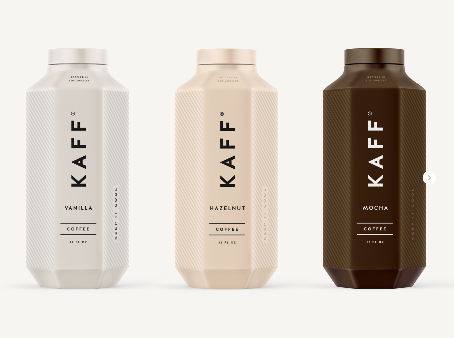
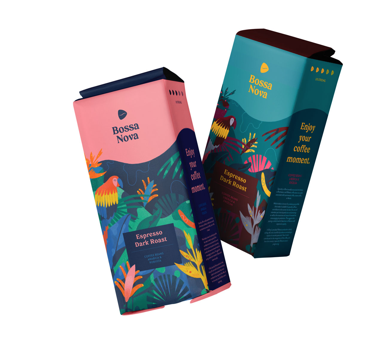
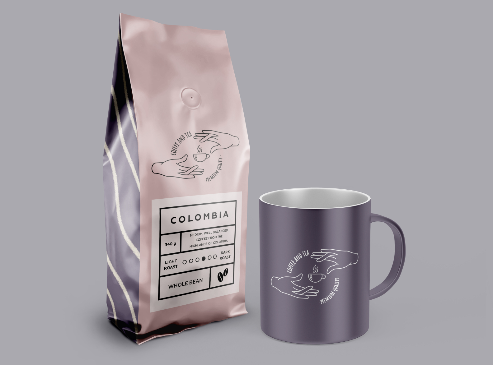
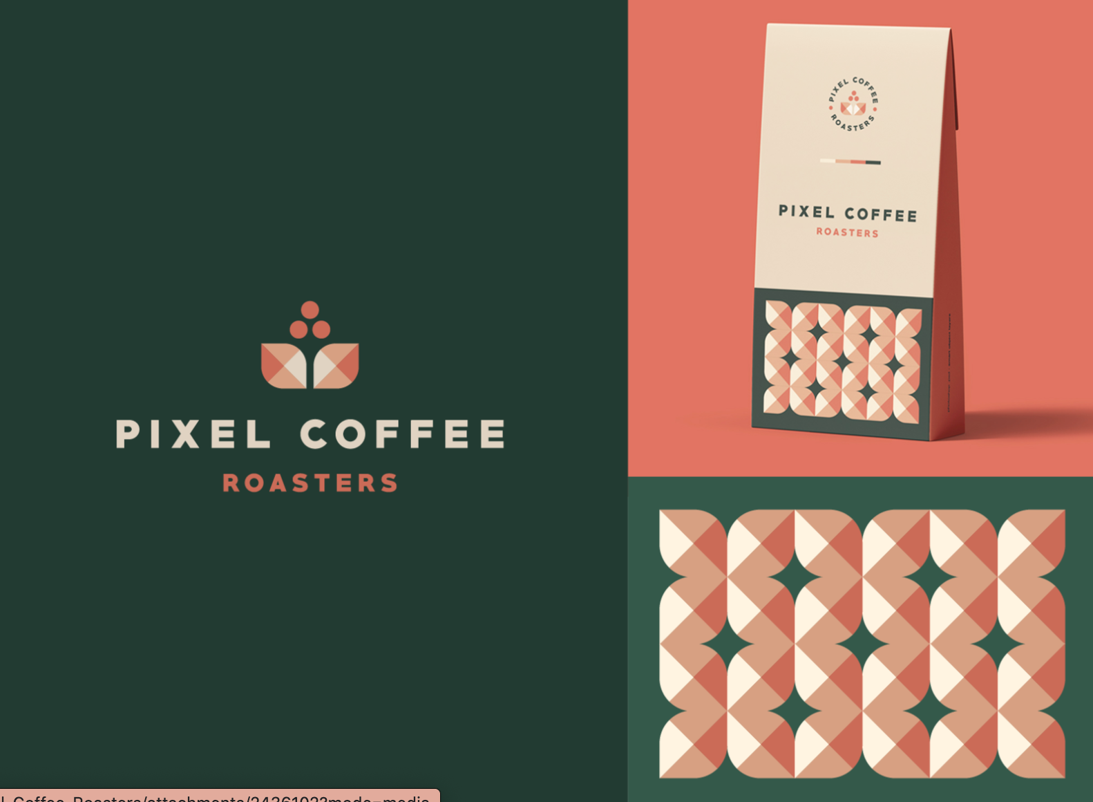
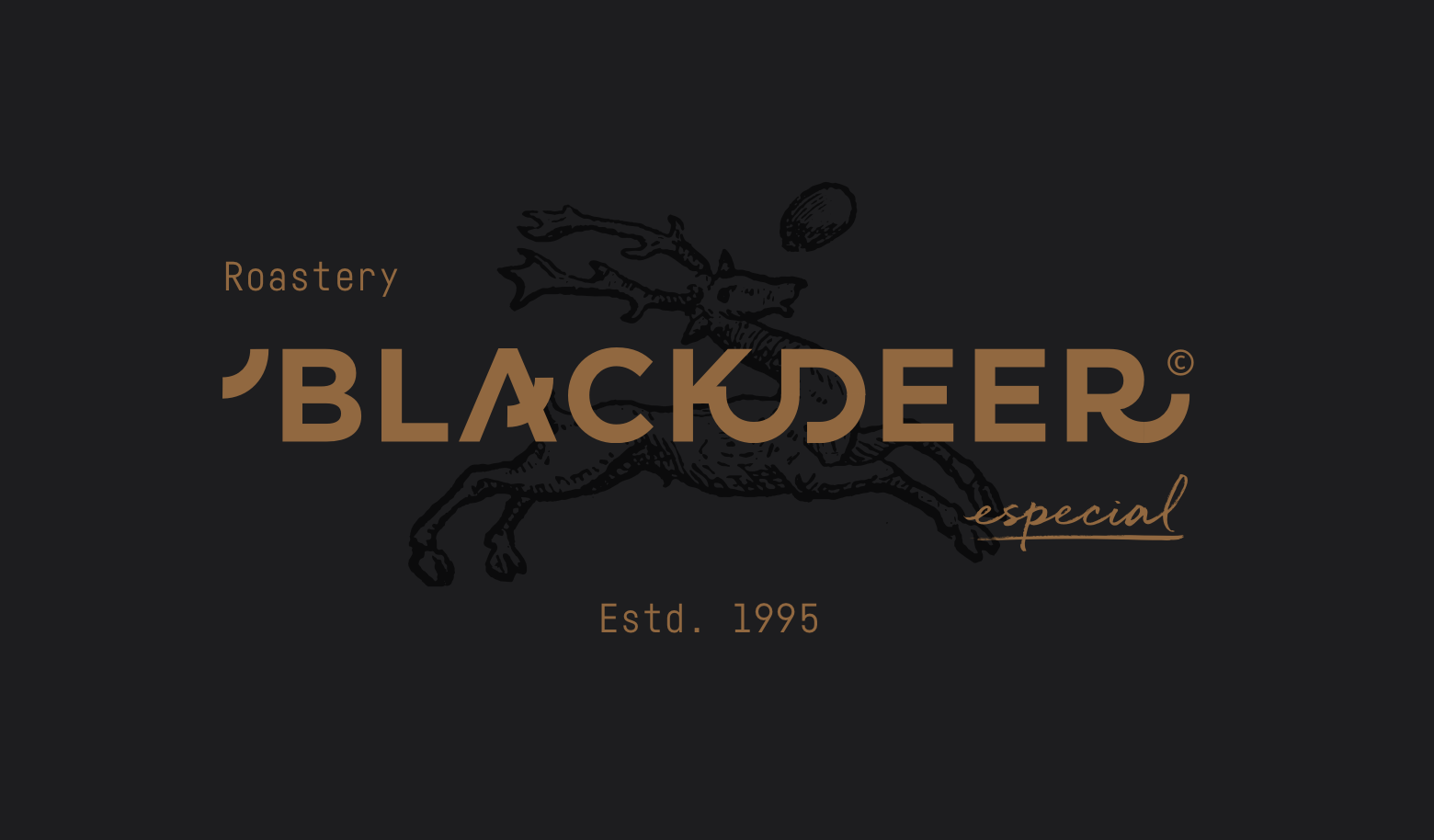
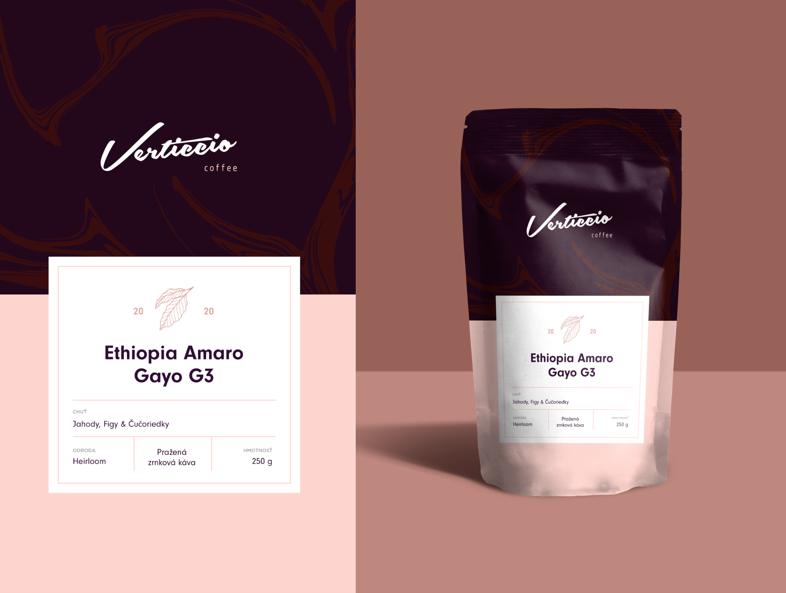
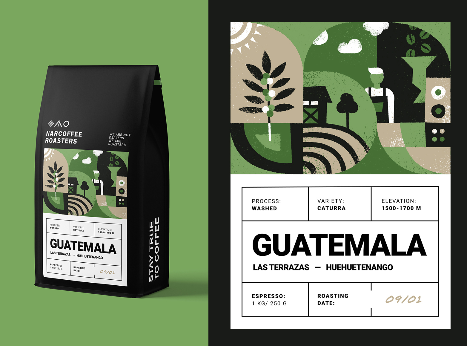
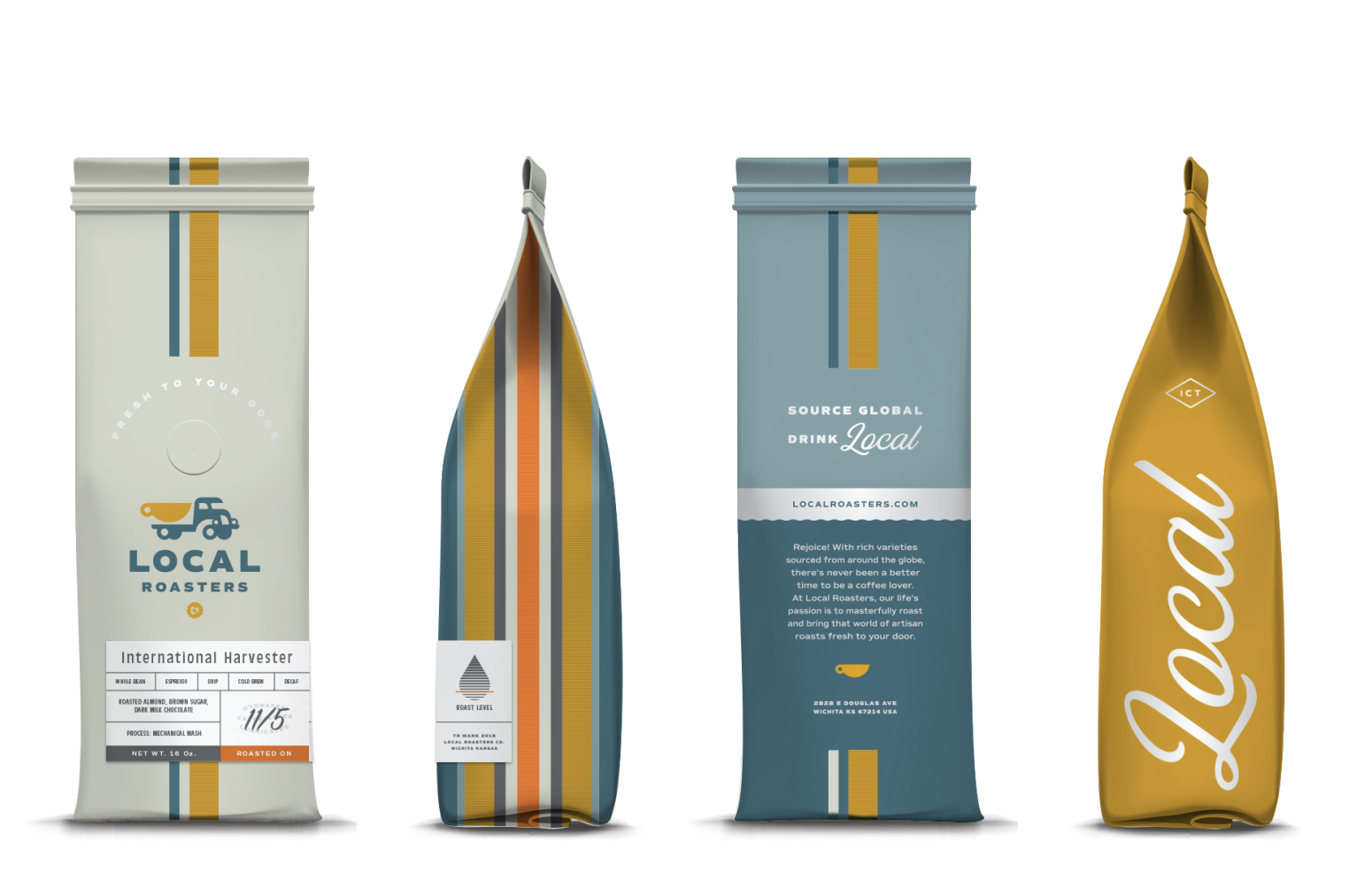
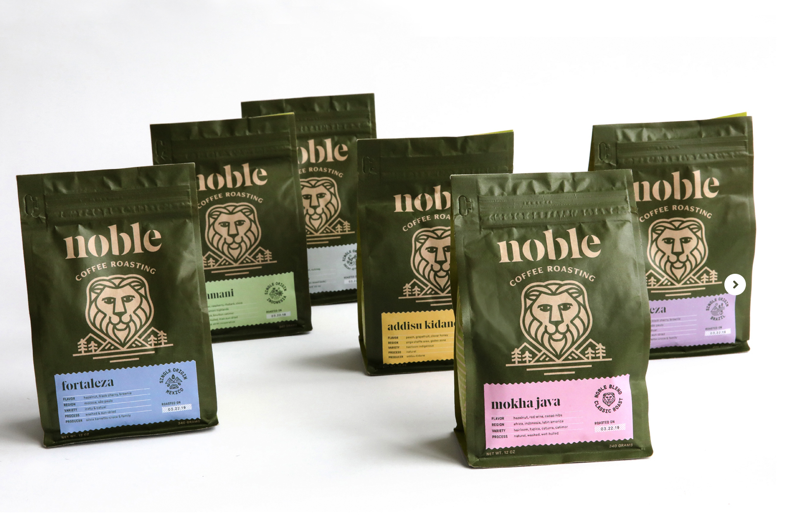
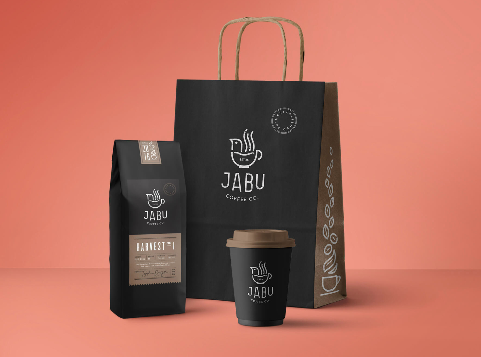
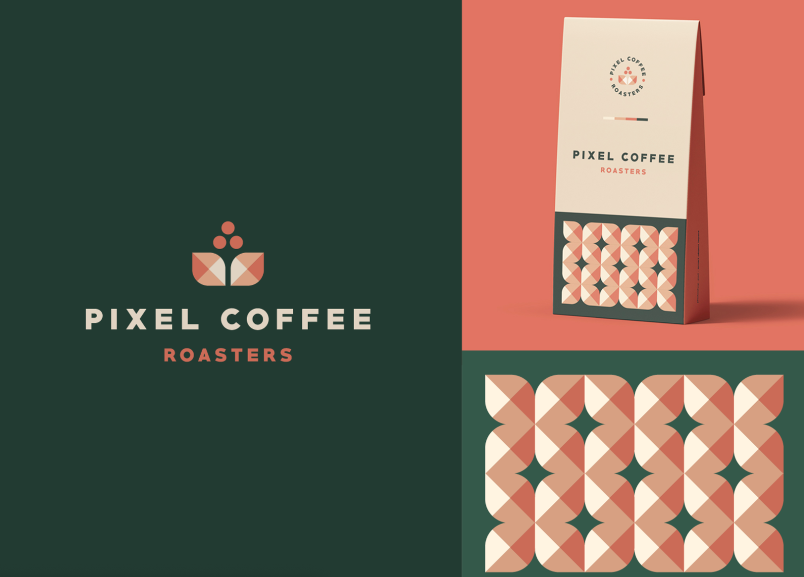
Our Favorite Coffee Branding Examples
I want to close out this article by inspiring you and showing you some examples of my favorite coffee brand designs.
My favorite places to get inspiration from are Pinterest, Dribbble, Behance, and the places around me.
So if you’re lacking inspiration, I hope this helps!
I hope this article helped you out in one way or another and inspired you to get to designing.
So go ahead, grab your coffee and go make something amazing.
And until next time,
Stay creative, folks!


Leave a Reply