At Theme Trust, we recently launched our first responsive WordPress theme. Since it was also my first time building a responsive website, I had to do some learning and research. Along the way, I discovered some interesting techniques, useful resources, and handy tools to help with the task. So in this article, I’m sharing some of those tools and scripts I came across that make developing a responsive website a whole lot easier.
FitText
FitText makes font-sizes flexible. Use this plugin on your fluid or responsive layout to achieve scalable headlines that fill the width of a parent element.
Respond
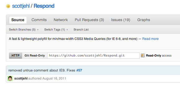
A fast & lightweight polyfill for min/max-width CSS3 Media Queries (for IE 6-8, and more)
Adobe Device Central CS5.5
Adobe® Device Central CS5.5 software simplifies the production of innovative and compelling content for mobile phones, tablets, and consumer electronic devices.
Responsive Web Design Sketch Sheets
During Denise Jacobs’ workshop on CSS3 at ConvergeSE 2011, I was inspired to make these responsive web design sketch sheets to help think through layouts for various devices.
Golden Grid System
Columns, gutters, a baseline and a script.
Hardboiled CSS3 Media Queries
Making layouts responsive using CSS3 Media Queries are a big part of the work that I’m doing for the Hardboiled Web Design site in the run up to the book’s launch.
Skeleton
Skeleton is a small collection of CSS & JS files that can help you rapidly develop sites that look beautiful at any size, be it a 17″ laptop screen or an iPhone.
Responsive Design Testing
Test your own site… type the url and hit enter.


Cheers for the collection , just begun working on my first mobile version of a website and the “Responsive design testing” is really useful.
thanks for all of these.
Great collection – I’ve downloaded quite a few of them to use in my own projects! Thank you!
Great tools for responsive designs
awesome post! amazing!Great collection too!
Much appreciated! I actually used some of these tools last night to turn my portfolio site into a responsive site.
Thx for sharing !!! Nice post I’ll try to use the Skeleton or the Golden Grid. A friend ask me to develop a site with an horizontal slideshow that fits the dimensions of the browser. Hope I can do it with those scripts.
Great bunch of tools you listed here. I didn’t know some of them, so thanks for the new toys.
Аmazing!Great collection.
Great information.
Thanks.
Your compilations are always the best!