Responsive web design continues to become more widely practiced. Because of that, as web developers and designers, we have more tools and resources that make it easier for us to create responsive web sites. So for today, we gathered 8 CSS Frameworks that will help you do just that. As you know, we never get tired of showing you tools to help you do your job, especially when it comes to something like responsive web design – something that is not only trendy, but useful and extremely user experience oriented. This is ever so important with the diversity of screen sizes you need to cover these days.
Titan Framework
Titan Framework – A CSS framework for responsive web designs
Responsive Grid System
Fluid grid CSS framework for fast, intuitive development of responsive websites. Available in 12, 16 and 24 columns with media queries for all standard devices, clearfix, and optional reset.
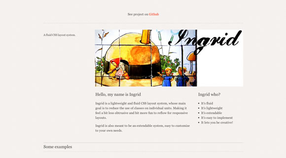
Ingrid
Ingrid is a lightweight and fluid CSS layout system, whose main goal is to reduce the use of classes on individual units. Making it feel a bit less obtrusive and bit more fun to reflow for responsive layouts. Ingrid is also meant to be an extendable system, easy to customize to your own needs.
Gumby
The NEW Responsive 960 Grid CSS Framework That You’re Already Familiar With.
Susy: Responsive grids for Compass
The web is a responsive place, from your lithe & lively development process to your end-user’s super-tablet-multi-magic-lap-phone. You need grids that are powerful yet custom, reliable yet responsive. Susy grids are fluid on the inside, ready to respond at any moment, but contained in the candy shell of your choice, so they respond how and when and where you want them to.
Responsive Grid System
Spectacularly Easy Responsive Design. The Responsive Grid System isn’t a framework. It’s not a boilerplate either. It’s a quick, easy & flexible way to create a responsive web site.
Foundation 3
The most advanced responsive front-end framework in the world.
Less + Framework
Less+ Framework is a cross-device CSS grid system using media queries. Less+ empowers designers and developers to build websites that can adapt their content depending on screen resolution.


I can vouch for using Foundation 3. It’s great for mocking up straight forward looking and functional sites, and even is a good starting point to build on top of for full site design.
Foundation 3 looks great!
I agree, I’ve tried Foundation 3 out and so far looks excellent 🙂
I recently used Gumby for a client’s business portal landing page and gave me amazing results. Have to check others too, thanks for sharing!
3 more
skeleton https://www.getskeleton.com/
twitter bootstrap : https://twitter.github.com/bootstrap/
now this ones a bit special as it’s focused only on creating the grid
https://gridsetapp.com
Great resource! I’m on board with Foundation3 and Twitter Bootstrap.
I am a fan of 320 and up, especially for supplying a range of UI controls.
Missing Twitter Bootstrap is a big mistake 😉
https://twitter.github.com/bootstrap/
You’re forgetting The Semantic Grid System, which is great because it doesn’t add any useless classes (from the semantic point of view) to the HTML.
Thanks for the list. There are many other CSS frameworks which work fine and easy to use among which : “Blueprint CSS” “Boilerplate CSS Framework” is which I commonly use.
missing the most popular today, bootstrap
another happy gumby user here! worked like a charm!
I use Bootstrap for admin interfaces as it is a great way to make web apps look really sharp. For the front end I’ve been getting away with the old 960 grid. The lazy part of me wants to use Gumby 960 but maybe that is a mistake.
The foundation is great, in any case, but on the other hand, restricting the freedom
I use WIREFY from author Chris Da Sie, gives a large amount of freedom.
We incorporate fully responsive styles into https://mixudo.com – submit your designs and sell them to the public!
Just last weekend, I released a new CSS framework I labeled “Cascade Framework”.
Cascade Framework combines feature richness with modularity, flexibility and a tiny footprint while maintaining support for old browsers.
Feel free to check it out at https://jslegers.github.com/cascadeframework/ .
If you want just the most basic features, there’s now also Cascade Framework Light ( https://github.com/jslegers/cascadeframeworklight ).
Great post, and many useful comments
Try out mine
https://paul-browne.github.io/articlr/
Also there is another one named Unsemantic.css which works purely around 960 grid system and uses percentages.
Which is better when compared to foundation Vs Ingrid?