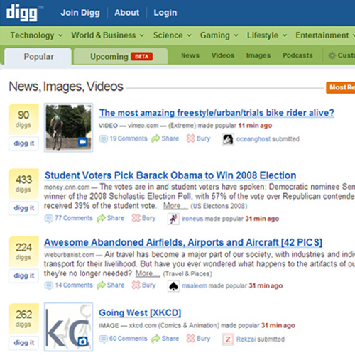
Web 2.0 aficionados don’t like traditional design because as they are quick to point out, guidelines are too rigid – grids, color theory, fonts, kerning, hierarchy of information, folds, etc.
Web 2.0, on the other hand, they say, is more fluid design because it focuses on philosophy, marketing, ease of use, greater texture, more color experimentation, and giving a more artistic flair while going for simplicity at the same time.
If this seems a bit confusing, that’s because it is. And for the designer who is trying to give his/her very best to a client, it is easy to fall into the “trap” of believing that everything traditional is pre-historic and will not attract visitors.
Certainly no one is recommending a return to Flash, but there are elements of traditional design that are absolutely stunning when done well, and that can make a website really pop.
A Look at Traditional Design Elements
Going back through traditional web design, there are certain elements that certainly stand out as common:
- Grid Systems – While not “fluid,” grids give organization to a site design and, quite frankly, it’s what you put into those grids that attracts and appeals, not the fact that there are grids.
- Color Palettes – Yes, traditional color is more subtle and follows functional color theory. However, many find this quite appealing, and even 2.0 reflects many designs with earth tones and subtle palettes. The difference is glossy buttons and bold contrasting color highlights that will capture attention. Added to traditional color palettes, these together make an effective combination of traditional and 2.0
- Attention to Detail with nice type, a balance of font variations and headlines, and good use of white space. In not using these elements, many web 2.0 designs do not capture visitor attention to important stuff – it has become lost in the textures, and the only way to pull it out from those textures is to add bold contrasting color. Sometimes that contrast can distract from the overall theme of the design.
- Use of Illustrations to Add Depth: While 2.0 uses textures to add depth, there are some stunning site designs that continue to use illustrations, as you will see from the examples below. It’s a matter of what best fits the client’s products and/or services, and the overall impression to be made.
- Unnecessary Elements Trimmed: In the really pre-historic days of web design, there was a lot of chrome. Traditional designed eliminated this in order to have sleeker, simpler looks. Hmmm…..isn’t that also a goal of 2.0?
- Important Stuff above the Fold: While some 2.0 designs are going below the fold, this is still not common, so there is not much difference here.
- Well-Planned Hierarchy of Information: This has generally been achieved by placement and type. If 2.0 does anything differently in this arena, it has been to use much larger and bolder type to differentiate relative importance of information.
- Buttons: Traditional design uses a wide variety of button types and colors; 2.0 has added gloss to buttons. Traditional design tends to put white space around buttons and curve their edges. 2.0 uses color and gloss to grab visual attention.
- User Interface: Both traditional and 2.0 designers are fully focused on user interface and experience. If there are differences here, it is that traditional design tends to use more text, although that text is highly organized in columns and rows and is hierarchical in presentation. But is also written to engage readers and is interspersed with media elements. 2.0 tends to use more graphics as opposed to text. And given the short attention-span of users these days, 2.0 may have the better idea.
Shared Goals – Sharing of Design
Traditional and 2.0 web design have the same goals – provide great user interface and experience, attract with rich and appealing design elements, and keep visitors engaged to the point of conversion.
Web 2.0 certainly has added some exceptional elements to design, especially with textures and colors, but traditional design elements cannot be ignored. Why? Because they still work!
Here are some examples of website designs that weave traditional and 2.0 to create stunning creations.
Digital Mash

A really striking design that is sleek and simple and demonstrates a great combination of traditional and 2.0. Traditional elements include the elimination of unnecessary element, nice color combinations and a good hierarchy of information. 2.0 elements include the large bold type, large images, and a phenomenal use of gradient.
Adit Shukla

Here is an example of a traditional illustration adding great depth to the site, and how cool is the sidebar bleeding into a river? Colors are nicely coordinated, and the black on white type is totally traditional. 2.0 elements include the transparent tabs and multiple ways for a user to navigate.
Pinch/Zoom

Pinch/Zoom is a design firm which is providing parts of its portfolio on separate pages with plenty of information about who they are – they specialize in mobile first strategies of web design. Traditional design elements include a great illustration with lots of white space below, black on white text and good balance o headline and type. It also has a really definite grid system. 2.0 elements include a simple interface, and the JavaScript portfolio pages within the site are very disciplined.
PixelMatrix

A very strong grid system makes this design highly traditional, along with obvious use of color theory, perfectly designed hierarchy of information, and enough white space against different color backgrounds. 2.0 design has crept in wit color gradients, good size fonts, and transparent tabs at the top. Another 2.0 strategy is multiple methods of connection, and that is certainly evident here.
Feelwire

This is a single-page website, but the rollover glossy icons at the top give the visitor all of the information necessary and are definitely a 2.0 element. Much of the rest of the site, however, is traditional – large amounts of white space with coordinated fonts and a grid layout. Simple and the perfect mix of traditional and 2.0.
Find the Right Mix
Rather than throw all of the traditional element designs, consider how they can be utilized along with 2.0 to get the design effect you are looking for, for each client. Design elements will continue to evolve, and already there is talk of 3.0 making 2.0 irrelevant. Nothing is irrelevant if it’s uniquely right.


Leave a Reply