

The power of call-to-action buttons shouldn’t be underestimated. This is probably one of the most effective conversion-generating elements on your site. Although it may not seem to be as informative as the main body of your page/article/headline, but is probably the last chance to motivate your visitors to take an action as they scan through your content. So, what are the secrets of the proper use of CTA buttons on your site or blog? How to make them bring you the desired results? Let’s find it out.
CTA buttons play a huge role in your online marketing efforts. In the contemporary highly competitive world, it’s not enough to create “good” content only. Every piece of information that you share on your blog or site should be compelling and appealing to your audience so that it triggers their emotions and motivates for an action. Text links within your copy can also help you encourage the readers to click. Still, call-to-action buttons are considered as the most effective clickable element of your site, which can also boost your conversion rates.
A good call to action is the one that encourages people to click. If it neither catches the eye nor triggers any emotions, then there is no point to keep it on the page. Believe it or not, but with some simple tweaks can turn a CTA button into a powerful lead generating engine that can grow your site’s conversions to a great degree. Before we dig deeper in investigating the major secrets of clickable call-to-action buttons, let’s cast a glance at the basic tips to consider.
Must-follow tips:
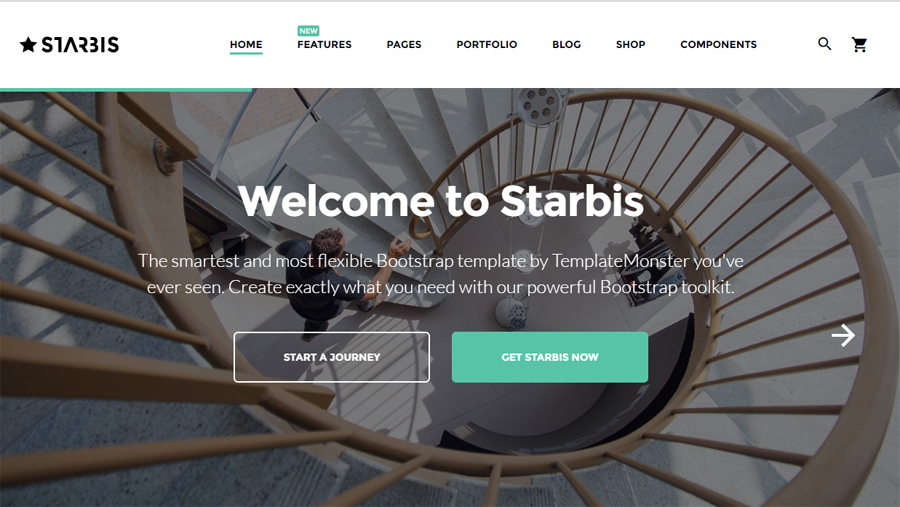
- Any CTA button that you add to your website should complement with its overall design and look contrasting to its background.
- The button should look natural within interface. The key factors that influence the way you need to present it on your web project are the industry to which you are related, your audience, the type of content/products you represent, etc.
CTA buttons come in different shapes, colors, sizes. They also feature different texts and positioning. Which choices are the most effective for your web project? Which ones will bring the desired conversions? Let’s now uncover the major principles of clickable call-to-action buttons.
Wording for CTA Buttons
When it comes to CTAs, texts are far more important than their graphical presentation. Call-to-action buttons should clearly communicate what action a person will make with a click. A word or a phrase that you write on it should trigger clicks and sales, as well as communicate the benefit. So, what are the right words to add to CTA buttons?
- Phrases starting with “Get…” communicate benefits that people can attain from your offer.
- To make people curious about what you are saying, you can enhance a CTA button with “See …” phrase.
- Those users who are thirsty for knowledge will find phrases starting with “Read …” appealing.

- People who reach your site with the primary goal to spend money will react on “Buy …” phrases.

Keep the copy short and easy to understand for a wide audience. You can also make call-to-action buttons more actionable while adding “Now” to the text. Moreover, you can enhance the buttons with widely-recognizable signs like arrows pointing at the button and images/cartoons/animations staring at it.
A message containing a CTA button converts 2.5 times better than the one featuring pure texts. The stats is taken from a study conducted by Adroll on Facebook back in 2014. Still, different buttons target different audiences. For example, a “Book Now” is more likely to convert better on travel sites, “Learn More” is for education resources, “Download” is for marketing experts interested in getting a new e-book, etc.

In order to make your business a success, you need to guide people to the places where they are expected to take an action. Before we move to specific practical tips, let’s consider the key ways how to “prepare” the audience for conversion.
- Resonate with the needs of your audience.
- Show a reason to take the next step.
- Communicate every statement clearly.
- Ask to click and explain what the reader will get after hitting a call to action button.
What Color to Use
Words and size of call-to-action buttons are not the only factors letting you communicate with your audience. Colors into which CTAs are painted play a predefining role as well. There is no one specific color that will appeal to different audiences in a similar manner. When thinking about the color choice, remember about the people whom you target. Are those males or females? Do you target youngsters or adults? Based on the way you answer these question, you can decide upon the most appropriate colors for CTAs. For example, call-to-action buttons painted in warm colors (like red and orange) will be more appealing to women. Men, in their turn, give preference to cool colors, like green and blue.
You shouldn’t forget about your business niche as well. If you work in the food-related industry, then combinations of red, yellow and greed colors will have an appetizing effect on your visitors. A general rule that you need to consider is making a CTA button contrasting to the content and backgrounds surrounding it.

Call-to-Action Button Placement
This is one of the most important factors that one needs to consider. Is one button per page enough? Maybe you should put more than two CTAs on one page? What is the optimal placement of a call to action button on the page? Well, there is no one fit it all rule. In order to find the best and the most effective placement of the button on your site, you need to run A/B testing to find out what solution fits your project the best.
One of the most popular recommendations provided by online marketers is that you need to include at least 2 call-to-action buttons to the text of your offer – 1 in the beginning after the introduction, and another one in the end. Thus, you can welcome people to learn more about the things that you are talking about as they land on the page and motivate them for a purchase after they have looked though the entire publication.
When placing a button above or below the fold, you need to make it accessible to a person when they are ready to buy. Thus, you can choose from the following options:
Place CTAs in navigation.

Put it at the bottom of the page for those people who will scroll the text to its end.

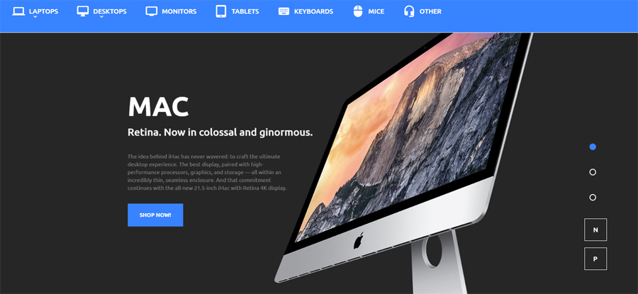
After ad copy for motivated users who will have a desire to buy after they read an advertisement. Here is a good example from TemplateMonster’s team.

On any other page of your site, which is frequently visited by your audience (like reviews, privacy policy, features, about story, etc.).
Use the Power of Animation
What we are talking about at this point is a hover effect, which can change the button’s color on the mouse-over. By changing its physical appearance, the call-to-action buttons looks far more captivating. A changing color keeps the users alerted that it is ready to be used. From the physiological point of view, a blinking button plays with a user’s mind and motivates them for an action.
Conclusion
Wrapping it up, we should say that only A/B testing will show what color, size, texts or whatsoever work better on your site. A call to action button is an integral part of your online marketing campaign. It should correspond to your own corporate style and stand out from the rest of the content provided on the page. A CTA button is like a final step that leads people towards conversion after they have learned the necessary details about your product/service. The position of CTAs on your site should stand out with its clarity and visibility. Simple, short urgent phrases will keep the audience alerted and motivated for an action.
We hope that you find the aforementioned tips and examples useful, and they will help you attain the desired conversion boost on your website.
Good luck!


https://uploads.disquscdn.com/images/cee944585ddb75d98851b99cd7c393804f5c777c38259feebb4b4a7c9c220283.jpg
Thanks for this tutorial! You made it so easy! Very informative post I found it is very useful me, Keep posting