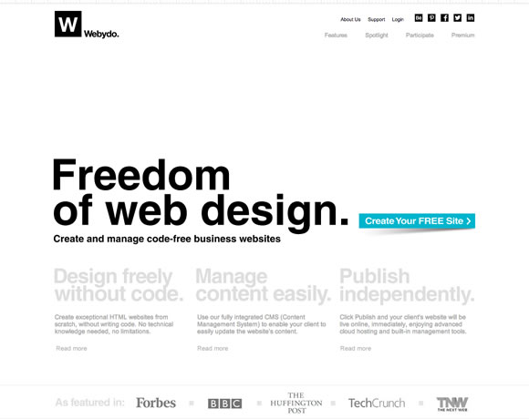
There are a many aspects of good web design, and whitespace is certainly one of them. Whitespace is the empty space around design elements such as images, text, columns, etc. It is that blank space that makes layouts clean and sophisticated. Remember that whitespace doesn’t need to be white, as long as it is blank, any color will do the job and will deliver a clean and elegant design.
InspirationWeb Design  Gisele MullerJanuary 13, 201411 Comments04.8k
13 Inspiring Examples of Whitespace in Web Design
Share
Gisele Muller
Gisele Muller loves communication, technology, web, design, movies, gastronomy and creativity. Web writer, portuguese/english translator and co founder of @refilmagem & @mentaway Twitter: @gismullr


Wow, this stuff is truly inspiring. White is so pure and beautiful but I have never thought that it can be used so wisely in web design. I will try to adopt bits and pieces in our projects at Designus.ie. However my understanding is that with a website as neat and clean as the above ones the whole emphasis and the power has to “fall” on the content. Otherwise the would look very empty..?
I love the clean crisp web designs
Whitespace is always good looking, very beautiful and ofcourse seo friendly I must say. I have have found much many whitespace design. Webydo is very smart design. thank you Muller for sharing this awesome design.
Hi Maria,
Utilizing your white space absolutely does give any website a certain crisp and clean feel to it, and allows visitors to more easily find the most important content on your website. Which, this is what matters, that your clients or visitors will quickly be able to navigate your site without feeling overwhelmed. A site won’t look empty with good content, you are right, but designing a page so that it feels full but not heavy and not empty is the balance and exciting challenge of any designer.
And thank you @Gisele and WDL for including us here as well.
~CID & The Webdyo Team
I’m honored to be in your list, thank you so much! I also love some of the other sites you have included, white space rules ;). Seriously, though… If it can be done well (and it can), whitespace can make the user experience SO much better and after all, we want people to actually be able to read the content we produce, right?
Thanks again for the inclusion, cheers!
Fantastic list and some great inspiration. Thanks for posting.
I love how they look, I reckon whitespace is important and also provides a clear hierarchy of elements, good for UX.
White space design is definitely more popular now. I really hate crowded websites… a really hate it when clients DEMAND I’m cram every single but of white space up. Horrid. Thankfully clean design is becoming more popular so those type of request are less and less common.
Muito bom teus posts. Todos =)
Absolutely love the idea of using white space to focus a visitors attention on the important parts. Web sites these days are so over crowded, you dont want to read more because you are tired of reading.
I shouldn’t be the one talking though…I don’t like wasting real estate and believe that every pixel counts, when actually it doesn’t. The only thing that counts these days, is to effectively deliver you message.
Thanks for this list! I love how designs nowadays are filling up with more white space to focus on their content and user experience. It’s great to see that designs are maturing and evolving as well. I agree with Bianca: clients should take heed into using white space as separation to display powerful content and increase readability for their customers.
Kudos!