
You would naturally like to see that your website will look good on every browser and device. Especially so if it’s an eCommerce website.
The following responsive web design examples are designed to provide you with information you can use to accomplish just that.
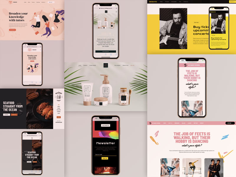
There’s more than just a few specifications and requirements to be attended to in today’s competitive climate; particularly in the area of responsive website design.
Meeting each requirement and checking everything twice to make sure you’ve left nothing out can be a daunting task.
It’s important however to make every effort to do so. According to data from StatCounter, mobile usage now accounts for more than half of all website traffic.
Yes, you can still focus primarily on desktop design, but don’t expect to get anywhere near the traffic responsive design allows you to experience.
Thankfully, a top-of-the-line WordPress theme like BeTheme makes it almost ridiculously easy to meet the myriad of technical requirements and specifications you might otherwise tend to consider to be somewhat of a bother.
You’d make Google happy too. Responsive, mobile-friendly websites have a habit of getting the high search rankings website owners covet.
Responsive web design is imperative.
Applying mobile design rules and specs doesn’t mean totally ignoring desktop usage. Go about it right and you can enjoy the best of both worlds – as you will see in the examples presented here.
Let’s take a closer look at how to go about making good things happen.
Responsive web designs that encourage leaner desktop experiences
There are some that think that good design means making use of every pixel. Quite the opposite is true when you are designing for both desktop and mobile. The more informational content you try to cram onto a desktop page, the harder it will be to meaningfully display that page on a mobile device.
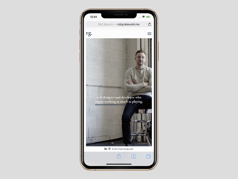
Rather than worry about “wasted” pixels, designers will benefit from creating simpler and more efficient experiences, as is the case with designer/developer Rob Grabowski’s site.
It looks like this on a mobile screen:
And like this on a desktop.
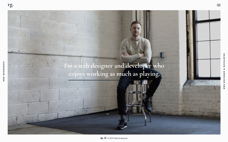
The lesson: consistency in design promotes seamless transition when viewing on one device, and then on another.
Mobile web designs that improve the decision-making process
Online users are occasionally (perhaps quite often) susceptible to experiencing information overload. A website page featuring an overabundance of information can actually make it more difficult for a visitor to find what he or she is looking for.
Good responsive design practices significantly mitigate information overload problems. As the screen size shrinks, it becomes easier and easier to find what you’re looking for.
BeRepair, one of BeTheme’s 500+ pre-built sites, provides an excellent demonstration of this.
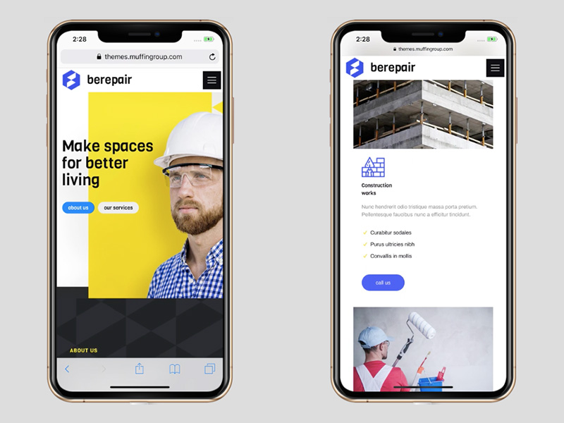
Note how a responsive layout makes it much easier for a visitor to avoid distractions and focus on information of particular interest.
This design concept works with the BeRestaurant pre-built desktop site as well:
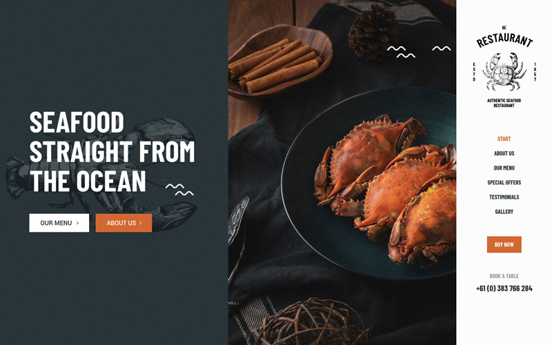
This desktop version is obviously an appealing design for a restaurant’s website.
What’s missing in the mobile version? Very little, if anything.
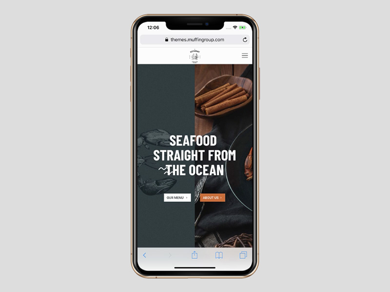
Granted, the menu on the right appears to be “missing”, but rather than trying to cram it into the mobile display it has simply been tucked into the top-right hamburger menu icon, from where a visitor can scan it without any distractions.
Responsive designs that eliminate the excess
Think about the kinds of paintings you’ve probably encountered in a museum or an art gallery:
- The landscape paintings often feature a central focus surrounded by beautiful details that enhance rather than detract from it.
- Portraits on the other hand typically have a singular focus; sometimes surrounded by intimate or relevant details.
Think of a desktop display as being akin a landscape and a mobile display as more like a portrait. To make the transition from desktop to mobile it’s usually necessary to maintain the central focus while trimming away many of the beautiful surroundings.
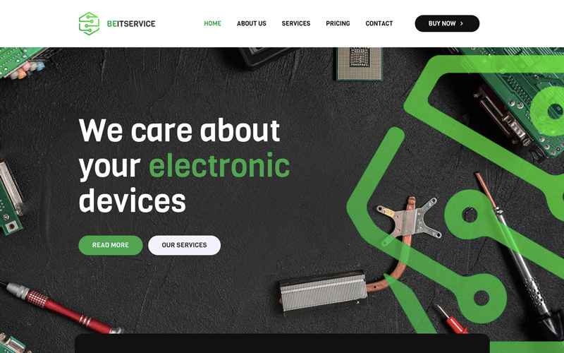
Which is what BeITService does.
First, the desktop display:
Next, how the page is displayed on mobile:
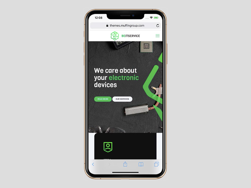
Although the original image is not replicated in full, nothing of real significance has been lost. The message being conveyed is front and center and unaltered.
Culturally Connected takes a somewhat similar approach:
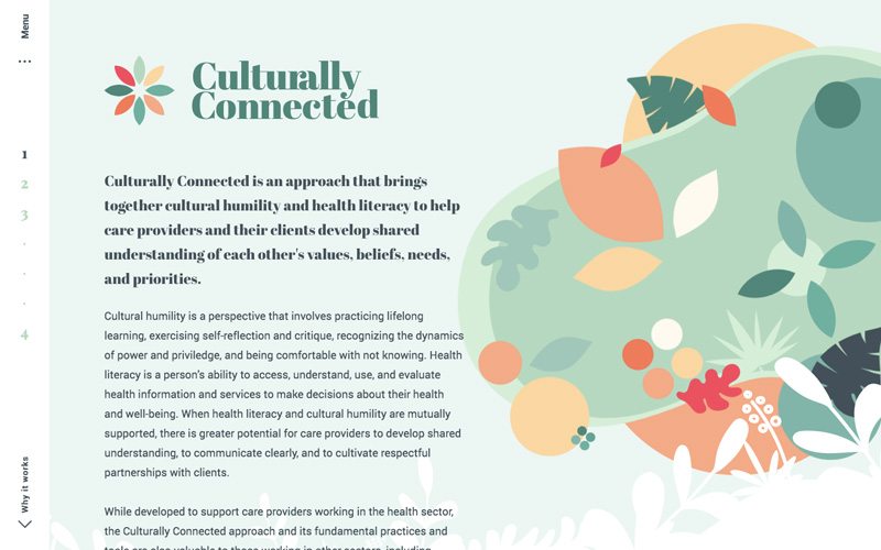
Like in a landscape painting, the central focus (the message) is surrounded by a beautiful background graphic.
On the corresponding mobile display, you get this:
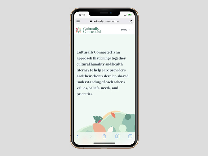
The portion of the graphic that has been retained is moved to the bottom, where it nicely complements and underpins the main message.
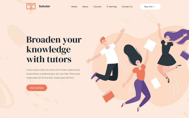
BeTutor is another useful example. Its desktop version looks like this:
Center the graphic below the main message, and you get the mobile view.
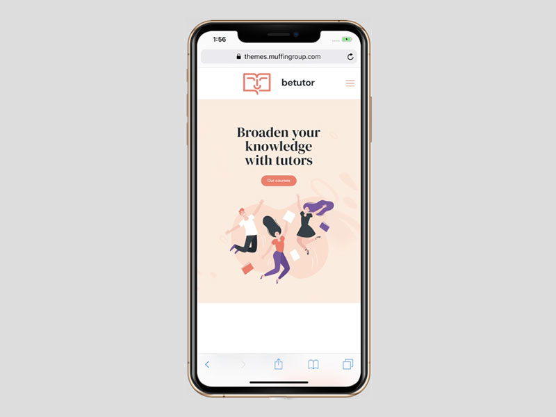
The mobile view remains uncluttered and the primary subject matter has been retained.
Responsive websites that leverage their space
Although reducing desktop display content is often required when designing for the small screen, using different ratios to leverage the available space can be a good option.
1987 Masters provides a good example of this leveraging approach.
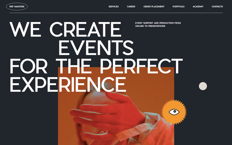
With a bit of astute leveraging, content has actually been added in the mobile version to provide the visitor with an option to learn even more about what the company has to offer.
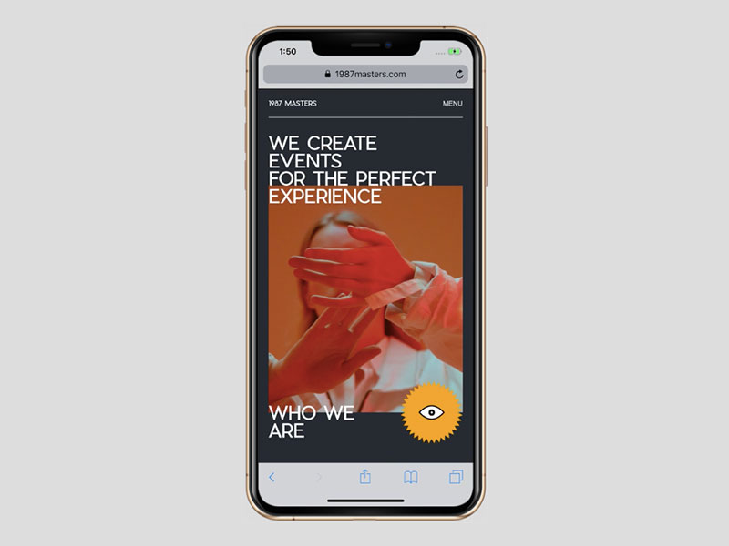
As you can see, a mobile design doesn’t have to show the same or less content to work well.
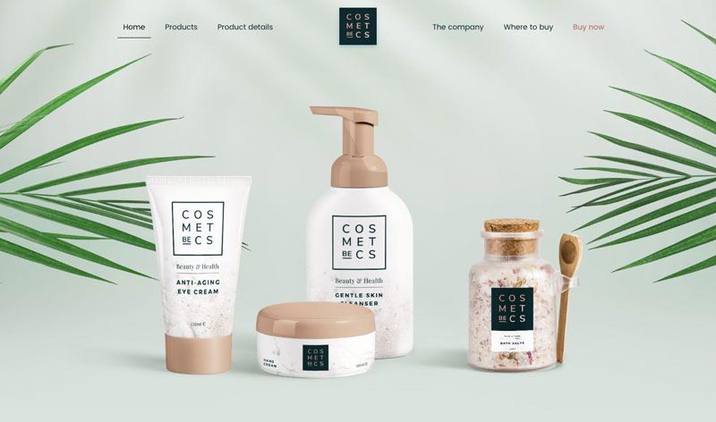
Designers have the option to use this greater ratio of vertical space to their advantage; like in this example of BeCosmetics.
The desktop view:
The mobile, having more vertical space, allows the designer to show the button inviting the user to explore further, together with some added introductory content.
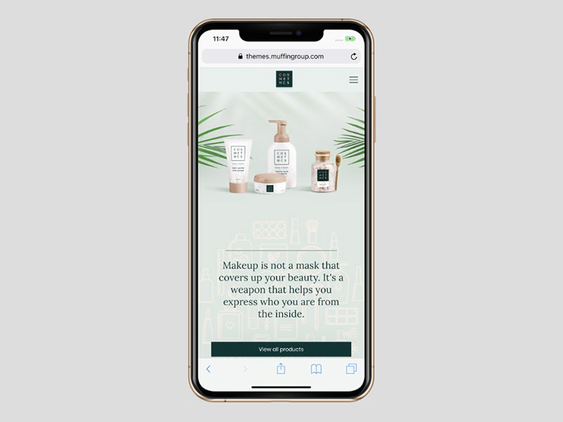
As you can see, less space doesn’t always mean the mobile user has to be satisfied with less meaningful content.
Responsive websites can also exhibit enhanced readability
When laying out a desktop website design you sometimes have to be careful about how much information you intent to show a visitor at one time. Putting too many words on a line or cramping letters together can make your message less readable and therefore easier for a reader to simply skip over.
Clear, easily readable text balanced by supporting visual elements should be the goal, a good example being the BeDanceSchool site:
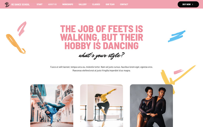
This is a good desktop layout. The eye-catching images nicely support the text, but there’s simply too much information for a mobile display to handle without having a negative impact on readability.
This is how the message can be effectively presented on mobile:
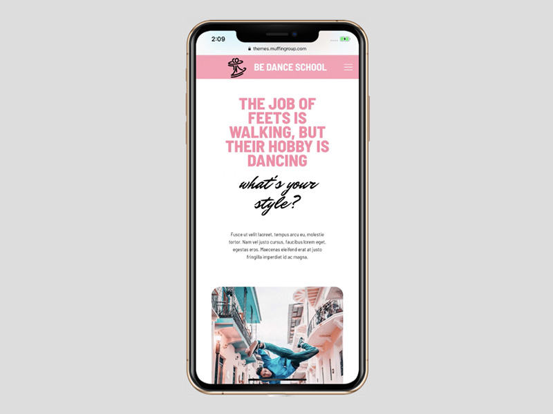
The pared-back mobile design is just as readable and equally engaging. Proper uses of font styles and sizes are important as well; as Base Coat demonstrates:
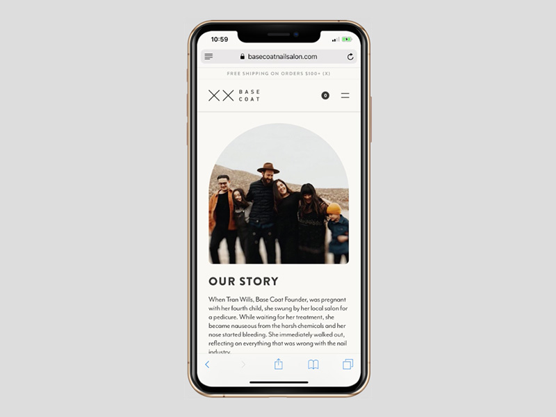
You do have to be careful about using the added vertical spacing for your text. On mobile its important that the visitor can see where it ends without having to scroll down.
Mobile site examples in which the visual content is spotlighted
The effectiveness of storytelling is well known, and visual storytelling elements can be made to fit hand in glove on mobile.
Visitors see this BeBand website on the desktop:
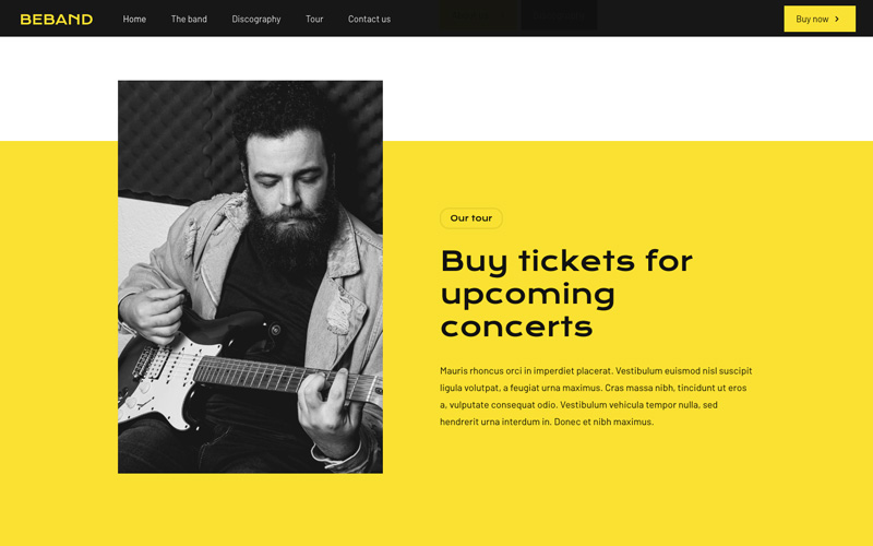
While on a mobile display they see this:
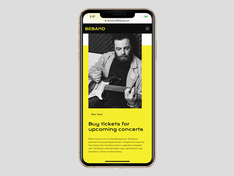
Everything is there; just nicely rearranged.
Videos also work well on mobile. First-time visitors to The Scott Resort are invited to watch a video.
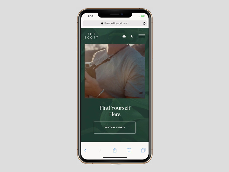
The type of device the visitor is on doesn’t matter since the video will automatically conform to the width of the screen.
Here is what it looks like on a desktop:

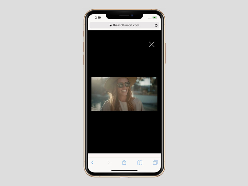
And here is how the same video appears on mobile:
With a mobile responsive design it can be easy to let your content adapt to a device in a way that allows users to have the experience you want them to have.
Examples of mobile responsive sites that have been designed to collect more leads
Try as you might, no matter how much traffic comes from your responsive mobile device designs, desktop displays still account for the majority of user conversions.
Don’t lose heart. That will change, and there’s nothing to keep you from creating responsive designs that will capture leads and improve conversion rates.
Check out this pre-built site for BeClub:
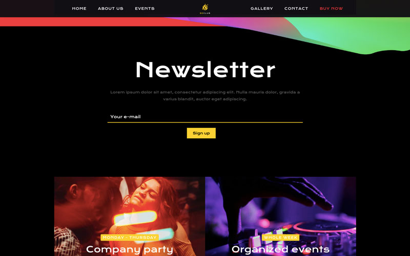
The “Newsletter” signup section is attractively highlighted and practically begs visitors to sign up.
You’ll naturally want to get the same visitor response on mobile. As the following example illustrates, that will not be a problem:
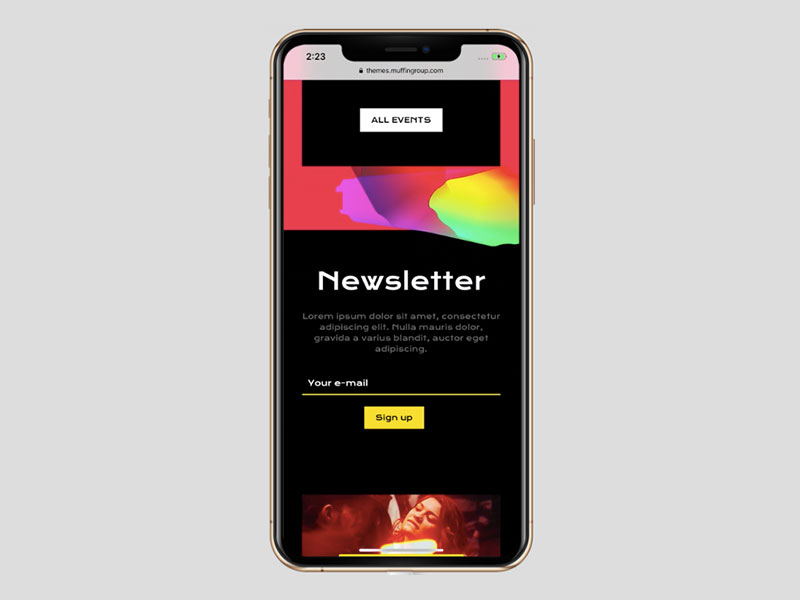
If anything, the mobile version might be more effective than the desktop. Making it easy for a visitor to get on your email list is a good way to increase conversion rates from users who prefer to work with mobile devices.
Responsive web designs that can make winning a habit
What do WordPress users look for in a theme that can help them design their website? They look for:
- A flat or shallow learning curve and ease of use
- Cost effectivness
- Features that adequately address their needs
- Flexibility and customizability
- Overall design quality
Not every WordPress theme has each of these qualities, nor does every theme adequately address website responsiveness. Some are great for desktop users but fall flat with respect to providing mobile users with a satisfying experience.
BeTheme is different. Every one of its 500+ pre-built sites has mobile responsiveness baked in.
BeTheme has all the other design and performance features WordPress users look for, so when you use it you won’t be wasting time worrying about how to make your website emulate the responsive designs we’ve featured here.
You can let BeTheme do much of the heavy lifting and devote your time to getting your new website up and running and in front of those eager to see what you have to offer.


Leave a Reply