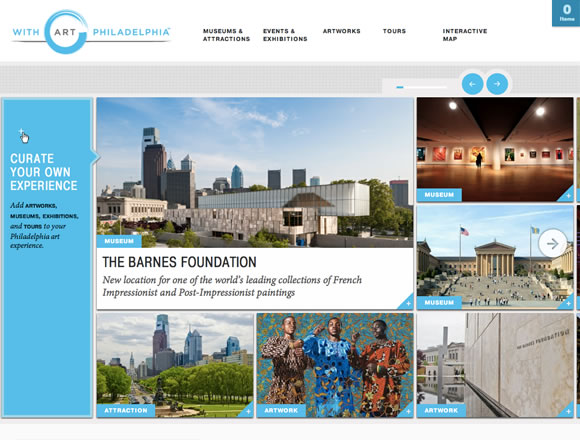
Last week we showcased examples of Minimal Color Usage in Web Design, and today, to keep you inspired about color options and combinations we decided to gather examples of beautiful colorful websites. We will show here that you don’t need a rainbow or super bright colors to add a nice colorful touch to your page. From colorful headers to images, textures and typography you will see a lot of different approaches to color usage in web design.
Inspiration  Gisele MullerJune 18, 201213 Comments04.6k
21 Beautiful Examples of Color Usage in Web Design
Share
Gisele Muller
Gisele Muller loves communication, technology, web, design, movies, gastronomy and creativity. Web writer, portuguese/english translator and co founder of @refilmagem & @mentaway Twitter: @gismullr


Great color used in all of these examples, color really brings things to life on the mobile web *biztag
Thanks for sharing, nice inspiration for great webdesign!
Nice! Carnation Group, Modo Luce and Matteo Zanga probably the best on that list. Although Matteo Zanga looks familiar – design wise…https://www.adhamdannaway.com/
Nice examples, thanks. We always think that colour usage should be minimal- a single splash of bold colour really makes a design work.
ooooooo, love Impero!
Good examples! I like this post with more inspirations. Il ike design like “yoke”
I don’t no how you continue to find these…. but wow, amazing. What other sites are you browsing daily to find some of these designs?
@ Gisele Muller : i am not sure, did you noticed the most of the site using Blue in any part of their site? Actually Blue is a trusted color in web. Blue, white, green, etc. are standard and simple. If you look around and check carefully any of these color are exist in each popular site.
whatever, i would like to give you thanks for this post to share with ut.
I like it. Nice color harmony.
These are excellent examples. Great variety!
Personally loves how Viens la uses robin with the green!
Awesomely done!
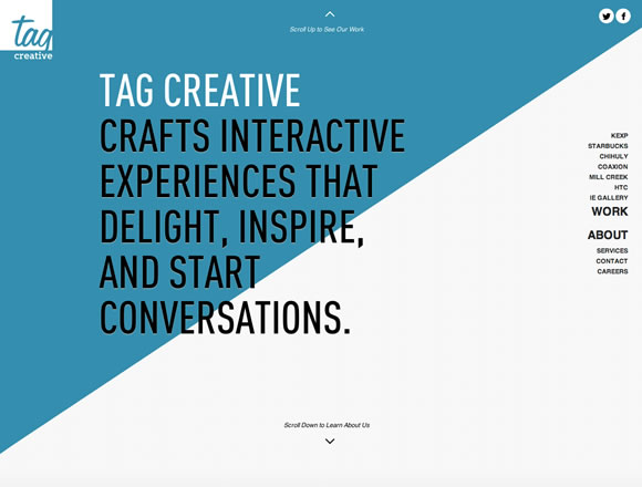
Thought this was a great article and it includes some of the best sites I have seen in a while. I thought every site you have included has something great about them, not only with the use of colour but the design and interaction on a lot of these sites blew me away. The site that stood out for me from the collection would have to be the Tag Creative site. I thought the use of colour was spot on and really helps break the areas of the site up and gives it a wow factor. The use of colour mixed with the techniques used on the site does make it stand out. I did also really like the Everything you need to know about Design for the bold use of colour. Great article and this will be one I will be going back to time and time again for when I am looking for inspiration both for design and development.
This article made its way into a discussion group I belong to on LinkedIn. Having read through the article and refreshing my memory on color principles in web design, I thought that my site could use a makeover. Thank you WDL, very good read.