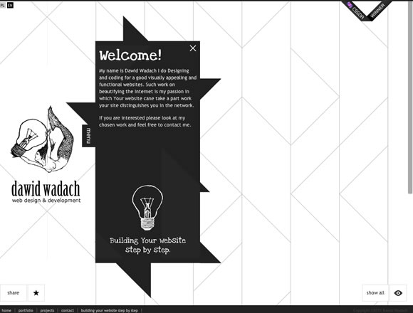
Last week we showcased a list with 21 Inspiring Examples of Dark Colors in Web Design, and this week, to show you a different approach on color choices, we decided to go for a list with examples of websites using mainly light colors on its designs. Color is indeed a really important element of web design, so nothing better than showing different approaches to keep you inspired.
Inspiration  Gisele MullerFebruary 6, 201215 Comments04.4k
21 Examples of Light Color Usage in Web Design
Share
Gisele Muller
Gisele Muller loves communication, technology, web, design, movies, gastronomy and creativity. Web writer, portuguese/english translator and co founder of @refilmagem & @mentaway Twitter: @gismullr


The first one is done really nice! This is my taste 🙂
All the designs have unique attractive look, and I really like the way these designers adopt the concept on each design, Surely they do have great skills of web design and development.
La Piuma has a beautiful design, love the hover action over the birds, the border style to the container, the grunge graphics really work well with the colour scheme of the site and the colours of the bird graphics.
I really dislike the Kipling website, very disjointed and no flow to designs. Although there are some clever little bits going on with the joins of images, it becomes lost with the size of it all, and even on my fast connection it is laggy.
Use of typography in Nicole Cozzolino website is brave, and verges on not working, but somehow it does. Bold type on a light background really makes an impact, and the content of the site still comes through well.
Thanks for sharing.
There are some nice websites showcased here. Thanks.
Great showcase, some really nice examples. La Piuma really like showing off their award ribbons though don’t they?
Really like the colors utilized in the different pages of the ‘girl with a camera’ website. And the simple, very clean design is just perfect. Thanks for sharing the inspiration Gisele.
Thanks as always for posting fresh ideas!
these cream and light color scheme are so cool … it gives websites a modern vintage look … very nice !
Some interesting designs, thank you for the showcase! I liked rainstarboutique – minamilistic design with unexpected and interesting animation effects in css and js! rethinkstoraenso was also interesting as the design is creatively incorporating their product and what the company is about. Thanks for the share!
Such a Beautiful collection of web designs, this is Nice to see them.
This is magic collection… I love so much this kind of site. Good images with use
of the light colours. So fresh and clean. Thanks for sharing and inspirations.
Loving The Work Cycle site!
Cool examples:) Light colored designs are extremely stylish mostly.
https://www.kerem.co is pretty awesome too, would fit in this post.
Hi Gisele Muller..Really nice layouts nice design and nice color schemes…
Youe collections are “AWESOME”.