Responsive design is something a lot of designers talk about. And considering the importance of responsiveness and all the buzz around it, it’s impressive the amount of websites that are still not responsive. By now, with the amazing growth of mobile usage, every single website should be responsive to be able to attend to every user’s “screen size needs.”
Today I gathered some fresh examples of responsive sites to reinforce the importance of adapting your layout to every screen. Probably you will recognize a few websites from past lists, but they are so good that they deserve to be back here. I used the mattkersley.com/responsive tool to check the response of each of the websites showcased here and I decided to show you the iPhone version of them. Check out the examples I gathered and let us know your thoughts on the subject.
British America Household Staffing
Designed to Move
Fhoke
Evolve
Digital Atelier
Andrew Lohman
Yaron Schoen
Friends of the Web
Simon Foster
Nudge
Johann Lucchini
Roy Barber
Face.Works.
Lab Fiftyfive
oak.is
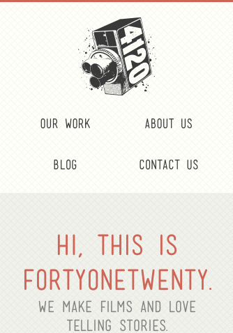
FortyOneTwenty
Colorkite
Louis Gubitosi
Substrakt
Julie Lavergne
The Brigade
Responsive Design Books
Responsive Web Design by Ethan Marcote
Implementing Responsive Design: Building sites for an anywhere, everywhere web (Voices That Matter)


screen size needs ! awesome collecttion! thanks for share!
Thanks. 🙂
nice Gisele…really good examples here, thanks
Gisele, you bring in very useful information every now and then. I really appreciate your hard work that you put in each of your articles. As far as responsive web designs are concerned, Yes! it’s the hottest topic being discussed every where.
This article would be VERY handy if you actually presented what framework they used. Might get hints by looking at the code or simply asking them. i.e. Foundation, Bootstrap, custom, etc etc
Example:
Substrakt: WordPress, 1140 CSS Grid
Very few of these sites have much actual content on their main page — they are little more than menus. I’d like to see examples of sites with ads and with lots of content out front.
Continuing that thought: My point is that “responsive design” that robs big-screen users of the content they’re accustomed to is more “subtractive” than it is “responsive.”
Noticed a few of these sites are using foot and inch marks (instead of apostrophes and quote marks) in main headings. Drives me crazy.
Gisele. Thank you so much for these examples. A memorable collection. Will check them again in 5 years time!
Good designs, but the list is almost entirely agencies. Any new ‘real’ examples? Like, client work that makes money?
Hi Gisele. Some great looking responsive sites you have short listed. We find that most of our clients want a mobile version of their site so most of what we design and build is responsive. It really took off last year and 2013 will be the year responsive comes of age. On a side note we built a free tool too to assist designers in viewing their responsive site and also to assist in showing their clients. We hope you like and maybe you could give Dimensions App a mention?
Gisele,
If I may, I’d suggest our own site as an addition to the other great examples presented here: https://www.brandsbyovo.com
This is a modified implementation of Bootstrap on a WordPress CMS.
Excellent work! Thank you for the “food for thought.”
Why is it that you just show a bunch of agencies as examples? there is nothing worse than supposedly seeing an example of something when you use only creative agencies who’s design challenges are minimal. Why don’t you show examples of responsive design in sites that actually have some content and real design problems to solve, not just cute little sound bites and pictures of hipsters.
Same thing happened when Flash was the trend … loads of clever Flash-based sites, by companies making Flash-based sites.
You know, I think most people are failing to realize that responsive websites will probably take the place of apps in 2020. Think about it … why create 3 different apps plus a website when eventually all the functionality and looks you need will live in one place?
I share Ann & Wouter’s sentiment here, but maybe I’ll present it a bit differently. While examples of responsive design are always great to see, the examples become less valuable when they reflect difficult real world challenges, like a large e-tailer or content site. I think case studies like the Guardian’s, Mashable’s or even Starbuck’s responsive are more valuable. Those are sites with lots of content, commerce and more reflective of the challenges faced by clients of the agencies listed.
awesome collecttion! Some sites I have never seen. Thanks
css-tricks.com is a good example of a full site that utilizes good responsive design. Somewhat obvious that it was created by developers and not designers.
I liked your examples. Thank you. While, responsive design may be a topic of discussion for a lot of designers, I agree a lot of sites have not adapted to using it correctly. There are still sites I visit with my phone that look absolutely horrible. It makes me leave the site. I really think more web designers have to take the initiative to get with the times, because believe it or not, I know many people who don’t have a computer and just use their phones.
Our latest website redesign focused heavily on responsive design. We feel it is a very important new addition to what a website should include nowadays. These designs show really well how excellent responsive design can create two completely different views for different users.
The Digital Atelier design particularly shows this well. The difference between the two designs really shows how the content needs to differ depending on the viewer and their device.
‘Simple is beautiful’ 🙂
Excellent post. I certainly love this site.
Continue the good work!
Very cool website in Fortyonetwenty – well done! And great use of space and Font in Johann Lucchini –
Alex
Isadora Design – Professional Web Design Company
Love this collection of inspiration! 😀 There’s so much to learn about developing websites for responsive design. Thank you for these examples!