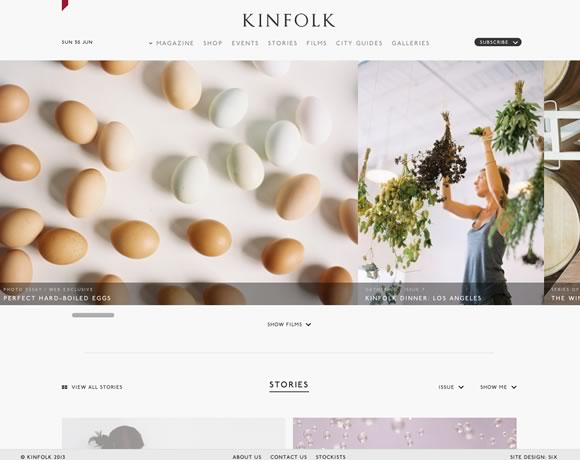
Back in April we showcased 21 Beautiful Examples of Big Images in Web Design. Since there are a lot of new websites using big images, we decided to gather a new round of inspiration around this trend. Once again you will be able to see websites using large and beautiful photography as backgrounds, headers and much more. Beautiful images get a lot of attention and are certainly a nice way to spice up your design. So check out these excellent examples and use them as inspiration for ways to use big images in your next project.
Dickson Fong
Dassel Und Wagner
The Kings of Summer
Squarespace
Big Data
Carles Palacio Photography
Streng Design & Advertising
MailChimp
Polly Stanton
M2Film
Charles Williams
Papiroga
Chesterfields 1780
W Eyewear
Get Winter Ready
Big Cartel Shop


Here’s another one for you: https://www.mobilewebdesignwolverhampton.co.uk
Many are very beautiful, but I think sometimes the full screen pictures have a detrimental effect on clear, consistent navigation.
I agree with you on that mate! Sometimes full screen pictures would definitely affect the consistency and clearness of the navigation.
I guess big picture websites are best to balance minimal design. Some can even use it for e-commerce websites too.
It is probably up to the UX/UI designer to make sure that big images on a website does not in any way obstruct the experience of the user, the selling point of the product and service of the website and message that needs to be delivered by the website.
Also designers should keep in mind to make sure that the images are properly optimized for the web and not make the website speed slower.
He and She Photography website looks really cool with big image background.
Thanks for sharing these cool ideas. Now I have something to base my designs with as I was inspired by the designs in this blog.