It’s always interesting to see another designer’s take on a famous website, app or even physical product. Different designers add their own personality and style, and often when designing a concept come up with novel and interesting ideas. To help give your inspiration a boost, we’ve brought together a showcase of some of our favourite redesign concepts.
It’s important to bear in mind that these redesigns aren’t necessarily the right choice. Sites and apps exist for a specific purpose and a lot of factors go into design decisions – often, not just aesthetics. Having said that, each of these designs brings a new way of looking at existing sites – whether it’s by simplifying and tidying up their appearance, or approaching them from a different design direction. We hope you find the showcase an interesting source of inspiration and that it helps with your next project.
Andrew Kim’s Microsoft Rebrand
Andrew Kim created a redesign concept for Microsoft in 3 days, with a drastically simplified and unified brand that could be used to tie both software and hardware together. His rebranding exercise brought him a lot of attention, and obviously impressed the team at Microsoft, who hired him shortly after.
BBC Me
BBC Me is a concept designed by Dmitrij Paskevic for a 2013 competition by D&AD. The idea behind it is to redesign the BBC News site to be much more personalised. Dmitrij describes it as being “a live, personal and dynamic news feed that is tailored to your needs”.
Amazon.com
One thing that has always bothered me about the design of Amazon is the hugely cluttered product pages. The current design makes use of very little white-space to separate out different sections – but this has been taken into consideration with Yanis Markin’s concept redesign. Bear in mind – while this is (in my eyes) much more visually pleasing, it may not do a great job at other things like focusing on reviews, or other things that users find useful. Still – it’s worth looking at and viewing as an alternative to how Amazon could handle things, if they so desired.
YouTube
This redesign of YouTube is a beautiful example of giving content a bit more room to breathe through the use of white-space. Not only that, but the navigation has been given a makeover, and achieves that tricky balance of simplicity with an easier to use navigation.
Wikipedia
A lot of care and attention has gone into this Wikipedia redesign concept. Created by design agency New, every detail has been thought through – including a radically simplified and less cluttered visual interface, and a significantly improved framework for editing Wikipedia entries.
IMDB
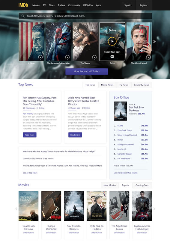
IMDB, the Internet Movie Database, has been around for a particularly long period of time in Internet years (launching in October 1990) – and so it’s current design, while useful, is still quite heavily rooted in it’s past. This concept by Bart Ebbekink is a beautiful redesign that declutters the current layout, and presents relevant information elegantly and cleanly.
Given the popularity of Facebook, the social network is no stranger to receiving an unsolicited redesign or two, but this design from Luke Taylor is one of the most radical departures from the current site. Turning the news feed into an almost Pinterest-esque approach, the timeline is completely reworked. While it’s not necessarily a more usable direction, it’s always interesting to see a new take on an existing design, and this is definitely an approach that’s out of the ordinary.
Yahoo.com
Yahoo – known partly for it’s search engine, but now perhaps more prominently for it’s news and content – recently redesigned it’s US site, but in a move that was described as reasonably unimpressive. Dan Petty called Yahoo’s official redesign a “mix between Craigslist and an old Google design”, and created the above concept redesign as a suggestion for a different aesthetic direction.
Skype
It’s not just websites that have concept redesigns created for them. The above example is a super-minimalist redesign of the Skype desktop app, by Vivek Venkatraman. The simple, refined approach has an iOS 7 feel to it. While it’s not necessarily as usable as the current app, it’s interesting to see what it would look like with such a stripped-back approach.
Spotify for Mac
Streaming music service Spotify is a fantastic product, but the desktop app could do with some love. Designer Maxwell Barvian has created a concept for how it could look, with a focus on usability and an uncluttered, easier to navigate interface. The overall result is highly polished, elegant and refined.
Have you found any examples of creative, interesting and inspiring concept redesigns? We’d love to hear about them in the comments.


Good evening Dan,
Inspired by Andy Rutledge’s beautiful baseball redux
https://andyrutledge.com/baseball-redux.html – I recently undertook an unsolicited redesign for the main theatre venue in the city where I live in England (hopefully you won’t object to a little self promotion!)
As you can see the original is not up to much – https://www.readingarts.com/thehexagon – but the main premise of my take – https://www.behance.net/gallery/Hexagon-Reading-redux/9503877 – was that A) it’s been left behind by competing arts venues in other surrounding towns and B) I wanted to create something flexible that depending on the type of event that was being performed.
Many thanks & kindest regards
Simon Cook
Pretty good redesign examples, but unfortunately, sometimes just a beautiful design does not mean a good ROI, conversion rate or, simply what the users want. It’s like a beautiful painting, it’s beautiful, but when it comes to a website that a lot of people will use, it needs to be what the users want, not what de designers think it needs to be.
I really love both the IMDB and Amazon redesigns. While I don’t use either of those sites regularly, from an aesthetic point of view, they are much improved! I can see how the Amazon update would cause some issues due to the fact that it is hiding much of the presented data under tabs, but it is a very well laid out grid and worthy of showcasing.
This is a great example of an article that presents interesting ideas. But the article would be much stronger with proper editing and proofreading. The contraction “it’s” is misspelled in several places, such as “…and so it’s current design.” That should be spelled ‘its’ without an apostrophe.
I agree with Rodrigo. Also add that people have become accustomed to the current designs of famous websites. Many people simple aren’t ready that, for example, their favorite Facebook will look different tomorrow. This can push away part of visitors and they can go to Google. But Amazon website really needs redesign. In my opinion it remains in past century. And offered design of Amazon in this collection is quite good as for me.
I like the YouTube one. Nice and clean design, easy to navigate. Lot simpler and much better interface than YouTube recently has. I agree with you guys about the redesign concerns, but if you think think back just how many times Facebook or bigger brands have changed their interface in the past, you will realize that most changes causing trouble only for a couple of days, no longer. People need to get the new interface used to and it always takes time. If it was an issue, no one ever would change the interface and would stick to dated, old, bad looking websites. Shouldn’t be afraid of changes. Change is good.;)