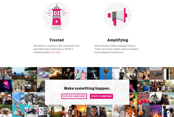
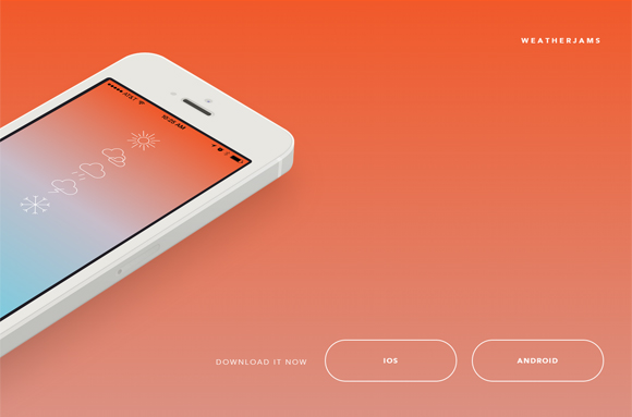
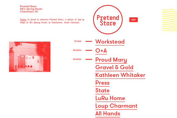
Although the first half of 2014 has gone by, today we can see new design trends that appeared in web design this year. “Ghost buttons” are those transparent, empty buttons that have basic button shape, but are bordered by a thin line. Some of these ghost buttons could be interactive, – while click over it, the button may become non-transparent, but white or some other color highlighting with the background. As a rule, designers use sans-serif light fonts for wording.
These kind of buttons are called ‘ghost’ due to their transparent nature. They’re transparent as ghosts, at the same time they grab users’ gaze at once and do not overload design. You may find ghost buttons on a wide variety of sites. The best ghost buttons look on websites with large-scale background, and flat, minimalist design. Scroll down to see 25 awe-inspiring websites using ghost buttons I put together below.


Great roundup. While there is a clear trend in design here and it seems not much to clearly establish brand identity (at an initial glance), I love the direction in style and execution of the design. All inspiring and exciting. Thanks for posting! 🙂
These are so great, thanks for sharing. Triplagent shows a great example of awesome responsive states. Lots of inspiration here, thanks again. I always seem to find something interesting on this site to start my day out right.
I’ve noticed that modern buttons designs are all very simple and all very similar. If you check some older button inspiration posts (pre 2012) there used to be a LOT more variation.