The importance of a website’s navigation shouldn’t be overlooked. After all, without it, one wouldn’t make it much further than the home page. That’s why designers spend extra effort coming up with ways to make the navigation menu not only look great, but also easy to use. For your Monday inspiration, we’ve rounded up 25 examples of beautiful and inspiring navigation menus.
Beautiful Type
Also some nice colors and type here. Social menu on the header and everything else on the left side.
Drupalcon Denver
Single page layout with footer navigation menus that will take you around.
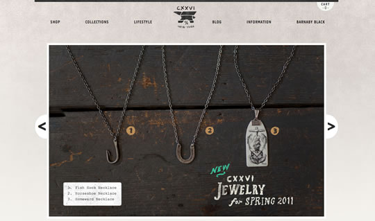
CXXVI
Browse around using the header menu or the image slider, really nice and clean.
Unfold
Another beautiful single page layout with a nice and smooth header navigation menu to take you around.
Tinkering Monkey
Beautiful layout! Nice and clean menu, colors and typography.
Shout
Nice colorful layout with a basic straightforward menu. Also a nice typography choice.
Sellected Studio
Really beautiful layout and navigation. Color combination and typography are really elegant.
Webvisionary Awards
A strong and cool single page layout. You can scroll around or use the header nav menu.
David Desandro
Nice layout based on shapes and typography. Header menu using pure typography and hover effects.
TEDxPortland
Another nice single page layout with footer navigation menus that will take you around.
Bluecadet Interactive
Beautiful and elegant layout with nice navigation menu that ‘frame up’ when you hover it.
anCnoc
Clean layout based on typography and beautiful images. Header and footer menus to help your navigation.
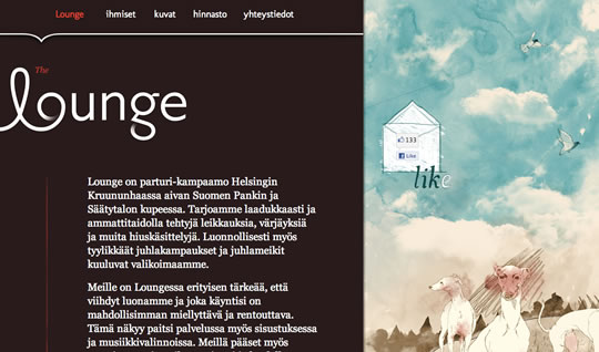
Lounge
Delicate single page design with typographic header menus.
Gene’s Sausage Shop
Beautiful typography and style on the navigation menu, and it actually looks like a real menu. 😉
Luke Dorny
Nice layout, colors, typography and menus. I also really liked the blurred effect when you load the page, check it out.
Visual Republic
Elegant single page design with a side menu that follow you where you go and help you navigate the site.
Wigolia
Beautiful layout. Elegant choice of colors and typography. Smooth navigation menu with a fade hover effect.
Facio Design
Beautiful layout and colors. Nice framed menu with hover effects.
Collaborative Fund
Another nice single page layout with smooth navigation menus.
The Coastal Cupboard
Nice layout, colors, type and images. Elegant and simple navigation menu with hover effects.
Ferocious
Header menu based on typography and shapes.
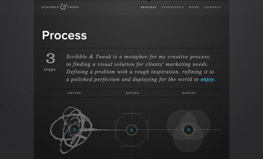
Scribble & Tweak
Super beautiful single page layout with smooth and clean menus.
Don’t Throw Batteries
Big and simple – a good combination for an effective nav.
Nordkapp
Yes, another single page layout with smooth navigation. 😉
Interlink Conference
Nice colors, type and menus.


Well, they are good examples but none of them are ‘inspiring’.
Great stuff, thanks for sharing.
Very nice examples, I especially lijke ‘Visual Republic’. Thanks
Some very creative ways to display your website’s navigation. I think the web’s come a long way since using just static text to move around one’s site.
Well done everyone.
Lots of great examples, as usual, thank you.
Personally though, I’ve never been keen on using multiple typefaces on a page (eg Gene’s Sausage Shop), but each to their own 🙂
Awesome list site with awesome navigation menu, I like “Nordkapp”…
Some of these are really nice. Then there are things like Wigolia. The layout is nothing new and while the colors are nice, I am surprised that this is a design company. Look at the logo. The kerning is all over the place – between the w and i and around the o. You can’t even tell what that icon is to the right of the logo. I realize this post concerns navigation, but being a designer myself, it’s hard not to notice stuff like that.
And the Webvisionary Awards site has some terrible illustration going on, not to mention being a MASSIVE layout.
The Bluecadet site is very nice.
Great inspirational article, I especially love the Ferocious example. Very creative and best yet flows left to right as a horizontal navigation.
great collection.. love em.
Overall excellent collection! GratZ. Although I have some problems with few…
1. tedxportland – you wrote that there is some footer navi. Didn’t see any. Something missing?
2. tinkeringmonkey – the navigation is quite nice. The problem is that there’s no active sections… I think that kind of thing is basic issue.
3. cxxvi – I don’t know but for me that navi font is just baaad… I have it, but maybe it’s just me.
4. ancnoc – why make 2 fixed navi sections? The one of the footer does the trick.
5. nordkapp – the idea is just great but… why for the first two sections this option is missing? Secondly the posiotioning of this navi in some sections could be better. My opinion is – If you’re doing something great make it look good:)
Cheers.
Though these are examples of basic, no frills navigation menus, they are anything but inspiring. In fact, the only way these could be considered inspiring is if you were looking for the most minimal and standard navigation format you could get, or possibly if you had no content (like some of these sites). Are these all friends of yours that needed hits or am I missing something?
Really nice article
Thanks
Nice! I like the sausage shop one! Must have spent quite some time designing it! Some of the others seem quite normal though.
I am quite inspired with few of the designs, would be changing navigation for my website soon.
I just came across https://www.optimumlightpath.com/. They seem to have a very nicely designed and functioning navigation. I like the colors and how the tab goes above the bar. I also like the use of images instead of just using all typical links and how you can find anything you want through the nav.
Some very good examples. Thanks for sharing. I particularly like the Ferocious and Selected Studio examples. Do you think we’re starting to see more circular designs and navigation in 2012?