All marketers and graphic designers know that when it comes to corporate communication, a good logo design is one of the most important tools. It doesn’t just provide an easy way to recognize the identity of your business, but also allows your audience to know who you are and what your business is related to. These are the main reasons for which every company should consider investing in creating at least a good logo, if not a memorable one.
However, before doing this, it’s important to know the most important criteria that make a logo effective. The first features consist in recognition and memorizing. This means that a good logo design can immediately “grab” the viewers’ attention and when they see it, they will associate it with your company.
Anyway, if you managed to catch the viewers’ eyes, it doesn’t necessarily mean you did it in a good way. There might always be a hidden something or some sexual-related design you cannot see at first glance.
Below is a list of Top 40 logo design failures that probably didn’t look so bad at first sight and somehow, made into production.
A style

Wow, I wonder what you could imagine while watching the letter A form of this logo. Definitely a bad logo example.
Comprehensive Health Care

I think we just saw this home while it was taking its chlotes of. Shame on us.
London Olympics 2012

Well, when you see this logo, it’s hard to ignore the little girl behind the computer. Maybe she could try a better version?
Aldershot & Farnborough Twins & Triplets Club

I don’t know what’s happening with the logos for this kind of organizations, but…Once again we have a child being placed in a position that just screams inappropriate.
Office of Government Commerce

I don’t know exactly how people feel that government organizations could take more care of people, but I hope this logo doesn’t illustrate this. Sometimes you need to shift your view to realize the error.
Take a look at the vertical version….
Dough Boys

With a logo like that, would you really want to get food from there?
SatAn

Man, what is it with satellite TV and awful logos? SatAn is a devilish German brand of satellite dishes. Maybe they would know something?
Locum

Believe it or not, Locum is a Swedish property management company. Would you trust to deal with them for your real estate?
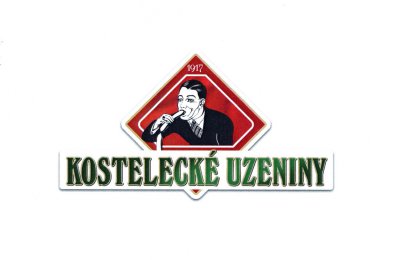
Kostelecké Uzeniny

This is the logo for the Czech sausage company Kostelecké Uzeniny. I’m sure their products are tasty, but..maybe. just maybe, it could find other ways to advertise sausages?
Sherwin Williams

Apparently, Sherwin Williams wanted to cover the world in blood-red paint. The sinister “cover the earth” logo was adopted in 1906 and it’s unbelievable they have kept this unfortunate logo for more than a century.
The Computer Doctors

Maybe they are doctors… Maybe they are good in what they are doing, but seeing this logo, I know one thing: I don’t want them anywhere near my computer.
Institute of Oriental Studies

Maybe if it’s seen from the other angle, this logo looks better. Or not. I just hope no child is allowed in there.
Taylor Pork Roll

Definetly not the best way to illustrate pork rolls.
Highlight

Except for the majormigrane this logo gave me, I actually kind of like it. It’s diffrent I guess.
National Reconnaissance Office Nrol- 39

I don’t know what you think, but the spy agency’s logo looks pretty phenomenally horrible with an octopus sucking the face of North America off. And the best thing? Someone paid for it and it’s being used to spy on you.
Chinese Iconography
![]()
I don’t care what the Chinese letters are saying, but there are no words for describing this disgusting image
Wikileaks

Even if the hourglass is an interesting idea, the Wikileaks’s logo is even more awkward than the Sherman Wiliam’s logo that covers the world with red paint. Needs improvement I would say.
Braum’s

I hope they don’t make the ice cream hot and fresh at the same time!
Bureau of Health Promotions

I wonder what kind of health services they are trying to promote here. Maybe a healthy increasing birth rate? Do they need a “bureau” for this???
Pepsi

I like these guys! At least they are sincere! By seeing Pepsi’s logo, no one can accuse the company of false advertising! The company shows what the effects can be if the people drink their soda. 🙂
Kudawara Pharmacy

I wonder what kind of pharmaceutical products are selling in there
Fully Erect Dome Tents

It seems someone is really excited about going camping.
Pepsi Max

I’m not sure what drinking Pepsi Max is supposed to do for you, but based on what the “X” letter looks like, maybe some people should stay away from it :).
MSN

This is a classic example of when redesigning a logo, taking things away without paying too much attention to detail, can and will lead to bad results. Always.
Clinica Dental

In my humble opinion, you might get more than just simple cleaning services for your teeth, according to their logo design.
Click Lovers

Click… Definitely, click. This is another great example of the importance of letter spacing, especially in logo design.
Wonky

If someone is wondering what’s the name of the company… Well.. it’s WONKY. Just to be clear and not to understand something else.
Islamic Understanding Institute

I don’t know exactly what was in the designer’s mind, but I’m sure this logo doesn’t have anything with the Institute it has been created for. Or with the understanding of their religion…
TGV Logo: Snail

Flip it upside down and you’ll get a snail. By the way, TGV is France’s high-speed rail service, and “TGV” is an abbreviation for “Train à Grande Vitesse”, meaning high-speed train in French.
Catwear

Speachless.
Tesco

I am very curious to find out if this accidentally NSFW giant waggling ..buttermilk logo from Tesco… is really selling Buttermilk to anyone.
Ilkadim Sünnet

Frowning face or a spider watched from the front. Or o schematic position… I just let your imagination work. Period.
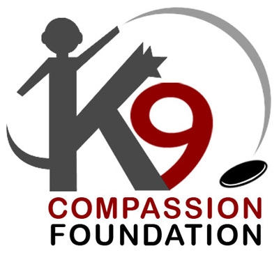
K9 Compassion Foundation

K9 Compassion Foundation is a non-profit organization having as the main goal to get every dog home. Unfortunately, their logo is far, far away from conveying their message. I hope they do a better work with pet adoption.
Hip Hop for HIV

A hip hop concert for educating the young about HIV realities was an awesome idea. The logo that advertises the event is bloody awful.
Labyrinth Coffee House

This logo was probably designed in a coffee house. One of those from Amsterdam if you know what I’m talking about.
Alternate Escapes

This logo is for a recreation center, where people should feel good and enjoy…. Maybe in the twilight zone.
Trashy Roots Salon and Spa

This is the logo for a full-service studio specialized in precision and curly women’s haircuts. Does anyone see the irony here?
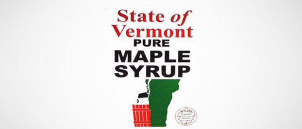
Marple Syrup

Congrats to the state of Vermont for celebrating one of their greatest exports with a logo of a man peeing in a trash basket.
Junior Jazz Dance Classes

Should be a logo or an optical illusion? If you see a pair of breasts here, you might have a dirty mind…


Marple Syrup. Lesson: always get content double-checked before publishing.
Wiki Leaks is fine, since if you analyze the black drops are related to the secrets they spill….