As we all know, a visual design’s purpose, regardless if it’s logos designs, outdoor signage, ads design or website designs, their job is to give off the same energy you would want people to receive when you describe the company or the organization they represent.
That being said, it’s quite surprising that there are actually people that are willing, and more importantly, more daring to post a logo design in the price range of $100. Some of them even show enough disrespect to the creative community to low down the prices until $50/design. But the worst part of this story is not just the low prices some customers tend to set, but also the fact that many designers accept them. Beyond this, it looks like no one thinks it’s almost a fact that only graphic designs failures will come out of that venture.
Somehow, I think the designers who take these shameful jobs can’t be fully blamed; quite frankly, I think they just don’t know any better or they didn’t look at the design from all perspectives. For the most part, the people accepting these disrespectful jobs are either young designers, at the beginning of their career or less skilled starving designers on their last money with no solid clients in sight. Or a person who knows to play a little bit with the design software and after getting no responses from other “so called designer” has decided to take the design work into his / her own hands and consider he/she did a very good job.
Obvious, this treatment of graphic design will lead, without any doubt, to the inevitable lower graphic design standards set for this creative profession. With a key creative field being disregarded every day, a client base for this field with an “ignorance is a bliss” mindset, and plenty of people claiming falsely to be graphic designers, what is there for real professional creatives to do?
Well, maybe take a note from the satire TV shows and celebrate some of the greatest design failures. We spent so much time celebrating how good some designs can be, and appreciating the real skills and talent that are showcased there, and we forget talking about graphic design failures. And we can see a lot.
That’s why in this article, you will see an array of awful designs. Some of them will make you laugh, other of them will make you to ask yourself “What was in the designer’s mind?”
1. The Eat

Everyone likes to eat, but I think the designer of this cup is the only who knows it’s about a cat!
2. Website stock photo failure

Did you see The Invisible Man movie? This could be a new way for making him visible for others! Nothing else to add, just a note for the designers: always double or even triple check your stock photos!
3. ChURrch

I can’t figure out if it’s only de designer fault, but I think a proofreader is missing here!
4. Apprenticeships

If you are looking for an apprentice, this doesn’t really mean anything. But if your target is a bunch of people looking for app rentals or ice ships or ice on ships, this design could have a sense.
5. Arlington Pediatric Center


I just checked their website and I saw they have changed their logo to something more appropriate for a medical center. It’s no longer a pedophilic center. But it seems they save something with crabs and bears. A new failure? Or just marketing strategy?
6. Mont-Sat
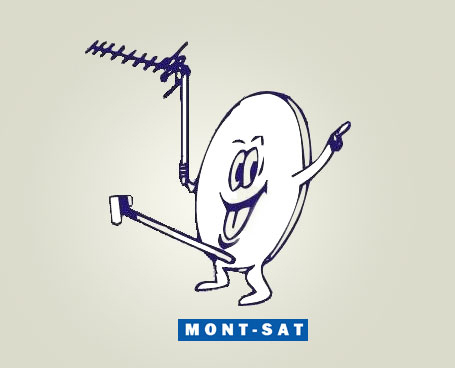
No one should be jealous on his happiness :D. He’s just Mr. satellite!
7. Unfortunate reflection

Who wants this??? The best example for checking the end result before playing with reflection!
8. Zombie apocalypse

Do you imagine how could it be? Bad designs might just send us into the zombie apocalypse!
9. Cannibalism of cats

As I remember, cannibalism is forbidden even in the cat community.
10. Kundawara Pharmacy

There’s no need explanation why Kundawara Pharmacy’s logo gained such widespread public attention.☺ We just wonder what services are offered behind of these doors.
11. Institute of Oriental Studies

The designer who created this logo thought it was the best representation for what the Oriental Studies mean ☺
12. Mama’s baking
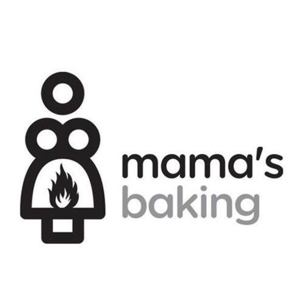
Maybe the designer’s intention was to start a fire down there? Ok, maybe in Greece, where this café is located, this doesn’t seem weird. Just maybe….
13. Maple Syrup

It seems no one noticed the suggestive nature of the sign for over a decade.
14. Mega Flicks

After reading this logo, many customers might think twice before entering into a MegaFlicks store. Lesson to learn: chose fonts carefully.
15. Rape Nuts

Rape Nuts? Grape Huts? Rape Guts? I think the copy was doing well before the designer decided to get some style with letters.
16. Super Bowl

Who needs an elbow, anyway? This happens when the designer doesn’t pay too much attention….
17. Don’t be happy
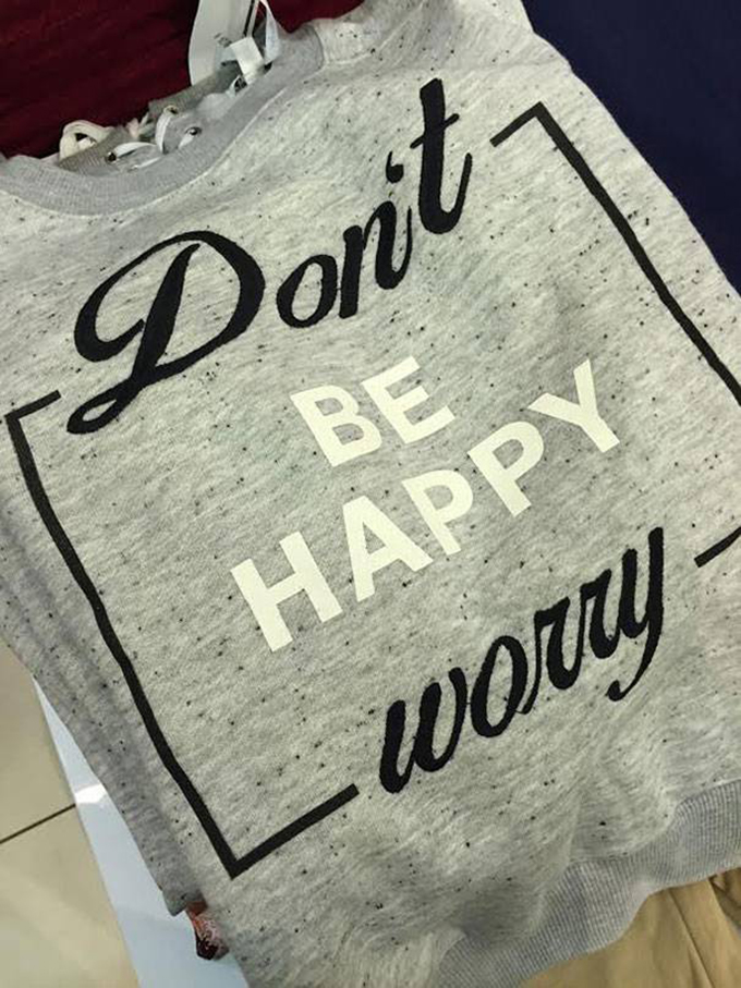
Good designs promote happiness and encourage you to set aside your worries. The bad designs do the exact opposite.
18. Poo

Everyone does it, but hopefully not on the table ☺\
19. Chewable vitamins

Everyone wants healthy skin, hair and nails. But I don’t think anyone likes to chew them.
20. Therapist? Rapist?

Yeah, sure, “rapists” and “therapists” are the same thing….. Think and design again…. With a better font. Or at least a little bit more attention. This image reminds me a lot of a different “therapies” design fail.

21. Virtual Reality

I really don’t think it’s necessary to make VR technology more whimsical than it already is.
22. Bone Goal

I don’t think the whole team should share the same “bone” goal…
23. Yves Levesque

It looked ok in Photoshop, right? This happens when the car wraps are designed without making real simulations.
24. Factory Farts
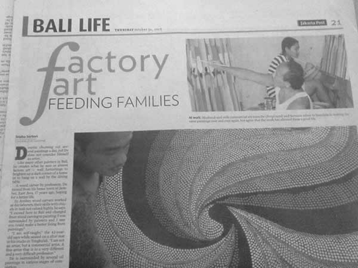
No family can live with factory farts. But this headline is a huge mistake.
25. Lesson about bones
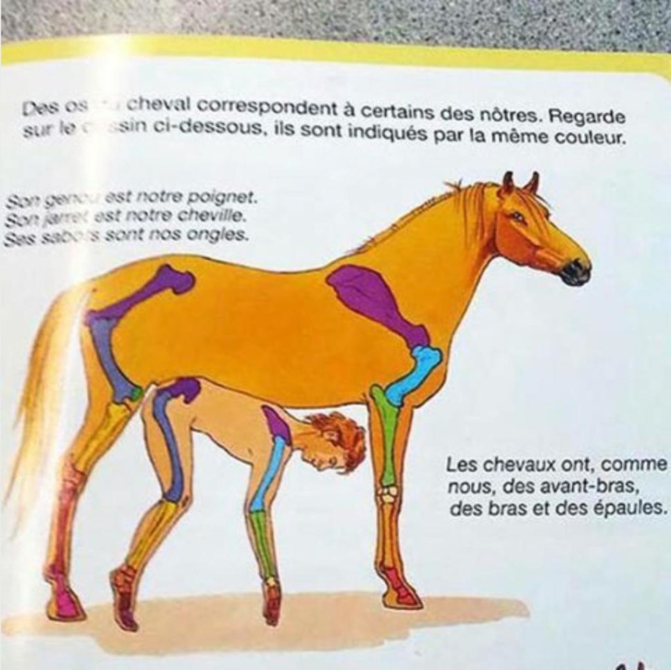
Definitely, this is not the lesson about bones you meant to be teaching.
26. You Are Alone

Pink on pink is really undercutting your message. Someone should learn about contrast in graphic design.
27. Wedding Invitation

Many people consider marriage being a prison. But I don’t think someone should be left hanging on their wedding day. ☺
28. Sauces or car clean products?

These sauces look like car clean products. I don’t think this is the vibe the designer wanted to be.
29. Fashion Fart

For sure, this wasn’t the intention of the designer, but still..
30. Unbelievable Transformation

When you work so hard, you change even the ethnicity…
31. Sasa Lele
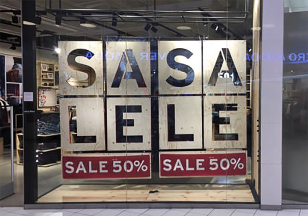
I love Sasa Lele ☺!. Especially when it has 50% discount!
32. Buy 3, get 2

It seems this designer is also the best marketer in the world ☺))!
33. Children’s Menu

Yes, I’ll take one Child Rib, please, along with a Child Burger! And for drink…….
34. Plastic Surgery

Maybe this women should start tell little white lies after her plastic surgery!
35. Exit poll
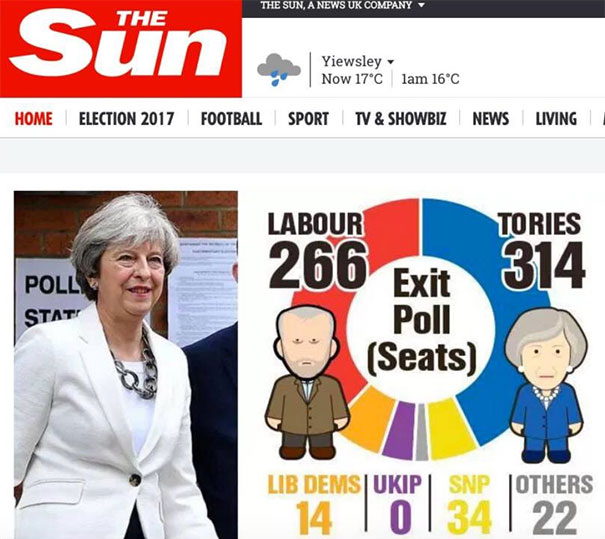
Apparently zero is a little bit less than 34, but it’s much bigger than 22 ☺. Someone should learn to make some infographics.
36. Men’s Boxer

Another example of unrealistic body expectation for men….
37. Love, Morriage, Bobby?
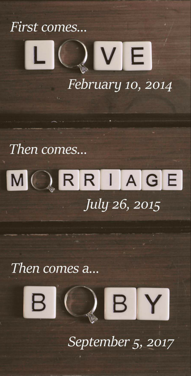
Who is Bobby? Does he know who will come up?
38. Ndeeisgihgbnocrehnotoedr

For sure, the designer’s intention was to be different, but, does anyone understand anything?
39. Doughboys

Maybe this restaurant offers pizza, salad and panini, but their logo says something else. I won’t mention what, yet it’s not too difficult to see for yourself.
40. Clinica Dental

Dental clinic or “full-service” practitioner? I think the patients of this clinic have already figured out ☺.
41. Year Of The Monkey

This poster was created for celebrating Year of the Monkey. But as humans, we have to ask: Which monkey?
42.Junior Jazz Dance Classes

This happens when the designer doesn’t pay too much attention to the negative space. Wonder if it’s a junior dancer center or something else?
43. The computer doctor

Just wonder why and how. Just view the mouse from the logo and pass your own judgment.
44. Corona

Clearly, this man doesn’t have any arms. But… would he be the man of the future?
45. Bureau of Health Promotion Taiwan

When you’ve gone too far, I think it’s better to step back and take a closer look. Am I right?


Leave a Reply