In an absolute sense, landing pages are any web page where a visitor can arrive at or “land” on as a response to clicking on a search engine optimized result or an online advertisement. Regardless their types (click through or lead generation), the only purpose of the landing pages is to convert the visitors to the next stage of their buyer’s journey.
Although their goal is simple enough in theory, in reality, designing an efficient landing page that really converts, requires some detailed planning, creative designing, and testing.
There are few core elements that a successful landing page should include:
- Simple design – including here the hero shot (images/video showing context of use)
- Unique Selling Proposition (USP) – the main headline, a supporting headline, a reinforcement statement and the closing argument
- The benefits of your offering
- Proof – including social proof and trust indicators
- A single conversion goal – your Call-To-Action (CTA) (with or without a form)
Although you have to follow the best practices for designing a successful landing page and you will find many trends related to this subject, there is no “right” way of doing this.
Regardless of what conversion you hope to get, it’s always helpful to check out some examples of great and also of awful landing pages, in order not just to get some inspiration from the best, but also to learn from the mistakes of the worst ones.
Keep in mind, I don’t have access to the analytics for each of these landing pages, so I can’t tell you specifically how well they convert visitors, contacts, leads, and customers. Also, for shorter pages, I’ve shown the entire page; for longer pages, I only displayed above the fold. You may need to click through the page to see some of the points I discuss.
The Good Ones
Many marketers and designers know the basics of a great landing page: clever, simple and attractive design, easy navigation, impactful copy and clear call to action. Anyway, an excellent landing page has to have the right mix of all of these elements.
Here are five examples of companies that do it well:
1. H. Bloom
H. Bloom is an online floral arrangement service that allows their customers to subscribe for having custom tailored bouquets delivered at home or at the office or for scheduling a complimentary design consultation. Its subscription landing page is a pleasure to look at, first because of using a high-resolution image and of a lot of white space that allows the visitor’s eyes to breathe.
Also, this landing has all the great conversion elements laid out: the benefits of the service and what customers will receive if they subscribe, the above-the-fold form superimposed over the image and even the bright orange “Submit” button. There are a few more images and information below the fold, but all the key information is listed.
2. PeekCalendar
An app for managing your time on the go, the PeekCalendar landing page uses images and two calls to action. Although this may distract the visitors from the purpose of the landing page, both CTAs are simple enough not to conflict each other. As powerful use of images and putting the call to action at the top of the page are effective strategies, we can find both of them here.
The page gives viewers the option to watch a video about the product or download the app. The background images show people using the product. While scrolling down, the page has logos and links to good press about the app, enhancing social proof and also the benefits the users will get.
3. Litmus
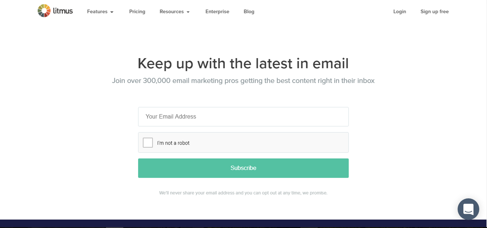
Email marketing platform Litmus has a great landing page for subscribing to its newsletter. The call to action is the first thing you can see on the above-the-fold white background, along with the snappy headline “Keep up with the latest in email”.
The subhead clearly communicates the benefits of the visitors after taking the action and all you have to do is to enter your email address.
Bellow the one-field form, Litmus has some trust indicators and a colorful list of newsletter archives.
4. Airbnb
Airbnb gives us another great example of an excellent landing page. For converting the website’s visitors into hosts, the company offers some enticing and personalized estimated weekly average earnings based on your location. If you want to get an even more customized appraisal, you can enter some additional information about your potential accommodations. Scrolling down, the landing page has listed the benefits the visitor can get if he becomes a host. If you’ve already used the website for a some of your travels and you visit the page knowing how the things work, the clear call-to-action at the top of the page makes it easy to convert on the spot.
5. Shopify
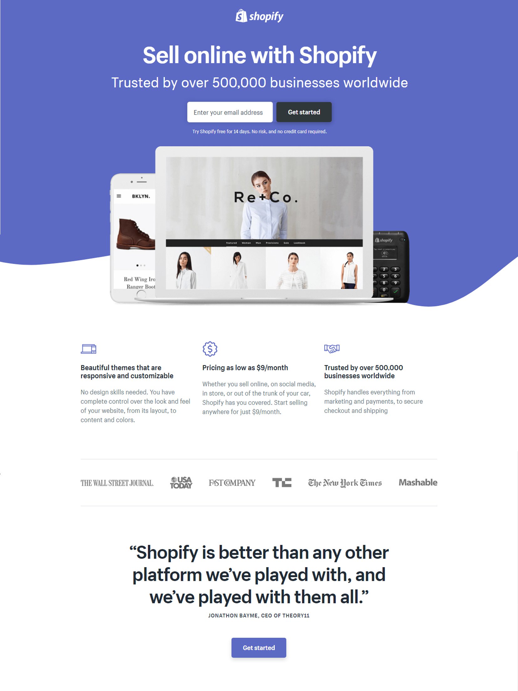
Like the other landing pages listed in this post in “The Good Ones” category, Shopify‘s trial landing page keeps things as simple as possible. The user-oriented headline is short and impactful, followed by the sub-headline that includes a trust element, like the number of users, for example. Also, the page relies on simple bullets, not paragraphs, to communicate the trial’s details and benefits. There are only a few fields you need to fill out before you get started. All of this makes it easier for you to get to the point: selling online with their tool.
The Awful Ones
As I mentioned in the beginning of this post, your landing page must be focused on a specific purpose and have a clear call to action. If you try to mix too many different elements into a landing page, it’s no surprise that things can go wrong and you don’t get the results you hope for.
Anything, starting with using too many colors, poor contrast, disengaging copy or just not understanding what your audience needs and wants can destroy your communication efforts and sent the visitors away from your landing page instead of making them go further with your website.
Oh, how does an awful landing page look like? Let’s check the examples listed below:
1. Chase
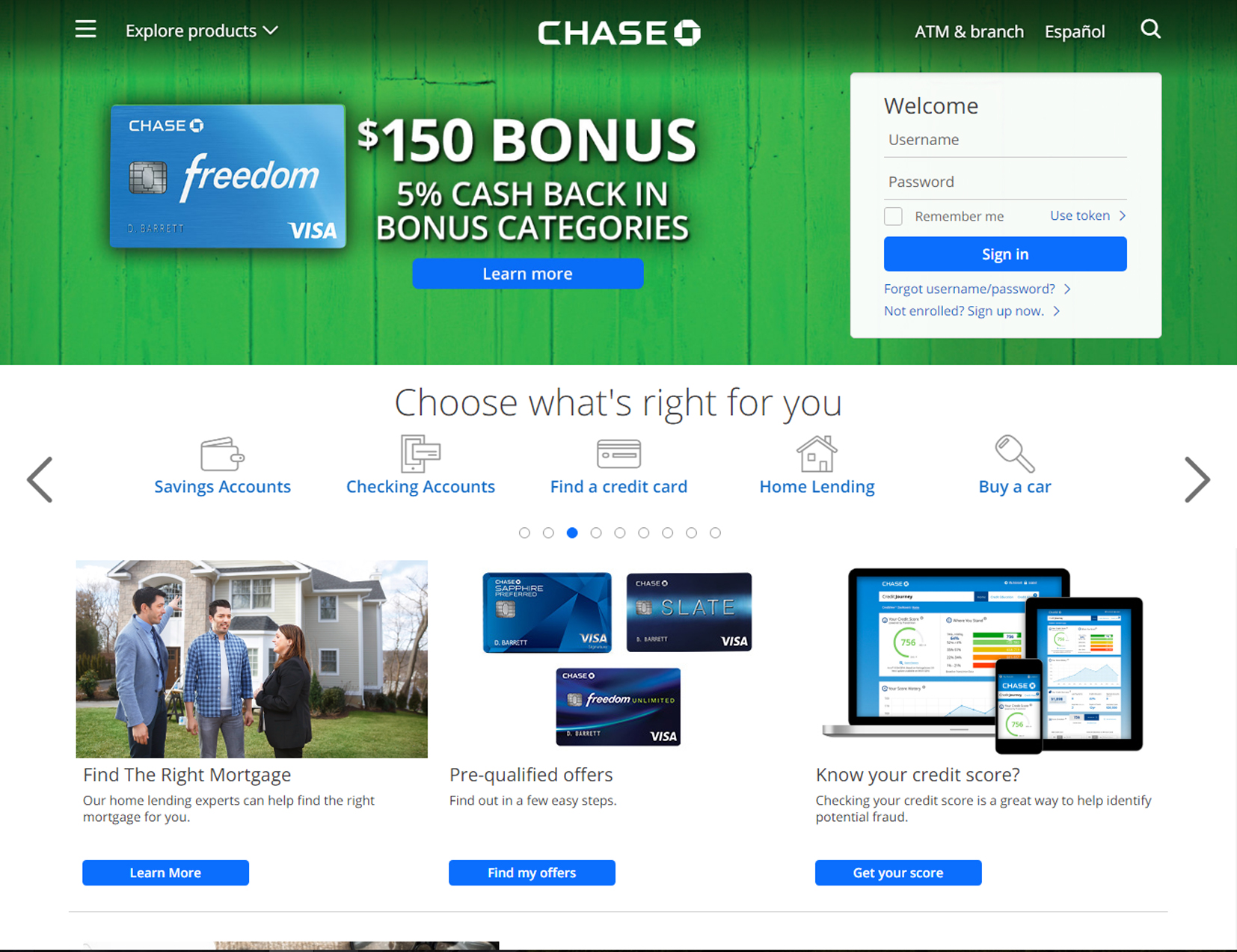
For a large bank, with sleek advertisements, Chase’s landing page for credit cards looks pretty bad. It is cluttered and some specific pages, as the sign in for existing customers, signing up for the new ones, using the token and learning about different credit card offering have irrelevant calls to action.
In terms of design, the page doesn’t look too bad, but it could look better if they would focus on just one goal. In terms of functionality, multiple calls to action could perform well and be efficient, but only if they don’t conflict each other and confuse the visitors.
2. Novum Publishing
Taking into consideration how many information related to design trends for online communication there are out there, Novum Publishing’s landing page is surprisingly outdated. Because the first impression always counts when it comes to your website’s conversion rate, having a fresh and up-to-date design is one of the key elements for a landing page.
Even if there is nothing wrong with the content in the top paragraph, its actual placement is a distraction from the sign-up form listed below the fold. Therefore, switching these two elements would be more beneficial for this landing page.
3. Lowes
Home improvement retailer Lowes has an issue of trying to get too much from one single landing page and see what finally gets. Its landing page includes a bevy of calls to action, which could easily overwhelm the visitor.
Instead of putting all on the same wall and see what will stick, it’s more efficient to have more landing pages, each of them being streamlined around a single goal.
4. Marketo
I’m sorry to put this on the list of the awful landing pages, but there is real room for improvement here.
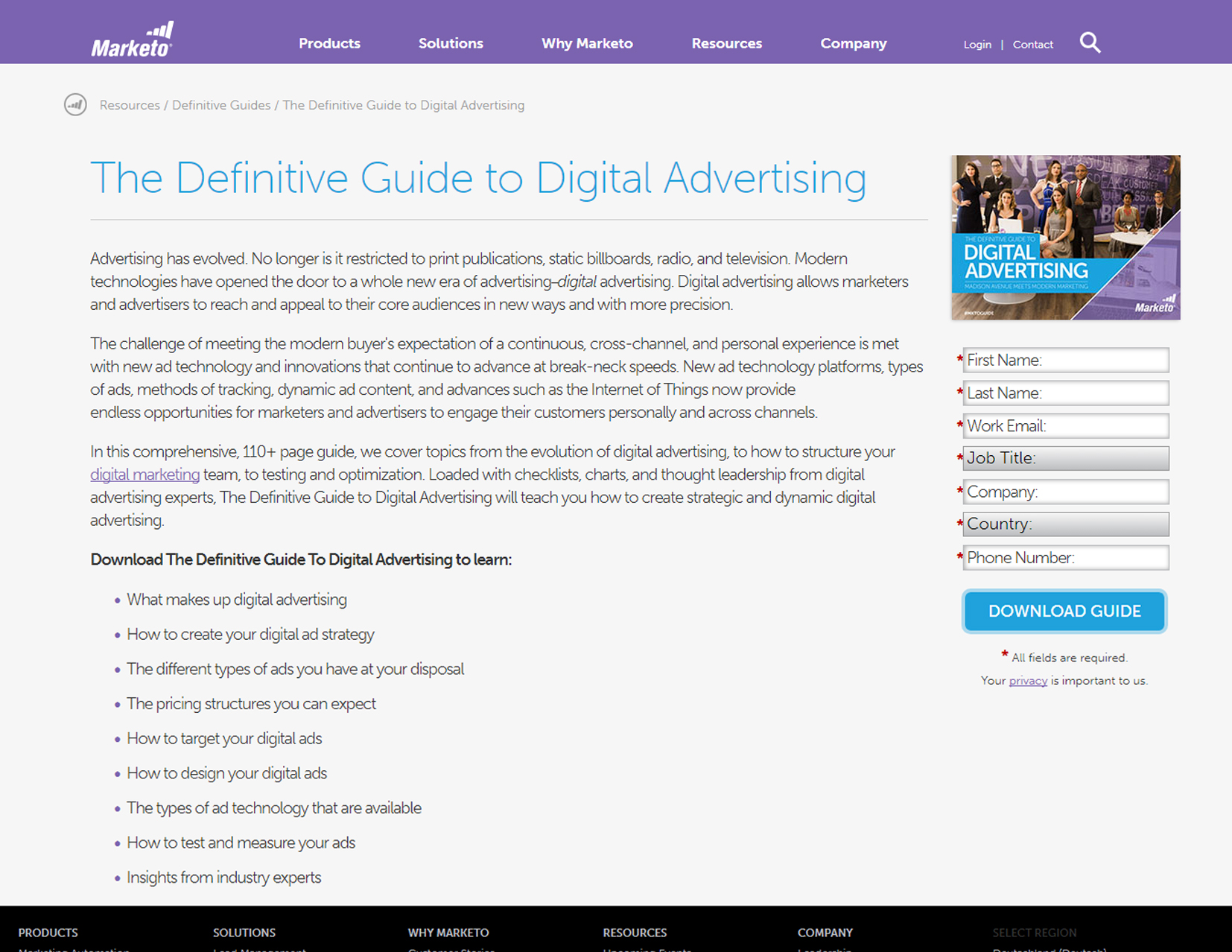
First of all, there is too much content here and therefore the page looks cluttered. The bolded text “Download The Definitive Guide To Digital Advertising to learn:” explains what the visitor gets if he downloads the guide, but it should be further up the page. Most viewers will start reading from the top and they might be bored before they reach the bullet point section, especially because it’s below the fold.
Also, the contact form is too intense. Maybe this comes from the desire to get as much information as they can about their audience, but having lots of section to fill is labor intensive and might determine people not finishing the signing up process. Contact forms should only ask for necessary information like an email address and a name.
5. Office Furniture
I think this is one of the worst landing pages I’ve ever seen. It’s so much clutter here, that I don’t have any idea where I’m supposed to look. First, this landing page really needs some white space to make the content and images more digestible for the viewers. Second, it needs a clear direction for the visitor.
One positive note – when scrolling down, you’ll find on the right side the customers reviews, which is an encouraging social proof.
Bottom line
Landing pages work or don’t work for many reasons, but they are effective when they speak directly to your audience.
Trying to do too much with a single page is almost always more overwhelming than impactful. Therefore, before designing a landing page, you should set a clear goal and follow the best practices for doing this.


OfficeFurniture Online are also quite heavily and persistently advertised through spam emails, so it seems that they make consistently poor decisions when it comes to promoting their business.
Great article, however these are all desktop layout. Curious as to how those results would look on an iPhone or tablet? With more than 50% of browsing occurring off the desktop, designing clutter-free, clearly defined landing pages with a single CTA is important, but keeping a mobile-first mindset is the only way to go in 2017 as a developer.