In order to build a website with a great UI/UX, every company should take into consideration a lot of factors. You must make the users feel at home and extend their reach from the first interaction with your website. Therefore, the essence of an excellent UI design is to help users complete a given task as simple and time-efficient as possible. Even if the approach for making this is different depending on many factors, an attractive interface and impressive images are elements with a great importance. But the core part of making a great UI design is to deliver the users an intuitive and smooth experience.
Many people that get started in the business keep looking for the best user interface websites, in order to see how different features have worked for other companies with different preferences and requirements.
For a good starting point for evaluating if a UI design is efficient, the research company Nielsen Norman Group defines usability through these 5 characteristics:
- Learnability:Can the user complete their tasks with little or without any difficulty?
- Efficiency:Does the interface allow the user to complete tasks in a timely manner?
- Memorability:After leaving a website, how likely will the user be able to remember how to use it the next time they visit?
- Errors:What steps does the interface take to lessen the chance of user error, and how do they let the users correct an error?
- Satisfaction: Does the user enjoy interacting with the design?
On top of those standards, a good UI should also reflect the personality of the brand in order to stand out from the competition and provide users with a delightful experience.
From this point of view, the following characteristics should be taken into consideration:
- Stunning and unique layout: Even for visitors who fail to stay, a great layout can make your website unforgettable. They might return because your products are laid out with creativity rather than being displayed in the old-fashioned grids.
- High-quality images: photos are the most eye-catching features that visitors see from the first glance on your website. Remarkable sites compete to cover their high-resolution image pages to expose their products from any possible angles.
- Thought-provoking slogans: Clever content providers and UI designers create and put thought-provoking slogans everywhere on their homepages from sliders, headers to landing pages and pop-up forms. Once one of the slogans hits the visitor’s eye, you have very big chances to get a new order or a new subscriber, and so on.
- Straightforward navigation: This idea is easily understandable. Nowadays, everyone is in a hurry. If your users can’t find soon what they want, for sure you will lose them very quickly.
- Rapid prototyping: if you take a closer look at most websites with a gorgeous UI design, you’ll find that rapid prototyping tools were adopted by most of them. This approach lays a solid basis for a fast iterative development in the next stages of the websites building.
Based on all these characteristics, we have looked around on the Internet and put together a list of five websites that have gotten great UI designs and deliver a delightful experience to their visitors:
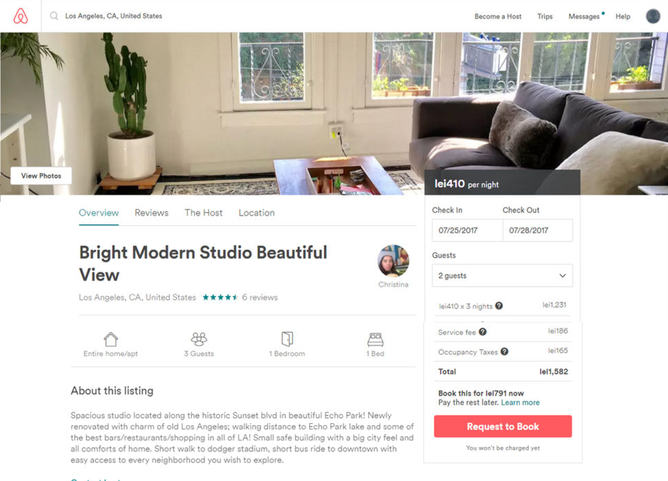
The UI of Airbnb does three things very well: booking a place to stay, sharing different places, experiences and destinations and creating trust between two complete strangers. Airbnb has prioritized making it easy to start booking a stay right from the home page.

The conversational invitation for searching is a delightful way of portraying the voice of the brand, as well as making the process of finding a place to stay simple. The only fields you need to fill during the initial search are: choosing a destination where you would like to go, along with the duration of your staying and the number of guests. By leaving out the additional filters until the next step, the process is streamlined, friendly and approachable.
The listing pages are complete with a description of any additional fees that may be included. This is a very straightforward, easy process for just about any user. The ‘Request for Book’ button sits right under this and is the brightest buttons on the page, inviting users to click it in order to finalize their order.
On the other hand, Airbnb takes pride in bringing people together and gives the conversation importance over the transaction. Airbnb has cleverly thought out its copy and used engaging photos and videos to ensure that the interface conveys an emotional tone that helps create a sense of trust between strangers.

MyUKmailbox.com is a company that provides BuyForMe and UK mail forwarding services to people everywhere in the world. The idea is simple: not every British online store delivers outside of the borders, and therefore MyUKmailbox.com provides the user a physical address where you can get your product and they take care of forwarding them where you want.
In fact, delivering simplicity, trust and efficiency are the main goals of the website. And MyUKmailbox does this! Even if as structure, the UI of MyUKmailbox.com can be seen on many other websites, the layout, design and content were created focusing on the customer. To clear things from the beginning, a video explainer is placed right on the home page and the user will find in a funny and nice way the benefits he will get after signing in. On the “Price” page, in addition to the pricing plans, they placed a Rate Calculator where, after filling a regular form, the user gets a cost estimation. This way, he can decide what financial option fits him the best.
The modern layout, which stays on top with the latest web design trends, reflects the personality of the brand and stands apart from the competition.
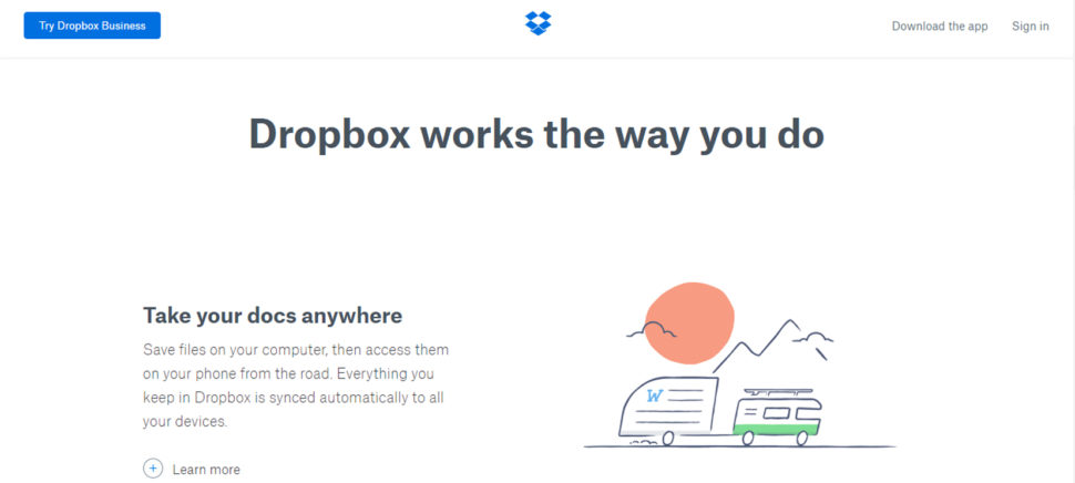
Dropbox has one of the easiest to understand interfaces by far. By having a folder and file organizational structure, it is easy to recognize and use by anyone who ever used a computer before. In terms of learnability, the things are pretty simple. All the actions you have to make in order to have an account and upload the files for storage or for sharing or download the files are so easy and intuitive, that every user has already known how to do from the start. It’s natural for most users to try dragging and dropping files from their desktops to the page without them even know if it’s possible or not, just because it’s so familiar.
Dropbox’s friendly personality, created by lighthearted illustrations, helps the user feel comfortable while using the product. Also, by adopting the usage of hand-drawn illustrations in everything they do, they put the user at ease, appeal to the child in all of us, and make the product seem more accessible. This addition to the interface makes the product feel like an old friend, ready to help users complete their file sharing tasks.
This is especially helpful if you are a large tech company like Dropbox.
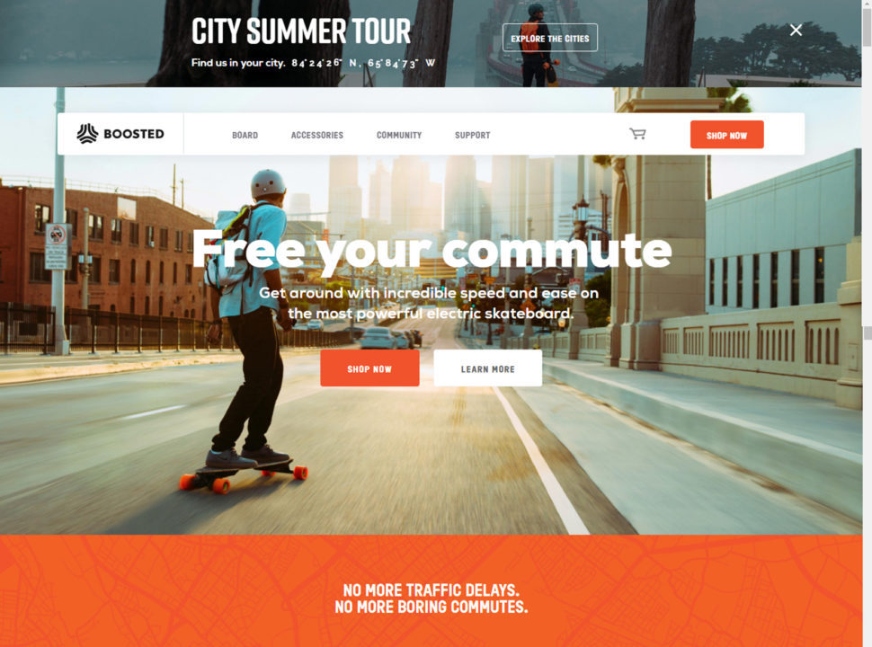
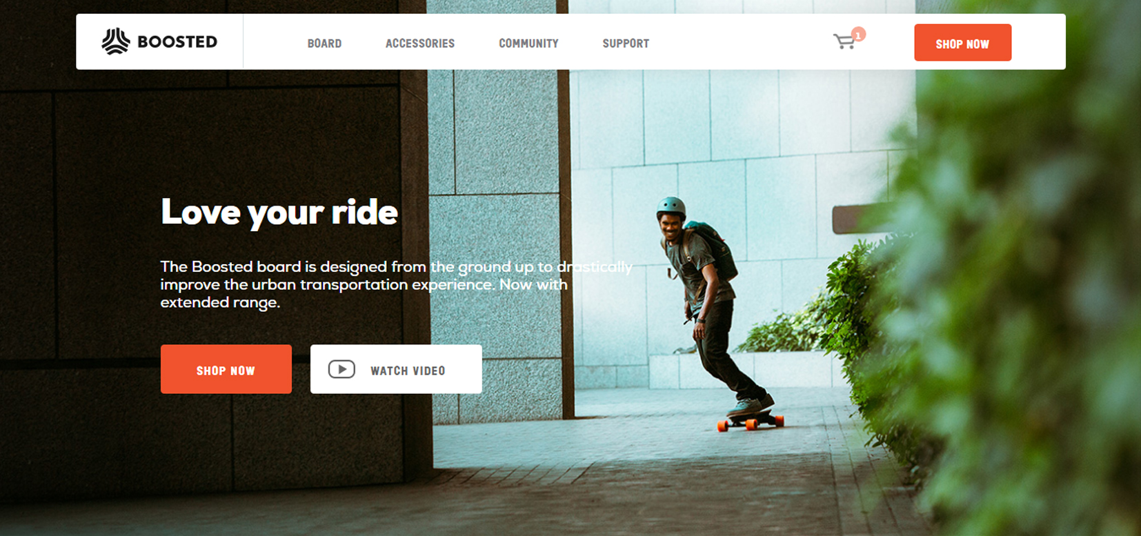
This is a website full of life and personality. Upon arrival, users are immediately greeted with some microinteractions. The UI lets here the product to take the spotlight, putting everything else in the background. When a visitor clicks the “Reserve for $100” button, a check out form pops up. Instead of being redirect to another page, this allows the user to go ahead quickly, fill the form and reserve his products without leaving the product page.
When scrolling down, the home page has a series of panels of big, bold and vibrant photos showing the product in use and information related to products, their advantages and the most important characteristics. This gives users a unique way of seeing what the product has to offer instead of just listing out features. By greying out the text, the eyes are drawn to the two bright and bold places that contrast with the image from background: “Shop Now” and “Learn More” call-to-action buttons.

The UI of Boosted Boards really helps to compliment the “cool” factor that the product has to offer.
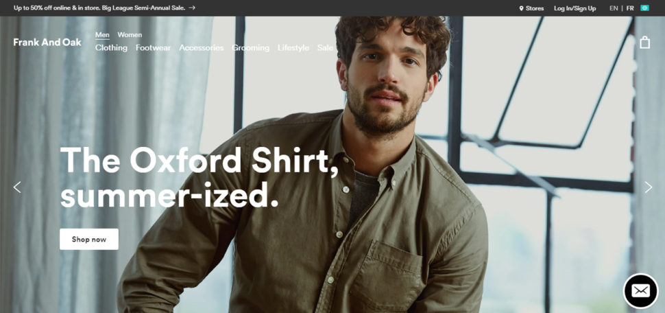
Men’s clothing retailer, Frank and Oak, uses their UI to grab the attention of their visitors and their taste of stylish shopping. The company uses big, bold photography and clean, sans-serif typography to capture the personality of the brand and to convey the message to their target audience.
The online shopping experience they deliver to their users is fairly straightforward. The navigation is quite easy,
if you want to dive deeper for more products or to switch between different products categories.
When you decide to buy a product, the UX Frank and Oak website delivered to the user is quite friendly and delightful. After clicking on one item, even if there are some other elements that help user to buy the right product, the page is focused on two things: the product’s images, and the call to action button, those two being the only colored elements on the page. To avoid some unpleasant situations, the ‘Add to Cart’ button won’t work until a size is selected.

Filling out personal information during the online buying process could be an unpleasant and stressful experience, but Frank and Oak help users out by breaking the form into smaller chunks of input fields to reduce the stress.

Overall, the UI of Frank and Oak website can be seen on many other websites, but the layout and the style were definitely created having the ideal customer in mind.



Leave a Reply