It has to be simple but memorable, modern but a bit classic, minimalistic but timeless; we expect so much from a simple design, don’t we? People usually underestimate the untiring effort invested in creating a simple logo that lives up to all these expectations. Not to mention the cases when your client says “I will realize what I actually want when I see it”. Duh!
Logo designers undoubtedly have a tough job. To help these distressing beings on Earth, we have accumulated the most effective logo design trends of 2017 that you should consider before skipping on your next logo design project.
1. Less Is More

Viewers are becoming a big fan of minimalistic designs, this is the reason why minimal and flat designs are dominating the market. The main purpose of your logo is to curate your brand story to targeted audience, therefore you should make sure the logo you are designing with minimal elements is practical and goal-oriented.
Minimalistic logo designs are easy to understand and thus are more likely to be remembered for a longer time. They are more like a nice pair of jeans, they go well with everything; no matter whether they are used on stationary designs or website.
2. Hand-Drawn
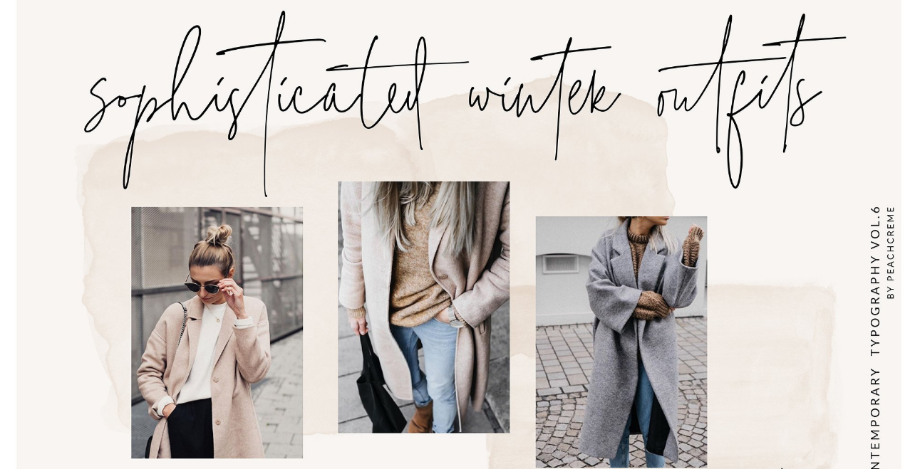
People love everything that owns a humanly touch. Hand-drawn graphics started their journey in the graphic design field in 2016 and have gained more ground in 2017. Usually used in food and drinks industry, hand-drawn logos are unique, modern, quirky, credible, and charismatic.
Handmade designs are a bit labor-intensive and difficult to work with when using on the digital platforms, yet they feel fresh and human. If you think your project is worth that much effort and you can handle such designs even on the digital mediums, then go for it.
3. Line Art
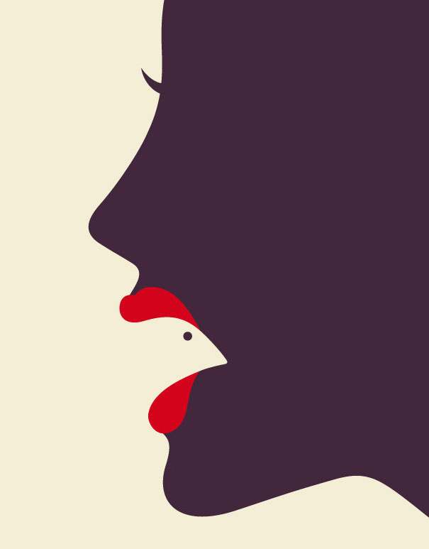
One of my personal favorites, Line art graphics are counted among the most creative designing styles in the industry. They give you enough room to show up your creativity when paired with the negative space. This type of designs uses an even thickness of lines to create a design usually with a single color.
If your client is looking for a simple, sleek and sophisticated design, try line art graphics. This gives a fine combo of image and text which enables to convey brand message conveniently.
4. Letter-Stacking
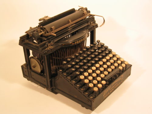
When used well with negative space, these letter-stacking graphics grabs viewers’ attention and tempt them to stop and peek at the design to crack what has been written. It amazes people; the more they are involved with the design, the more they will like it. Besides, when you have longer text to use in your design, you can try this style. Make sure to choose your font wisely. Bold, legible fonts are consider-worthy here.

5. Broken letters
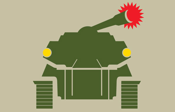
2017 has started with designers using broken fonts different than their utilitarian nature. These logo designs consist of appropriate fonts broken to exhibit a modern and fresh feel.
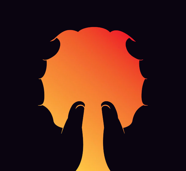

While designing a custom logo for your clients, it is great to put out-of- the-box ideas to the table.
Yet, the designers should make sure that their logos satisfy all the essential requirements slickly
and represent the brand in the very best way.



Thanks for sharing this wonderful post.